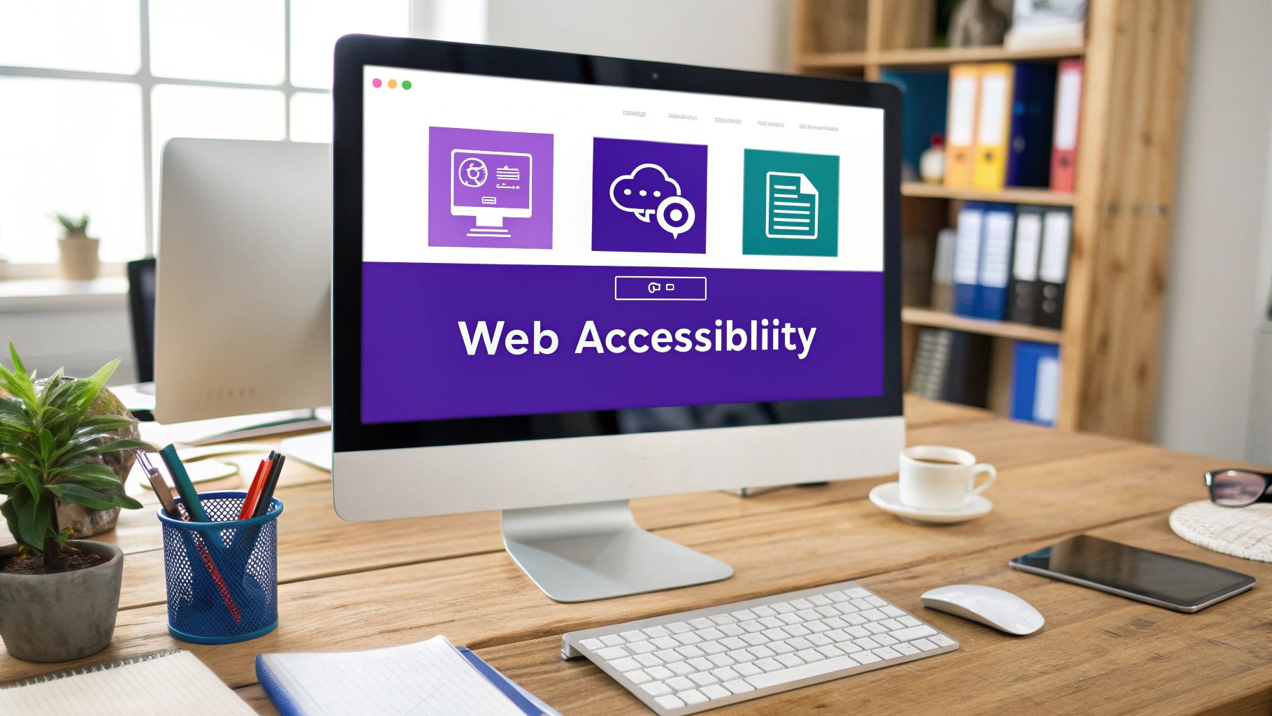
Top 9 Website Accessibility Best Practices for 2025

In the competitive world of e-commerce, creating an inclusive online store isn't just a compliance checkbox; it's a powerful growth strategy. An accessible website welcomes every potential customer, including the one in five adults living with a disability. This opens up your brand to a significant, often underserved, market segment, building loyalty and unlocking new revenue streams. By implementing key website accessibility best practices, you directly improve the user experience for everyone, which can lead to higher conversion rates and better customer retention.
This guide moves beyond theory and dives straight into actionable steps. We'll break down the essential practices every e-commerce store, from growing Etsy sellers to established Shopify brands, needs to implement. Just as you might consider broadening your customer base by exploring new payment solutions, such as accepting cryptocurrency payments for your business, enhancing your site's accessibility is a fundamental way to expand your reach.
Think of this as your roadmap to building a store that’s not only compliant but also a joy to use for all shoppers. We'll cover everything from semantic HTML and keyboard navigation to mobile-friendly design, helping you turn accessibility into a tangible competitive advantage.
1. Semantic HTML Structure
Think of your website's code as its skeleton. Using generic <div> and <span> tags is like having a skeleton made of undefined bones; it holds things up, but there's no inherent structure. Semantic HTML, on the other hand, uses tags that describe the meaning of the content they contain. This is one of the most fundamental website accessibility best practices because it provides a clear, logical roadmap for assistive technologies like screen readers.

When you use tags like <nav>, <header>, <main>, and <article>, you're telling screen readers exactly what each part of your e-commerce site is for. This allows a user to instantly jump to the main product grid or the navigation menu instead of having to listen to every single element on the page.
Why It's Crucial for E-commerce
For an online store, a clear semantic structure is non-negotiable. It allows a shopper using a screen reader to easily find your main products (<main>), navigate categories (<nav>), or skip to the footer (<footer>) to find your return policy. This creates a smooth, efficient shopping experience, reducing frustration and abandonment.
Key Insight: Good semantic structure is a win-win. It’s a cornerstone of accessibility that also provides a boost to your SEO, as search engines use these same semantic cues to understand and rank your page content.
Actionable Tips for Implementation
- Structure Your Headings: Always start your page with a single
<h1>for the main title (like the product name). Use<h2>,<h3>, and so on for sub-sections, and never skip levels (e.g., don't jump from an<h2>to an<h4>). - Use Landmark Roles: Wrap your main sections in the correct tags. Your logo and top menu go in
<header>, your primary content (like product listings) goes in<main>, and your site navigation belongs in<nav>. - Validate Your Code: Use tools like the W3C Markup Validation Service to check for errors in your HTML structure. This helps catch issues that could confuse assistive technologies.
2. Alternative Text for Images
If your website's semantic HTML is its skeleton, then images are its visual soul. But for users who can't see them, those visuals are just empty space. Alternative (or "alt") text provides a textual description of an image, allowing screen readers to convey its meaning and purpose. This is a critical website accessibility best practice that ensures your visual content isn't a barrier for shoppers with visual impairments.

When a screen reader encounters an image with properly written alt text, it reads the description aloud. This gives users the same contextual information that a sighted person would get from looking at the image, whether it's a product photo, an instructional diagram, or a promotional banner.
Why It's Crucial for E-commerce
For your online store, images are everything. Alt text turns your product photos from inaccessible gaps into valuable sales tools. A good description like "A navy blue cotton t-shirt with a small embroidered whale on the chest" gives a shopper using a screen reader the essential information they need to make a purchase. It ensures every customer can "see" your products, understand promotions, and engage with your brand's visual identity.
Key Insight: Alt text isn't just for accessibility; it's a powerful SEO tool. Search engines can't "see" images, so they rely on alt text to understand what an image is about, helping your products rank in image search results and driving more organic traffic to your store.
Actionable Tips for Implementation
- Be Descriptive but Concise: Describe what’s in the image accurately. For a product, include key features like color, style, and material. Aim for under 125 characters so screen readers don't cut it off.
- Skip "Image of": Screen readers announce an element as an "image," so starting your alt text with "image of" or "picture of" is redundant. Jump straight into the description.
- Use Empty Alt for Decoration: If an image is purely decorative and adds no real information (like a background texture or a stylistic border), use an empty alt attribute (
alt=""). This tells screen readers to ignore it, preventing unnecessary clutter. - Context is Key: The same image might need different alt text depending on its context. A picture of a model wearing a watch on a product page should describe the watch, while on a blog post about fashion, it might describe the overall outfit and style.
3. Keyboard Navigation Support
Imagine trying to shop online without a mouse or trackpad. For many users with motor disabilities, and even power users who prefer efficiency, the keyboard is their primary tool for navigating the web. Implementing robust keyboard navigation support is one of the most critical website accessibility best practices, ensuring that every interactive element, from product filters to the "Add to Cart" button, is accessible without a mouse.

This means a user can move through your site in a logical sequence using the Tab key, interact with elements using Enter or Space, and see a clear visual indicator of where they are on the page. Without this, parts of your store become completely inaccessible, creating a dead end for a significant portion of potential customers.
Why It's Crucial for E-commerce
On an e-commerce site, keyboard navigation is not just a feature; it's the pathway to a purchase. A shopper must be able to tab through product variants like size and color, activate filters, navigate to the checkout page, and fill out payment forms all with their keyboard. If the focus gets stuck or skips over the "Complete Purchase" button, the sale is lost.
Key Insight: A clear and visible focus indicator is the keyboard user's equivalent of a mouse cursor. If it's faint or non-existent, it's like asking a customer to shop in the dark.
Actionable Tips for Implementation
- Test Your Tab Order: Unplug your mouse and navigate your entire site using only the
Tabkey. Does the focus move in a logical order? Can you reach every link, button, and form field? - Make Focus Visible: Ensure the focused element has a highly visible outline. Your CSS should define a clear
:focusstate for all interactive elements, with a contrast ratio of at least 3:1 against the background. - Implement "Skip to Content" Links: Add a "skip navigation" link at the very top of your page. This allows keyboard users to bypass repetitive header and navigation menus and jump directly to the main content, such as your product grid.
- Manage Focus in Modals: When a pop-up or modal window appears (like for a quick view or email signup), ensure keyboard focus is trapped within it. The user should not be able to tab to elements hidden behind the modal.
4. Color and Contrast Accessibility
Imagine trying to read light grey text on a white background. For many people, especially those with visual impairments like low vision or color blindness, this isn't just difficult; it's impossible. Color and contrast accessibility ensures that your content is legible for everyone by maintaining a sufficient difference in brightness between text and its background. It's a foundational part of website accessibility best practices that also means not relying on color alone to convey crucial information, like an error message or a selected size.
This practice goes beyond just helping users with disabilities. It benefits anyone viewing your e-commerce store in bright sunlight on their phone or on a low-quality monitor. Good contrast makes your content more readable and your call-to-action buttons more prominent for every single shopper.
Why It's Crucial for E-commerce
On an e-commerce site, poor contrast can directly impact sales. If a customer can't read your product description, see the price clearly, or distinguish the "Add to Cart" button from the background, they're likely to leave. Relying solely on a red border to show an error in a form field can completely prevent a user with red-green color blindness from completing their purchase. Clear, high-contrast design reduces friction and builds trust.
Key Insight: Strong color contrast is not about limiting your brand's color palette. It’s about using your palette intelligently to ensure text, icons, and important interface elements are always clearly distinguishable from their surroundings.
Actionable Tips for Implementation
- Meet WCAG Standards: Aim for a contrast ratio of at least 4.5:1 for normal text and 3:1 for large text (18pt or 14pt bold). Use a tool like WebAIM's Contrast Checker to verify your color combinations.
- Use More Than Color: Don't use color alone to indicate an action or status. For example, if a selected product swatch has a green border, also add a checkmark icon or a bolded outline so the selection is clear without relying on color.
- Test in Grayscale: A great way to check if you're relying too heavily on color is to view your site in grayscale. If important information is lost or calls-to-action become unclear, you need to add non-color visual cues like patterns, icons, or text labels.
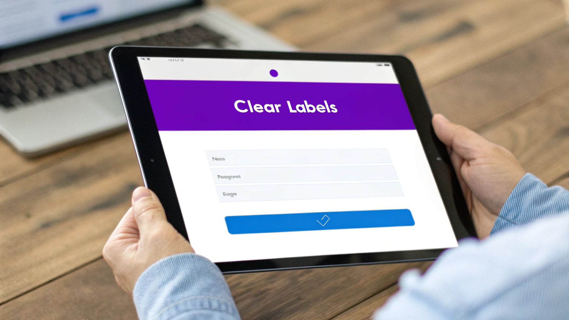
5. Form Accessibility and Labeling
Think of your website's forms as the checkout counter of a physical store. If the counter is confusing, poorly lit, or hard to navigate, customers will abandon their purchase. For an e-commerce site, inaccessible forms for contact, sign-up, or checkout are a direct barrier to sales. This crucial website accessibility best practice focuses on ensuring everyone can understand, fill out, and submit your forms with ease.
Accessible forms use clear, programmatically associated labels for every input field. This means a screen reader can announce what information is needed for each box, like "First Name" or "Credit Card Number." It also includes providing helpful instructions and ensuring error messages are descriptive and easy to find, preventing user frustration.
Why It's Crucial for E-commerce
From creating an account to entering shipping details and payment information, forms are the heart of the e-commerce transaction. If a customer using a screen reader can't tell which field is for their zip code versus their security code, they simply cannot buy from you. Clear labeling and error handling, like those seen in Shopify's checkout process, remove these roadblocks and are essential for converting visitors into paying customers.
Key Insight: Don't treat form labels as just visual text. Properly linking a
<label>to its<input>using theforattribute is the single most important step for form accessibility, creating a direct connection that assistive technologies rely on.
Actionable Tips for Implementation
- Explicitly Link Labels: Always use the
<label>tag with aforattribute that matches theidof its corresponding<input>. For example:<label for="fname">First Name</label><input type="text" id="fname">. - Group Related Fields: Use the
<fieldset>and<legend>tags to group related controls, such as a set of radio buttons for shipping options. The<legend>acts as a caption for the entire group. - Provide Clear Error Messages: When an error occurs, the message should be specific ("Please enter a valid email address") and programmatically linked to the input field, often using
aria-describedby, so screen readers announce it automatically. - Give Format Examples: For complex inputs like dates or phone numbers, provide a clear example of the required format (e.g., "MM/DD/YYYY") as placeholder text or nearby instructions.
6. ARIA (Accessible Rich Internet Applications) Implementation
When standard HTML can't quite describe the function of a complex, interactive element on your site, ARIA (Accessible Rich Internet Applications) steps in. Think of ARIA attributes as extra signposts you add to your code to give assistive technologies, like screen readers, crucial context about what an element does and its current state. This is one of the most important website accessibility best practices for modern, dynamic e-commerce sites.
For example, a custom-built dropdown menu or a dynamically updating shopping cart might be confusing for a screen reader. ARIA attributes like aria-expanded="true" or aria-haspopup="true" explicitly tell the user what's happening, bridging the gap where native HTML falls short and making your interactive store features usable for everyone.
Why It's Crucial for E-commerce
Modern e-commerce sites are filled with rich, dynamic components: product quick-views, size selection modals, and live-updating search filters. Without ARIA, a user relying on a screen reader may not know that a modal has opened, that a button has revealed new content, or that search results have updated on the page. ARIA ensures these interactive shopping tools are announced clearly, preventing user confusion and cart abandonment.
Key Insight: The first rule of ARIA is not to use it if a native HTML element can do the job. For instance, always use a
<button>element for a button instead of addingrole="button"to a<div>. ARIA should supplement, not replace, good semantic HTML.
Actionable Tips for Implementation
- Describe Custom Controls: Use
roleattributes to define what a custom component is (e.g.,role="dialog"for a pop-up modal). Use state attributes likearia-checkedfor custom checkboxes oraria-selectedfor tabs. - Announce Dynamic Changes: Use
aria-liveon regions where content changes without a full page reload, such as a mini-cart update or an "Item Added!" confirmation message. Use it sparingly to avoid overwhelming users with constant announcements. - Label Interactive Elements: For icon-only buttons (like a search magnifying glass or a wishlist heart), use
aria-labelto provide a clear, descriptive text alternative that a screen reader can announce. - Test with Screen Readers: Don't just rely on code. Test your ARIA implementation using actual screen readers like NVDA, JAWS, or VoiceOver to ensure it creates an intuitive and logical user experience.
7. Responsive and Mobile Accessibility
With a majority of online shopping happening on mobile devices, accessibility can no longer be a desktop-only concern. Responsive design ensures your site looks great on any screen, but true mobile accessibility means ensuring it functions perfectly for everyone, regardless of the device or how they interact with it. This is a critical component of modern website accessibility best practices, guaranteeing a seamless experience from a 4-inch phone to a 30-inch monitor.
This practice involves designing for different input methods, like touch and voice commands, and ensuring that accessibility features like screen readers work just as well on a phone as on a computer. It's about making sure your product pages reflow correctly when a user zooms in and that all buttons are large enough for someone with motor impairments to tap accurately.
Why It's Crucial for E-commerce
A shopper who can't easily tap the "Add to Cart" button or navigate your mobile menu is a lost customer. For an e-commerce store, a frustrating mobile experience directly impacts your bottom line. By prioritizing mobile accessibility, you ensure that every potential customer, including those using assistive technologies on their phones, can browse, select, and purchase products without barriers.
Key Insight: Mobile accessibility isn’t just about smaller screens; it’s about different contexts and capabilities. Users might be multitasking, have a temporary impairment (like holding a child), or rely on touch-based assistive tools, making usability paramount.
Actionable Tips for Implementation
- Test on Real Devices: Go beyond emulators. Regularly test your site's functionality using mobile screen readers like VoiceOver (iOS) and TalkBack (Android) to find and fix real-world usability issues.
- Ensure Proper Zoom: Your site must allow users to zoom in up to 200% without losing content or forcing horizontal scrolling. This is a core WCAG requirement that helps users with low vision.
- Design for Touch: Make sure buttons, links, and other interactive elements have a target size of at least 44x44 CSS pixels to be easily and accurately tapped. Implementing responsive web design best practices is fundamental for ensuring your site adapts well to various screen sizes and touch inputs.
8. Video and Media Accessibility
Product demos, unboxing videos, and tutorials are powerful tools in e-commerce, but they become exclusionary barriers if not made accessible. Media accessibility involves adding layers of information, like captions and transcripts, so users with hearing or visual impairments can understand the content. This is a critical component of website accessibility best practices, ensuring your engaging video content reaches every potential customer.
Without captions, a deaf user misses your entire sales pitch in a product video. Similarly, without audio descriptions, a blind user won't know what's happening on screen. Accessible media ensures that everyone, regardless of ability, can engage with your brand's story and product information.
Why It's Crucial for E-commerce
Imagine a customer is excited about your new product but can't understand the "how-to" video because they are hard of hearing. They are likely to abandon their cart and find a competitor with clearer instructions. Providing captions, transcripts, and audio descriptions makes your product features and benefits universally understandable, building trust and supporting purchasing decisions.
Key Insight: Accessible media doesn't just cater to users with disabilities. Captions are widely used by people in noisy environments or those who prefer to watch videos with the sound off, dramatically expanding your content's reach and impact.
Actionable Tips for Implementation
- Provide Accurate Captions: Use professional services or carefully edit auto-generated captions (like YouTube's) for accuracy, punctuation, and synchronization. Include important non-speech audio like
[upbeat music]or[product clicks into place]. - Offer Full Transcripts: A transcript is a text version of the entire media file, including dialogue and sound descriptions. It's invaluable for users of screen readers and also makes your video content crawlable for search engines.
- Ensure Player Accessibility: Your media player must be operable with a keyboard. Users should be able to play, pause, and adjust the volume and captions without needing a mouse.
- Include Audio Descriptions: For videos where visual information is key, provide an optional audio track that describes what is happening on screen. For comprehensive guidance on developing visual aids, consider exploring resources on creating effective video tutorials.
9. Performance and Loading Accessibility
A fast, responsive website is a more accessible website. Performance and loading accessibility focuses on ensuring that your site loads quickly and smoothly for everyone, including those using assistive technologies or on slower internet connections. A slow site can be a significant barrier, causing users to abandon their journey before they even see your products. This is a critical aspect of website accessibility best practices that directly impacts user experience and satisfaction.
A site that lags or has content that shifts around as it loads can be disorienting and frustrating, especially for users with cognitive disabilities or those relying on screen readers. By optimizing performance, you ensure that accessibility features load instantly and the entire experience is seamless, preventing users from getting stuck or confused by a half-loaded page.
Why It's Crucial for E-commerce
In e-commerce, speed is money. If a product page takes too long to load, a potential customer is likely to leave. For users with disabilities, this problem is magnified. A slow-loading "Add to Cart" button or a checkout process that hangs can make a purchase impossible. Ensuring your site is lightweight and responsive means your accessible features work as intended from the very first second, creating an inclusive and efficient shopping environment.
Key Insight: Site performance isn't just a technical metric; it's a core component of accessibility. A fast website respects the user's time and patience, ensuring that everyone, regardless of their connection speed or device, can access and use your store effectively.
Actionable Tips for Implementation
- Implement Accessible Loading States: Use skeleton screens or ARIA live regions to inform users what is happening while content loads. This prevents confusion and lets screen reader users know the page is active and not frozen.
- Respect Motion Preferences: Use the
prefers-reduced-motionCSS media query to disable or reduce non-essential animations for users who are sensitive to motion. This creates a more comfortable browsing experience without sacrificing your site's design. - Optimize Your Media: Compress images and use modern formats like WebP. Ensure product videos are optimized for streaming. Large, unoptimized media files are a primary cause of slow load times that create accessibility barriers.
- Prioritize Critical Content: Ensure essential HTML and accessibility markup (like landmarks and alt text) load first. This allows assistive technologies to build a usable interface for the user immediately, even if other elements are still loading.
Website Accessibility Best Practices Comparison
Your Next Step: From Accessible to Unstoppable
We've covered a lot of ground, from the foundational importance of semantic HTML to the nuances of ARIA roles and video captions. Navigating the world of website accessibility best practices can feel like learning a new language, but it's a language that speaks directly to a wider, more loyal customer base. Implementing these practices is not about ticking boxes on a compliance checklist; it's a strategic business decision that fosters inclusivity, enhances user experience for everyone, and ultimately, drives revenue.
Think of it this way: you wouldn't lock the front door of your physical store to 25% of potential customers. An inaccessible website does exactly that in the digital world. By embracing these principles, you're not just avoiding legal risks; you're building a stronger, more resilient brand that stands for something more than just its products.
Your Actionable Roadmap to Accessibility
Getting started is often the hardest part. Here’s a simple, actionable plan to move from learning to doing:
- Start with a Quick Win: Pick one high-impact area from our list to tackle this week. A great starting point is adding descriptive alt text to your top 10 product images. It’s a tangible change that immediately improves the experience for visually impaired shoppers.
- Audit Your Core Journey: Use your keyboard exclusively to navigate your site. Can you add a product to your cart, go to checkout, and fill out the form without touching your mouse? This simple test will quickly reveal critical friction points.
- Leverage Free Tools: Run your homepage through a contrast checker or a WAVE accessibility evaluation tool. These tools provide instant, concrete feedback on what needs fixing, turning abstract concepts into a clear to-do list.
The most important takeaway is that accessibility isn't a one-and-done project. It's an ongoing commitment, a mindset that should be woven into every decision you make about your e-commerce store, from uploading a new product to redesigning a landing page.
By prioritizing accessibility, you are future-proofing your business. You're creating a welcoming space where every visitor feels seen, understood, and valued. This dedication transforms casual browsers into devoted customers and builds a powerful reputation that sets you apart from the competition. You're not just making your website usable; you're making your brand unstoppable.
Ready to build an e-commerce powerhouse that’s accessible from the ground up, letting you focus on scaling your business? At Wand Websites, we specialize in creating high-conversion Shopify stores with these critical website accessibility best practices built into their DNA. Let us handle the technical complexities so you can focus on what you do best. Book a discovery call with Wand Websites today!
