Mastering Site Information Architecture for E-Commerce


Imagine walking into a massive library where none of the books are organized. No signs, no sections, no Dewey Decimal System. You'd be lost, frustrated, and you'd probably leave without finding what you came for. That’s exactly what a website feels like without a solid site information architecture.
It’s the invisible framework that makes a website make sense. Think of it as the strategic layout of your online store—the difference between a chaotic mess and a beautifully arranged space that effortlessly guides customers right to the checkout.
Why Site Information Architecture Is Your Silent Salesperson

When you design a website, you’re not just putting up pages; you’re creating an experience. A confusing structure creates friction. It makes visitors work too hard, and when they get frustrated, they leave. It’s that simple.
That’s why effective IA isn't just a "nice-to-have" design element; it’s a core business strategy. It works around the clock as your silent salesperson, guiding users, building their confidence in your brand, and paving a smooth, clear path to purchase.
The Immediate Impact of a Strong IA
You only get one chance to make a first impression, and it happens in seconds. A clean, logical layout instantly signals that your site is professional and trustworthy. The data doesn't lie: a visitor's first impression is 94% driven by your site's overall design, with IA at its core.
On the flip side, a confusing site is a major turn-off. A staggering 38% of visitors will abandon a website immediately if they find the layout or content unattractive and hard to navigate. You can dive deeper into these web design statistics to see just how much it matters.
A great website experience feels invisible. Users don't notice the structure because it just works, allowing them to focus entirely on your products and message. That seamless journey is the hallmark of excellent site information architecture.
How Structure Drives E-Commerce Success
For any e-commerce business, a thoughtfully planned IA directly fuels growth. It’s what organizes your products into logical categories, makes your navigation menus intuitive, and ensures the checkout process is a breeze.
This thoughtful organization has some powerful knock-on effects:
- Boosts User Engagement: When people can find what they’re looking for easily, they stick around longer. They browse more pages and interact more with your brand.
- Reduces Bounce Rates: A clear path forward stops users from getting frustrated and hitting the "back" button. It’s one of the best ways to keep your bounce rate low.
- Improves SEO Performance: Search engines like Google love well-organized sites. A logical structure makes it easier for their bots to crawl and index your pages, which can give your search rankings a serious lift.
- Increases Conversions: At the end of the day, it's all about sales. A frictionless experience removes the barriers that stop people from buying. By guiding visitors from discovery to checkout without a single hiccup, a strong IA becomes one of your most powerful tools for turning traffic into revenue.
Let's break down how these pieces connect to your bottom line.
How Information Architecture Impacts Key Business Metrics
This table gives a quick snapshot of how specific IA elements create better user experiences and, in turn, drive real business results.
As you can see, every decision you make about your site's structure has a direct impact on how users behave and whether they ultimately decide to buy from you.
The Unbreakable Rules of Great Information Architecture

Just like a house needs a solid foundation and frame to be livable, a great website relies on a few core principles of site information architecture. These aren't just abstract ideas; they are the practical rules that make the difference between a smooth, intuitive shopping trip and a frustrating dead end.
Getting these rules right is what transforms a jumble of products and pages into a cohesive online store that just makes sense to your customers. Let's dig into the foundational concepts that separate the best e-commerce sites from the rest.
Treat Everything as an Object
A powerful way to think about your site's content is to treat every piece of it—a product, a blog post, a customer review—as a distinct object. Each object has its own set of consistent traits.
For example, think of a "T-Shirt" as an object. Every single T-shirt you sell will have attributes like size, color, material, and price. By defining it this way, you create a predictable experience for your users. They quickly learn that no matter which T-shirt they click on, they'll find the same type of information in a familiar layout. This consistency is a huge trust-builder and makes shopping feel effortless.
“Good information architecture is invisible. It’s what allows users to focus on their tasks and your content, not on figuring out how to use your website.”
This mindset also makes your life easier behind the scenes. Adding a new product is as simple as creating a new instance of a pre-defined object, which helps keep your entire catalog organized as your store grows.
The Power of Limited Choices
Have you ever looked at a restaurant menu with hundreds of options and felt totally overwhelmed? That's decision paralysis, and it happens on websites all the time. The principle of choices is all about giving users a manageable, meaningful set of options at each step.
A navigation menu packed with too many links is a classic example of cognitive overload. Someone looking for "Women's Shoes" doesn't need to see 30 different subcategories all at once. A much better approach is to offer a few clear paths forward:
- By Style: Boots, Sandals, Sneakers
- By Occasion: Casual, Formal, Athletic
- By Collection: New Arrivals, Best Sellers
This focused structure gently guides the user without making them think too hard. It’s absolutely essential for mobile design, where screen real estate is precious. Remember, confusing navigation adds to the user's workload, and patience is thin—53% of mobile users will abandon a website if it takes more than three seconds to load. Organizing your content logically is key to keeping things snappy. You can explore more about IA's foundational principles at fullclarity.co.uk.
Create Clear and Obvious Labels
Labels are the signposts that guide people through your website. They're the words you use in your navigation, on your buttons, and in your page titles. The principle of disclosure simply means that your labels need to be clear, specific, and use the same language your customers use.
This isn't the place for clever marketing slogans or internal jargon. If you sell home goods, your menu label should be "Kitchen & Dining," not "Culinary Creations." A customer should know exactly what to expect before they click.
Stick to these three simple rules for effective labels:
- Be Specific: "Shop Men's" is much better than a generic "Shop."
- Use Familiar Terms: "Contact Us" is instantly recognizable; "Get in Touch" can cause a moment of hesitation.
- Stay Consistent: If you call it "My Account" in the header, don't switch to "Your Profile" in the footer.
This kind of consistency removes friction and makes the whole shopping experience feel seamless and trustworthy. These core principles—objects, choices, and disclosure—are the bedrock of a site that people genuinely enjoy using.
How to Plan Your Website Structure From the Ground Up
Building a great site information architecture isn't about guesswork or what you think will work. It’s a strategic process that starts and ends with your users. Imagine you're an architect designing a new library. You wouldn't just start putting up shelves; you'd first study how people look for books to create a layout that feels completely natural. The same logic applies to your website.
The very first step is always research. You have to get inside your customers' heads to figure out how they think, what words they use, and what they expect to see when they land on your site. This foundational work is what separates a confusing website from one that feels like it was made just for them.
Start With User Research
Before you sketch a single layout, you need to understand your audience’s "mental models"—basically, how they naturally organize information in their minds. How do they group different products? What terms pop into their heads when they search for items you sell? Nailing this is the secret to creating an experience that just clicks.
Here are a few tried-and-true ways to gather these insights:
- Card Sorting: This is a classic for a reason. You give users a list of your product categories or pages (on virtual "cards") and ask them to sort them into groups that make sense. It’s a direct window into their thought process.
- User Interviews: There's no substitute for a good conversation. Sit down with your ideal customers and ask them about their online shopping habits—what works, what drives them crazy, and how they typically find what they need.
- Competitor Analysis: Take a close look at the top e-commerce sites in your niche. How do they structure their navigation and label their categories? Don't just copy them blindly, but look for patterns that reveal common user expectations.
This research isn't just a box to check; it’s a critical phase. Modern IA is all about using these user-focused methods to align a site’s structure with what customers actually want. Simple, clear labels are proven to make sites easier to understand and can dramatically lower bounce rates. You can discover more about modern IA trends at slickplan.com and see how they're shaping today’s best user experiences.
To choose the right research approach, you need to know what each method is best for.
Comparing Common IA Planning Methodologies
Not every research method serves the same purpose. The table below breaks down some popular options to help you decide which one fits your project's needs.
Picking the right combination of these methods will give you a well-rounded view, ensuring your final site structure is built on solid evidence, not just assumptions.
From Research to Blueprints
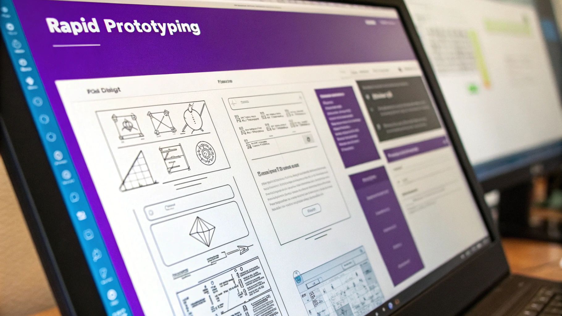
Once you have a good handle on how your users think, it's time to turn those insights into a concrete plan. This is where you'll create sitemaps and wireframes, which act as the skeleton for your entire website. Think of these as the official blueprints that get everyone—from designers to developers—on the same page.
A sitemap is basically a high-level flowchart of your website. It shows how all your pages connect and clarifies the overall hierarchy. It’s all about the logical flow, not the visual design.
A wireframe, on the other hand, is a simple, low-fidelity sketch of a single page. It maps out where key elements like navigation menus, product photos, and "Add to Cart" buttons will go. Wireframes help you nail down the usability before anyone starts worrying about colors and fonts.

This process flow shows just how straightforward it can be: start with what your customers are looking for, organize it logically, and then give it a clear name. It's a simple but powerful progression.
Crafting Intuitive Navigation and Labels
All your research and sitemaps ultimately lead to this: designing your site’s navigation system. This includes all the menus, links, and breadcrumbs that guide people around. Your goal is to make this system so intuitive that people don’t even notice it.
A user should never have to wonder, "Where am I?" or "How do I get back?" Good navigation provides clear signposts at every step of the journey, making the experience feel effortless and reassuring.
Here’s a quick checklist to help you build a navigation system people will love:
- Use Customer Language: Label your categories with the exact terms your customers use. If your card sorting showed people group "Sofas" and "Couches" together, use that in your menu. Ditch the internal company jargon!
- Keep It Simple: Don’t bombard users with a million choices. A concept known as Miller's Law suggests most people can only handle about seven items in their short-term memory. Keep your main navigation menu focused on the absolute essentials.
- Be Consistent: Your primary navigation should be in the same spot on every single page. This consistency builds trust and helps users feel confident as they move through your site.
- Implement Breadcrumbs: For larger sites, breadcrumb trails (like Home > Men's > Shoes > Boots) are a lifesaver. They instantly show users where they are and give them an easy, one-click way to go back.
By following these steps, you build a foundation rooted in a deep understanding of your users. The result is a website that doesn't just look good, but one that feels genuinely helpful and works beautifully for the people who matter most: your customers.
Choosing the Right Architectural Model for Your Store
Think about the difference between a massive department store and a small, curated boutique. Both sell products, but the way you navigate them is completely different. The same idea applies to your website. Your store’s site information architecture is its floor plan, and it dictates how customers find their way around your digital space.
Picking the right model isn't about finding some "best" universal option. It’s about matching the structure to your products and, more importantly, to how your customers actually shop. Let's walk through the most common models in e-commerce to figure out which one makes the most sense for your business.
The Hierarchical Model: The E-Commerce Standard
You’ve seen this one a million times. The hierarchical model, or "tree" structure, is the bread and butter of most online stores for a reason: it just works. It starts with a broad homepage and then branches out into major categories, which then split into even more specific subcategories.
A big-box online retailer is the perfect example. The homepage points you to "Men's," which then breaks down into "Shirts," "Pants," and "Shoes." "Shirts" might even go deeper into "T-shirts," "Dress Shirts," and "Polo Shirts." This structure is so popular because it’s predictable. It lets shoppers start broad and drill down until they find exactly what they’re looking for.
Key Takeaway: The hierarchical model is your go-to for stores with a large, diverse inventory that can be sorted into clear, logical groups. It creates a natural path for customers to follow.
The Sequential Model: Guiding the Purchase Path
While a hierarchy is fantastic for browsing, sometimes you need to guide a customer through a very specific set of steps. That's where the sequential model comes in. It’s a straight line, a simple A-to-B-to-C flow where each page leads directly to the next.
The most obvious place you see this in e-commerce is during checkout.
- Shopping Cart: "Here's what you're buying."
- Shipping Information: "Where should we send it?"
- Payment Details: "How are you paying?"
- Order Confirmation: "You're all set!"
This rigid, step-by-step path is brilliant because it removes all distractions. When a customer is ready to give you their money, the last thing you want is for them to get lost or confused. This model is also perfect for things like product configurators or subscription sign-ups where a specific order of operations is essential.
The Matrix Model: Empowering User Choice
What happens when your products don't fit neatly into one single category? What if they have several equally important traits? This is where the matrix model shines. It’s the magic behind all those product filters and faceted search systems that let users slice and dice your catalog however they want.
Imagine shopping for a new laptop. You probably care about a few things at once:
- Brand (Apple, Dell, HP)
- Screen Size (13-inch, 15-inch)
- Price ($500-$1000, $1000+)
The matrix model lets you jump between these different attributes, essentially letting you build your own path to the perfect product. It puts the customer in the driver's seat. This is absolutely critical for stores selling anything with lots of filterable specs—like clothing, electronics, or auto parts—because it helps shoppers quickly narrow a huge selection down to a handful of perfect choices.
E-Commerce Architecture Best Practices That Drive Sales
A well-thought-out site information architecture isn't just about keeping your digital storefront tidy; it's a sales-generating machine. When a customer can effortlessly find what they're looking for, compare their options, and sail through checkout without hitting a single snag, they’re far more likely to buy. This is where good theory turns into real profit.
Putting these e-commerce best practices into action can give your store’s performance a serious lift. It’s all about creating an intuitive space that guides shoppers from their very first click all the way to a completed order, turning casual window shoppers into repeat customers.
Optimize Your Product Categories
Think of your product categories as the main aisles in your store. If the signs are confusing or the aisles are a mess, people will get frustrated and walk out. The trick is to organize everything based on how your customers actually shop and search, not how your internal inventory system is set up.
It all starts with using labels that make sense to your shoppers. Use clear, everyday terms they would naturally type into a search bar. For example, "Men's Running Shoes" is instantly understandable, while something vague like "Men's Velocity Footwear" just creates confusion.
To get your categories just right, keep these points in mind:
- Balance Breadth and Depth: You need enough categories to be helpful, but not so many that you overwhelm people with choices. The sweet spot is a structure that lets shoppers narrow down their options in just a few logical clicks.
- Avoid Overlapping Categories: Every product needs a single, clear home. A t-shirt shouldn’t be listed under both "Casual Wear" and "Everyday Tops"—that just creates clutter and can even cause SEO headaches.
- Showcase Popular Categories: Make sure your best-sellers or most important categories are front and center in your main navigation. This helps guide new visitors straight to the good stuff.
A solid information architecture is absolutely essential for guiding users to a purchase. To learn more, you can improve your Shopify conversion rate with deeper strategies.
Design Intuitive Filtering and Faceted Search
If your store has a ton of products, a powerful filtering system—often called a faceted search—is a must-have. This is what lets a shopper take a huge category like "Dresses" and instantly narrow it down by size, color, price, and style. It puts them in the driver's seat.
Good filtering helps customers find their perfect item in seconds, which is a game-changer for conversions. The data backs this up: while the average e-commerce conversion rate is somewhere between 2.5% and 3%, a great user experience powered by smart IA can boost conversions by up to 400%. That's a massive opportunity you can't afford to miss.
A customer who can’t find a product can’t buy it. Smart filtering transforms a potentially overwhelming catalog into a personalized shopping experience, making discovery simple and satisfying.
Create a Frictionless Path to Purchase
Every single click matters, especially when a customer is getting close to the checkout. A strong IA makes sure this final leg of the journey is as smooth as butter. It’s all about providing clear signposts that build trust and remove any last-minute doubts.
Here are two must-haves for a seamless path to purchase:
- Implement Breadcrumbs: These little navigational trails (like Home > Women > Handbags > Leather Totes) show users exactly where they are on your site. They give context and a simple, one-click way to go back a step without hitting the browser's back button, keeping them engaged on your site.
- Strategic Internal Linking: Don't just rely on your main navigation. Use internal links within product descriptions and blog posts to point users to related items or categories. This not only helps them discover more of what you offer but also gives your SEO a nice boost by spreading link authority across your site.
By focusing on these practical steps, your site's structure becomes more than just an organizational tool—it becomes a powerful force that actively drives sales and builds lasting customer loyalty.
Essential Tools for Building and Testing Your IA
Building a solid site information architecture isn't something you have to map out on a napkin anymore. There’s a whole suite of modern tools designed to help you plan, visualize, and test your website's structure, making the entire process feel less like guesswork and more like a science.
These tools are what turn abstract ideas into a concrete blueprint. Instead of just hoping users will find their way around your store, you can build interactive sitemaps and wireframes that your entire team can get their hands on, comment on, and improve together. This kind of collaboration saves a ton of headaches and prevents expensive redos later on.
Visualizing Your Site Structure
You wouldn't build a house without a blueprint, right? The same logic applies to your website. The first real step is to map out the hierarchy and flow of your site, and there are some fantastic tools that help you do just that before a single line of code is written.
Getting this right early on is key for team alignment and for catching confusing navigation paths before they become a real problem.
Some of my go-to options for this stage are:
- Slickplan: This is a powerful, all-in-one platform for creating detailed sitemaps, user flow diagrams, and content plans. It's built for teamwork, so everyone can jump in and contribute in real-time.
- GlooMaps: A much simpler, free tool that’s perfect for whipping up a quick visual sitemap. Its no-fuss interface is great for smaller projects or for teams who are just dipping their toes into IA planning.
- Miro: Think of this as a massive digital whiteboard. It’s fantastic for those early brainstorming sessions, mapping out user journeys, and creating rough wireframes in a really collaborative, free-flowing way.
The Rise of AI in IA Planning
Beyond the classic mapping tools, artificial intelligence is starting to make a real impact. New AI-powered tools are popping up that help speed up the entire design process. They can generate wireframes and sitemaps intelligently, letting you iterate on ideas much faster.
These tools can even analyze user behavior data to suggest the best way to structure your content, putting you on the fast track to a more intuitive website. It's an exciting space, and you can learn more about these IA trends to see where things are headed.
By using the right tools, you shift from assuming what users want to knowing what they need. This data-backed approach is the foundation of a high-converting e-commerce site.
Got Questions About Information Architecture? We've Got Answers.
Alright, so we've covered the what and the why of site information architecture. But let's be real—putting it into practice can bring up some tricky questions. Let's dig into a few of the most common ones that pop up.
What’s the Difference Between IA and Navigation, Really?
This is easily the most common point of confusion, but the distinction is actually pretty simple once you see it.
Imagine your website is a massive, well-stocked grocery store. The information architecture is the master plan for the entire store—deciding that produce goes in the front, dairy is in the back, and the snack aisle is right in the middle to tempt you. It's the logic behind why things are grouped together and where they live.
Your navigation, on the other hand, is the actual signs hanging from the ceiling. It’s the "Aisle 5: Cereal & Granola" and the "Dairy & Eggs" signs that guide you to what you need. Navigation is the visible part that helps people get around, but the IA is the invisible strategy that makes the whole layout make sense in the first place.
Information Architecture is the blueprint that organizes everything behind the scenes. Navigation is the set of signs and pathways customers use to find their way. One is the map, the other is the signposts.
How Often Should I Revisit My Site's Architecture?
Thinking of your site architecture as a one-and-done project is a common mistake. It needs to evolve right along with your business.
As a general guideline, a quick health check every 6-12 months is a smart move. Plan for a much deeper audit and overhaul every 2-3 years, or whenever you're gearing up for a major site redesign.
That said, some events should ring the alarm bells for an immediate review:
- You're launching a big new product line. This can completely change how your categories should be organized.
- Conversion rates suddenly tank. This is often a huge red flag that your customers are getting lost or frustrated.
- Bounce rates are sky-high on important pages. People are landing, taking one look, and leaving. Something isn't clicking.
- Your business goals have shifted. If you’re now focused on a different customer or product, your site’s structure needs to reflect that.
How Can I Tell If My IA Is Actually Working?
You don't need a fancy lab or a massive budget to test your IA. One of the most powerful and straightforward methods is called a tree test.
It’s simple: you give users a task (like "Find a pair of black running shoes") and show them only the text-based hierarchy of your site menu—the "tree." You then watch to see which path they take to complete the task.
If most people navigate the tree quickly and end up in the right spot, your IA is probably solid. But if they hesitate, click back and forth, or end up in the wrong category, you’ve just found a clear sign that your labels are confusing and need a rethink.
Ready to build an e-commerce site with an architecture designed for growth from day one? At Wand Websites, we craft conversion-focused websites that turn your hard work into more traffic and loyal customers. Let's build your brand beyond the marketplace. Learn more about how we build for growth.
