Shopify Product Page Optimization A Guide for Etsy Sellers

So, what is Shopify product page optimization, really? It's all about methodically tweaking your product pages so they show up higher in search results and, more importantly, persuade visitors to actually buy something.
Think of it as a mix of technical SEO, persuasive writing, great photos, and trust-building signals. Getting this right is how you'll finally break free from relying on a marketplace and start building a real, standalone brand.
Your New Blueprint for Driving Sales on Shopify

Jumping from a marketplace like Etsy to your own Shopify store is a massive shift. You’re not just another listing in a sea of competitors anymore—you’re in the driver’s seat of your brand's entire customer journey. This guide is your new command center, designed to transform those basic Shopify pages into powerful sales machines.
The mindset has to change, too. You're no longer borrowing an audience; you're building one from the ground up. That means all those little details you might have glossed over on Etsy are now mission-critical for growth.
To really get things moving, you have to embrace conversion rate optimization best practices. It's not about one big secret; it's about making a series of smart, intentional tweaks that make it incredibly easy for a customer to go from "just looking" to "just bought."
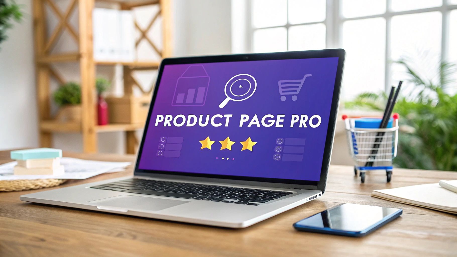
Mastering the Core Pillars of Optimization
Before we get into the nitty-gritty, let's nail down the foundations. We're going to skip the fluff and focus on the elements that genuinely make a difference. These are the absolute non-negotiables for creating a page that both Google and your customers will love.
Here’s what we’ll zero in on:
- Lightning-Fast Page Speed: Your pages must load in a snap, especially on mobile. We're talking about a world where a one-second delay can kill your conversion rates.
- Compelling Visuals and Media: People can't touch your products, so your images and videos have to do the heavy lifting. We’ll cover how to tell a story and answer questions visually.
- Essential Trust Signals: Shoppers are wary. We need to show them you’re legit with reviews, secure payment badges, and crystal-clear policies.
Think of your product page as your digital storefront. Just like you'd carefully arrange a physical shop to feel welcoming and intuitive, your Shopify page needs that same strategic touch.
This guide will walk you through mastering these essentials. By building this solid foundation, you’re not just aiming for a few quick sales; you're setting yourself up for long-term, sustainable growth. Let’s start building your new blueprint.
Get Found on Google with Foundational SEO
Before anyone can fall in love with your products, they have to find them first. On Etsy, you were mostly playing inside their ecosystem, figuring out their specific algorithm. Now, with your own Shopify store, the entire internet is your playground, and your number one tool for getting discovered is Google.
This means that solid search engine optimization (SEO) isn't just a nice-to-have anymore. It's the absolute bedrock of your store's visibility.
Don't worry, this isn't about getting tangled in technical jargon. It’s about making a few smart, strategic tweaks to your product pages. These small changes tell search engines exactly what you’re selling and who you’re selling it to, and they can make the difference between showing up on page one and getting completely lost in the noise. Getting your Shopify product page optimization right starts with these fundamentals.
Nailing Your Product Titles and Meta Descriptions
Think of your product title and meta description as your digital billboard on a Google search results page. Your title is the big, bold headline, and the meta description is the compelling little blurb that convinces someone to click your link instead of the dozen others around it.
If you’re coming from Etsy, your first instinct might be to get creative and artsy with your product names. For Shopify, you need to shift your thinking to clarity and keywords first.
A Simple Product Title Formula: A fantastic starting point is
Primary Keyword - Secondary Keyword | Your Brand Name. So instead of "The Wanderer's Journal," a much stronger title would be "Handmade Leather Journal - A5 Refillable Notebook | Artisan Craft Co." It’s descriptive, packed with terms people actually search for, and still has your brand front and center.Writing Meta Descriptions That Get Clicks: You’ve got about 155 characters to make your pitch. While this little snippet doesn't directly impact your Google ranking, a great one can send your click-through rate soaring. Mention a key benefit, a unique selling point (like "free shipping" or "sustainably sourced leather"), and a friendly nudge to check it out.
Structuring URLs for People and Search Engines
When you create a new product, Shopify automatically generates a URL (what it calls a "handle") based on your title. You can—and absolutely should—edit this. A clean, short URL is much easier for both search engines and actual humans to understand.
For instance, with a title like "Handmade Leather Journal - A5 Refillable Notebook | Artisan Craft Co," Shopify might spit out a long URL like this:/products/handmade-leather-journal-a5-refillable-notebook-artisan-craft-co
It's a bit of a mouthful. A cleaner, more focused version would be:/products/handmade-leather-journal
This simple edit keeps the most important keyword and makes the link look much tidier. The goal is always short, descriptive, and permanent.
Pro Tip: Once a product page is live, try your best not to change its URL. If you absolutely have to, make sure you set up a 301 redirect from the old URL to the new one. This tells Google where the page has moved, preserving your hard-earned SEO value and preventing "Page Not Found" errors for your customers.
Demystifying Schema Markup for Standout Results
Alright, this is where you can get a real edge on the competition. Schema markup is just a snippet of code that gives Google extra details about your product. It’s the secret sauce behind those eye-catching search results that show star ratings, pricing, and stock levels right on the Google page.
These beefed-up listings are called "rich snippets," and they work wonders for getting more clicks because they make your product pop. In fact, pages with rich snippets often see a 20-30% higher click-through rate than those without.
The best part? You don't need to be a developer to make this happen.
Many modern Shopify themes already have this feature built-in. If yours doesn't, there are plenty of great Shopify apps that can add it for you with just a few clicks. The key is to make sure you're feeding Google this crucial info:
- Product Name: The official name of your item.
- Reviews & Ratings: Your average star rating and the total review count.
- Price: The current price, including any sales.
- Availability: Is the item in stock, out of stock, or up for pre-order?
By getting these foundational SEO elements right, you’re not just tweaking a webpage. You’re building a powerful, long-term asset that will keep bringing in free, organic traffic for years to come.
Tell a Story, Don’t Just List Specs

Your product descriptions and photos are your 24/7 sales team. This is your chance to go beyond a simple listing and really connect with people, turning a casual browser into someone who gets what you do. It's about shifting the focus from a list of features to a story of benefits.
As someone coming from Etsy, you're already a great storyteller. On Shopify, you've got an even bigger canvas to show customers how your product will fit perfectly into their lives. This isn't just fluff—it's a critical part of Shopify product page optimization. The goal is to create an experience that answers their questions, builds their confidence, and gets them to click "Add to Cart."
From Features to Feelings
One of the most common mistakes I see is people just listing what a product is. A leather journal has "120gsm paper" and "a durable cover." Okay, that’s technically true, but it’s cold and doesn't exactly spark joy.
The magic happens when you translate those dry facts into real-world benefits and feelings.
A simple trick is to state a feature, then ask yourself, "So what?"
- Feature: 120gsm acid-free paper.
- So What? (Benefit): Your favorite fountain pen won’t bleed through, keeping every page pristine.
- The Feeling: The freedom to write, sketch, and dream without holding back.
You want your customer to picture themselves using and loving your product. Use sensory words that bring the experience to life. That emotional hook is what separates a product they scroll past from one they feel they absolutely need.
Your Visuals Do the Heavy Lifting
Online, nobody can touch, hold, or try out your products. This makes your photography and videos absolutely essential. High-quality visuals aren’t a "nice-to-have" anymore; they're the bedrock of trust and the primary way you communicate the value of your work.
Think of your visual gallery as a complete story. You need to show it all.
- Studio Shots: Clean, crisp photos on a simple background that show the product from every angle. No distractions.
- Lifestyle Shots: This is where you put your product in a real-world context. Show that journal on a cozy desk next to a cup of tea or peeking out of a travel bag. Help them see it in their life.
- Scale Shots: Place your product next to a common object, like a phone or a coffee mug. This instantly gives people a sense of its actual size.
- Detail Shots: Get up close! Show off the texture of the leather, the quality of the stitching, or any unique details that make your product special.
A great product photo doesn't just show what something looks like; it shows what it feels like. It communicates the quality, care, and passion you put into your work.
Things are getting even more immersive now. People want to explore a product from every angle before buying. Adding 3D product images is a powerful tactic that has been shown to boost conversion rates by up to 250% in some cases. It just goes to show how much shoppers value visuals that let them really inspect an item. You can dig into more impactful Shopify statistics to see how these trends can shape your strategy.
Make Sure Your Media is Fast and Findable
Uploading gorgeous images is only half the battle. If they're not optimized, they can actually hurt you by slowing your page to a crawl—a certified conversion killer.
Before you upload a single image to Shopify, run through this quick checklist.
- Compress Your Images: Use a tool like TinyPNG or a Shopify app to shrink the file size without any noticeable drop in quality. A good rule of thumb is to aim for under 200KB.
- Use Descriptive File Names: Ditch
IMG_8457.jpg. Instead, name your file something likehandmade-leather-a5-journal.jpg. This gives Google a clear clue about what the image is. - Write Great Alt Text: Alt text is what shows up if an image doesn't load and is what screen readers use. It's also a big deal for SEO. Be descriptive and include your keyword: "Handmade brown leather journal with a brass clasp, open to a blank page."
When you tell a great story with both your words and your visuals—and make sure all that media is optimized for performance—you build a connection that guides customers confidently toward making a purchase.
To help keep it all straight, here is a quick checklist you can use for every product you upload.
Visual Content Optimization Checklist
This little table is your cheat sheet for making sure every image and video on your product page is working hard for both your customers and for search engines.
Running through these steps for each product might feel like extra work at first, but it quickly becomes second nature. The payoff in customer confidence and search visibility is more than worth it.
Building Trust to Secure the Sale
Let's be honest: on the internet, trust is everything. A shopper can fall in love with your product, but if something feels even a little bit off, they'll abandon their cart without a second thought. This is where trust signals become your best friend.
When you were on Etsy, you had the advantage of their massive, built-in reputation. Now, on your own Shopify store, it's up to you to build that same sense of security from the ground up. This means showing people why they should feel confident handing over their payment details to you.
It’s all about putting those hesitant buyers at ease. By weaving in clear, credible trust signals, you’re dismantling their doubt and making the decision to buy feel simple and safe. This part of Shopify product page optimization is what turns a casual browser into a happy customer.
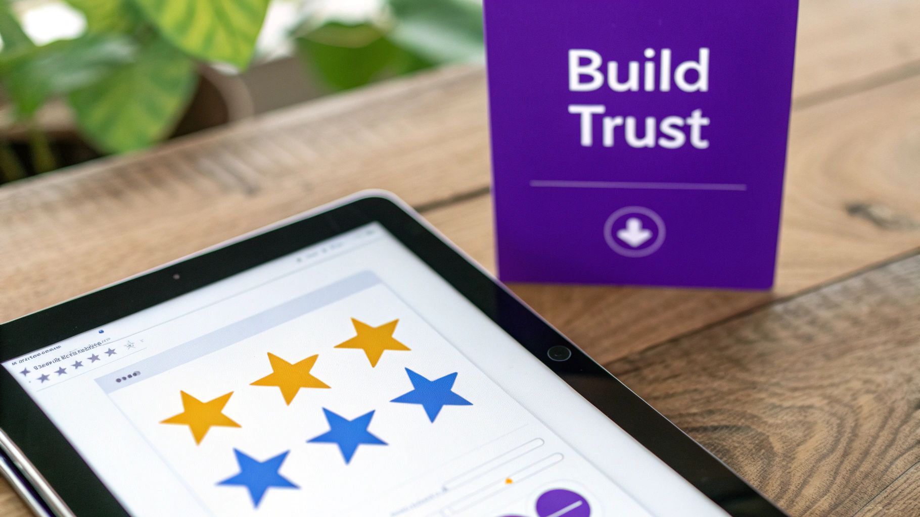
Harness the Power of Social Proof
There’s no trust signal more powerful than social proof. When someone sees that other people have already bought and loved your products, it instantly validates their own interest and quiets that little voice of doubt.
Your mission is to make collecting and displaying reviews a seamless part of your business. A simple Shopify app can automatically email customers a few weeks after their purchase to ask for feedback. Pro tip: find an app that lets customers upload photos with their reviews. For handmade or visual products, that’s pure gold.
"A product with just five reviews has a 270% greater likelihood of being purchased than a product with no reviews." That's not just a minor bump—it’s a game-changer driven by the simple confidence that comes from seeing others have had a great experience.
Don't bury your reviews on a separate page! Put them front and center, right below your product title or main description. Let them do the heavy lifting right where the buying decision happens.
Use Trust Badges Strategically
Trust badges are those little icons that visually scream "security" and "reliability." They're effective because our brains recognize these symbols much faster than we can read text. Placing them in the right spots can give a customer a huge sense of relief.
A few must-haves include:
- Secure Payment Icons: Logos like Visa, Mastercard, PayPal, and Apple Pay show customers you use payment gateways they already know and trust. Stick these near your "Add to Cart" button and in your site's footer.
- Guarantee Seals: A "Money-Back Guarantee" or "Satisfaction Guaranteed" badge can be the final nudge a hesitant buyer needs. It basically says, "What have you got to lose?"
- Security Seals: While Shopify's built-in SSL certificate is a great start, adding an icon from a service like McAfee or Norton can communicate an extra layer of site security.
To really build loyalty, you have to master e-commerce customer service, and that starts right here. Clear policies and visible guarantees are a form of silent, proactive customer service.
Create Ethical Urgency and Scarcity
Another way to build confidence and encourage a purchase is by using ethical urgency. This isn't about faking pressure; it’s about being transparent about real-world situations, like low inventory or a sale that’s about to end.
This is a perfect fit for anyone selling handmade or unique items. A simple "Low Stock" counter (e.g., "Only 3 left!") is an honest and powerful way to signal scarcity. It tells the shopper, "Hey, people love this, and it might be gone if you wait."
You can do the same with countdown timers for promotions. A banner that clearly states "Sale ends in 24 hours" gives people a gentle push to make a decision. The key here is to be genuine. Use these tools to reflect what's actually happening with your business, not to trick people. That transparency is what builds long-term trust.
Make It Fast, Make It Mobile
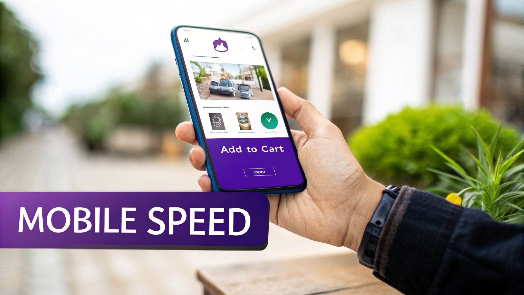
You could have the most stunning product page on the internet, but if it takes ages to load or is a disaster to use on a phone, it might as well be invisible. All that effort poured into gorgeous photos and compelling descriptions goes right out the window if technical issues block the path to purchase.
This is where we tackle two of the biggest—and quietest—conversion killers: agonizingly slow page speed and a clumsy mobile experience.
Fixing these technicals isn't just about site maintenance; it's about respecting your customer's time. When you nail this part of Shopify product page optimization, you're paving a smooth, frustration-free road from their first click to the final checkout.
Don't Make Them Wait: Your Need for Speed
Every. Second. Counts. A page that loads in one second can see a conversion rate 3x higher than one that takes five seconds. For a small business, that’s not just a statistic—that’s the difference between a good month and a great one. Slow pages don't just annoy people; they actively send them packing.
So, what's the usual suspect? Unoptimized media, especially your images. I know we touched on image compression before, but it's so important it’s worth saying again. Every single image you upload needs to be as small in file size as possible without looking grainy or pixelated.
Your Shopify theme also plays a massive role. Some themes are loaded with flashy features that look impressive but are packed with heavy code, dragging your load times down. When you're picking a theme, look for ones known for being fast and lightweight. A clean, quick-loading theme will always make you more money than a slow, complicated one.
Want a quick check-up? Run your product page URL through Google's PageSpeed Insights. It'll spit out a score and give you a punch list of exactly what to fix.
Design for Thumbs, Not Cursors
Shopping on a phone isn't a "trend" anymore; it's the norm. With 79-81% of all traffic to Shopify stores coming from mobile devices, you have to change how you think about design. You can dig into more stats about the dominance of mobile shopping at trybecause.com.
This means you can’t just design for a big desktop screen and hope it shrinks down nicely. You absolutely must adopt a mobile-first mindset.
Think about how people actually use their phones. We scroll and tap with our thumbs, usually one-handed. Your most important stuff—the "Add to Cart" button, size selectors, and image carousels—has to be right there in that easy-to-reach "thumb zone."
Seriously, pull up one of your product pages on your phone right now. Is the "Add to Cart" button big, bold, and obvious? Can you swipe through the photos without fumbling? Is the text broken into easy-to-read chunks, or is it a giant wall of words? Look at everything through that lens.
A Quick and Dirty Mobile UX Checklist
A great mobile experience is about more than just having a site that fits the screen. It's about making it feel effortless.
Run through this list on your own product pages:
- Thumb-Friendly Tappin': Are your buttons and links big enough to tap easily without accidentally hitting the one next to it?
- Simple Navigation: Can people find your menu and get to other categories or their cart without a headache?
- Readable Text: Is the font big enough to read without pinching and zooming? Keep those paragraphs short and sweet.
- Painless Forms: If you use forms for personalization, keep them dead simple. Fewer fields = less friction.
- Vertical-First Media: Think about using vertically shot photos or videos. They fill the screen on a phone and create a much more immersive feel.
By focusing on a fast, flawless mobile experience, you’re making sure that every single person who visits your site has a clear and easy path to becoming a happy customer.
Using Data to Drive Continuous Growth
Getting your product pages live is a huge milestone, but the real work—the fun work, really—is never finished. The best stores are constantly evolving, not based on guesswork, but on what real customers are actually doing.
This is where you put on your detective hat. It’s all about listening to the data, learning from user behavior, and making small, smart tweaks that add up to big results over time. Think of it as a continuous cycle of improvement, turning your store into a well-oiled machine.
Taking the Guesswork Out with A/B Testing
So, how do you know if a change is actually an improvement? That’s where A/B testing comes in. It sounds technical, but the concept is simple: you show two versions of your page to different visitors and see which one gets more sales.
You show half your traffic the original page (Version A) and the other half a new version with one single change (Version B). The one that converts better is your new winner. It’s a powerful way to let your customers vote with their clicks. In fact, smart, consistent testing can boost conversions by as much as 30% over time. You can dive deeper into the numbers by checking out these key CRO statistics.
Not sure where to start? Focus on the elements that have the biggest impact on a buyer's decision.
- Your Main Headline: Try a benefit-driven headline like "Your Coziest Nights Start Here" against a more descriptive one like "Hand-Poured Lavender Soy Candle." Which one resonates more?
- The 'Add to Cart' Button: This is a classic test. Does a bright green button outperform a subtle gray one? What about the text? Test "Add to Cart" vs. "Buy Now" or even something more playful like "I Need This!"
- Your Hero Product Image: Pit a clean studio shot against a lifestyle photo showing your product in a real-world setting. Sometimes seeing an item "in use" is what finally convinces a shopper.
Here's the most important rule for A/B testing: only test one thing at a time. If you change both the headline and the button color in the same test, you'll have no idea which change actually made the difference. Keep it simple and clean.
Watching the Right Metrics
Drowning in data is a real risk, but you don't need to track everything. A few key metrics will tell you almost everything you need to know about how your pages are performing. Your Shopify Analytics and Google Analytics dashboards are your new best friends here.
Keep a close eye on these three vital signs for your product pages:
- Add to Cart Rate: This tells you what percentage of visitors liked your product enough to add it to their cart. If this number is low, it might be a sign that your description isn't compelling enough or your photos aren't doing the job.
- Bounce Rate: This is the percentage of people who land on your page and leave without clicking anything else. A high bounce rate can be a red flag for slow page speed or a disconnect between your ad and your product page.
- Time on Page: Are people actually sticking around to read what you wrote and browse your images? Or are they leaving after a few seconds? Longer time on page usually signals that you've captured their interest.
By checking these numbers regularly and running targeted A/B tests, you create a powerful feedback loop. This is how you stop guessing and start building a dynamic, ever-improving sales engine that truly works for your business.
A Few Lingering Questions
Moving from Etsy to your own Shopify store is a huge step, and it's totally normal to have questions. Here are some of the most common ones I hear from sellers just like you.
"So, How Different Is This From Etsy SEO?"
Great question. Think of it this way: on Etsy, you're playing in their sandbox. Your main job is to get found inside the Etsy marketplace, using their tags and attributes to appeal to their specific search algorithm. It’s a closed ecosystem.
With Shopify, you’re playing on the open internet, which almost always means you’re playing for Google. This is both freeing and a little daunting. You suddenly have control over technical stuff like page speed, URL structure, and even fancy things like Schema markup. The flip side is that you're responsible for building your store's authority from the ground up, without Etsy's massive domain power to back you.
"What Metrics Actually Matter Here?"
It's easy to get buried in data. Honestly, you only need to keep a close eye on a handful of metrics to know if your product pages are working.
Focus on these four:
- Conversion Rate: This is the big one. What percentage of people who visit the page actually buy the product?
- Add to Cart Rate: This tells you how compelling your product is. Are people taking that crucial next step?
- Bounce Rate: How many people land on your page and leave without clicking anything else? A high bounce rate can be a red flag for a confusing page, a bad product-market fit, or painfully slow load times.
- Average Time on Page: Are people sticking around to read your description and look at your photos? More time on page usually means more engagement.
Here’s a practical tip: if you see a high "Add to Cart" rate but a low overall conversion rate, the problem probably isn't your product page. It's more likely an issue with your shipping costs or checkout process.
"How Often Should I Be A/B Testing?"
This depends entirely on how much traffic you get. To get trustworthy results from an A/B test, you need a decent amount of data. If you have a popular product that gets consistent daily visitors, you could probably run a test every few weeks.
The golden rule is to only test one major thing at a time. Change your main product photo or your call-to-action button color—never both at once. If you change two things, you’ll never know which one made the difference. Always start with a simple hypothesis, like, "I bet a green 'Add to Cart' button will get more clicks than the orange one."
Ready to stop being just another shop on Etsy and build a powerful, high-converting brand of your own? At Wand Websites, we build websites that turn your hard work into more traffic and more sales.
Let's build your growth engine together at https://www.wandwebsites.com
