Service Page Layout: Expert Strategies for Building High-Converting Designs

Building the Foundation of an Effective Service Page
Your service page forms the core of your online presence and directly impacts your business results. Like a physical storefront, it needs to welcome visitors and make it easy for them to find what they need. Creating a service page that converts means focusing on both clear information presentation and smooth user experience, so potential customers can quickly understand your offerings and take action.
Key Elements of a Winning Service Page Layout
Creating an effective service page requires careful attention to several essential components working together:
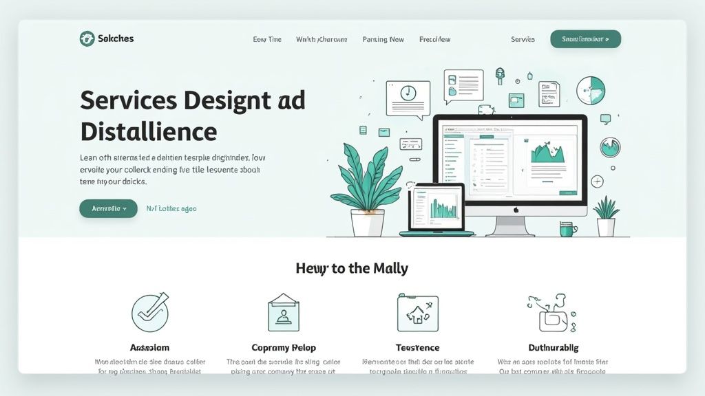
Clear Value Proposition: Start with a compelling statement at the top that immediately shows what you offer and why it matters. Just like an elevator pitch, this hooks visitors and encourages them to learn more. For example: "Convert Visitors into Customers with High-Performing Websites."
Compelling Headlines and Subheadings: Break up your content with descriptive headers that guide readers through your services naturally. This helps organize information logically while making the page easy to scan and digest.
Benefit-Oriented Content: Focus on explaining how your services help customers rather than just listing features. For instance, instead of "We offer social media management," say "Increase Brand Visibility and Drive Targeted Traffic with Our Social Media Expertise."
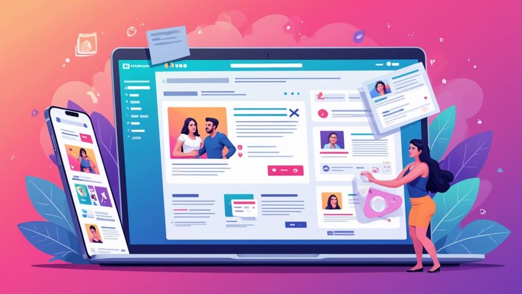
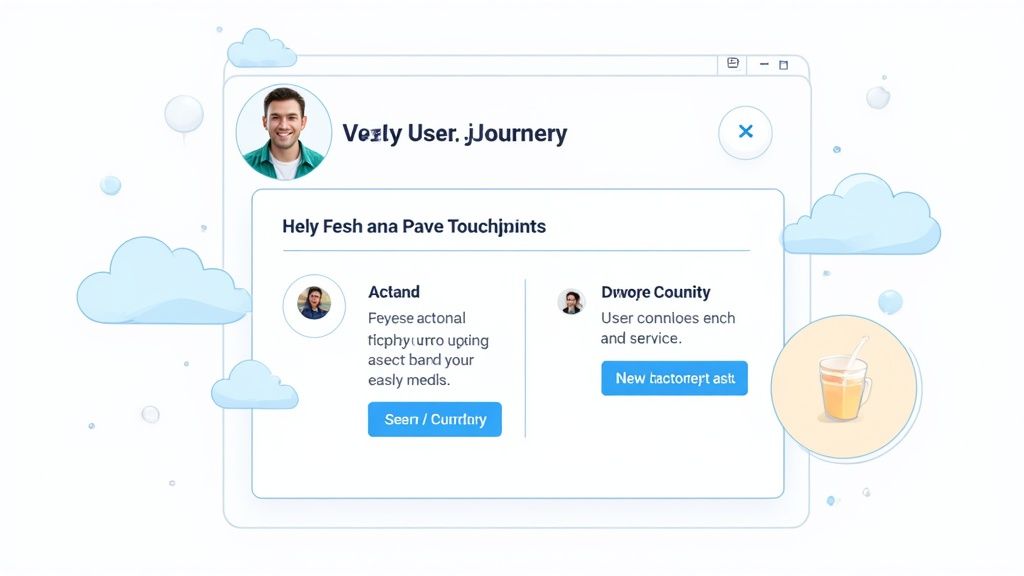
Strategic Use of Visuals: Include high-quality images and videos that showcase your work and break up text blocks. Just as pictures enhance a story, visuals make your page more engaging while helping explain complex concepts clearly.
Clear Call to Action (CTA): Guide visitors to the next step with strategically placed buttons like "Request a Quote," "Book a Consultation," or "Get Started Today." Having clear CTAs removes uncertainty about how to proceed.
Structuring Your Service Page for Conversions
The overall organization of your service page matters just as much as individual elements. A logical flow keeps visitors engaged and moving toward conversion:
| Element | Purpose |
|---|---|
| Above-the-Fold Content | Capture attention immediately with your value proposition and key visuals. |
| Service Descriptions | Clearly explain each service, focusing on benefits and unique selling points. |
| Testimonials and Social Proof | Build trust and credibility by showcasing positive feedback from clients. |
| Pricing and Packages | Provide transparent pricing information to help visitors make informed decisions. |
| Frequently Asked Questions (FAQ) | Address common questions and concerns, reducing friction in the buying process. |
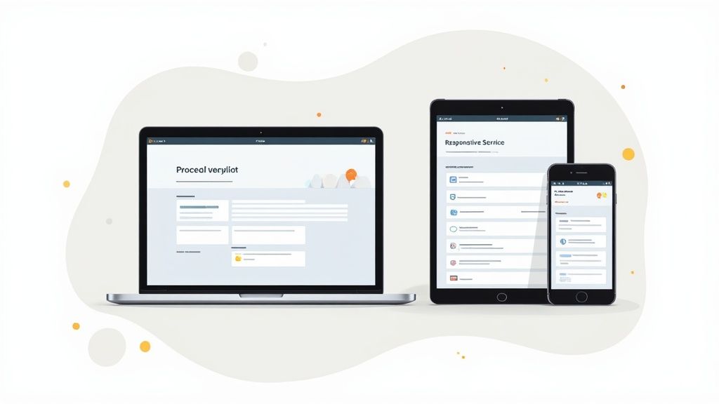
Remember to prioritize mobile design since many people browse on phones and tablets. Your service page should work smoothly across all devices - just as a physical store needs to serve all customers well. Poor mobile experience often leads to lost business opportunities.
By thoughtfully combining these elements and organizing your content clearly, you create a service page that not only attracts visitors but turns them into customers. This solid foundation supports your online success and helps grow your business effectively.
Crafting Mobile-First Experiences That Convert
With most people now browsing on phones and tablets, mobile optimization has become essential for any successful service page. When mobile users have a poor experience, they quickly leave and look elsewhere. That's why starting with mobile design first makes sense - build for smaller screens initially, then adapt for desktop later. This approach helps create experiences that work well across all devices.
Optimizing for Touch Interactions
Mobile users interact differently than desktop users, primarily through touch. Buttons and interactive elements need enough space to tap accurately without hitting neighboring elements by mistake. For instance, adding proper padding between clickable items and making buttons large enough for fingers greatly improves usability. Natural touch gestures like swiping and pinching should also be incorporated where they make sense. These small details make the mobile experience feel smooth and intuitive.
Managing Content Hierarchy for Smaller Screens
Mobile screens have limited space, so organizing content thoughtfully is key. Think of it like arranging products in a store window - put your most important offerings front and center. Lead with your main value proposition and key calls-to-action before users need to scroll. Clear headlines, high-impact visuals, and strategically placed buttons help visitors quickly understand your services and take action. The goal is making key information immediately visible and accessible.
Ensuring Visual Appeal Across Devices
Images and visual elements need special attention for mobile. Large image files slow down load times, causing frustration and bounces. Optimize images by compressing file sizes while maintaining quality. Also use responsive images that automatically adjust to different screen sizes - this keeps visuals looking sharp whether on phones or desktops. Good visual optimization creates a smooth, engaging experience.
Responsive Design for Seamless Transitions
A responsive layout ensures consistent experiences as users switch between devices. Rather than maintaining separate mobile and desktop versions, responsive design automatically adapts your content to any screen size. For example, flexible grids and images resize proportionally across devices while preserving your layout's structure. This creates a unified brand experience and helps users feel comfortable engaging with your services on any device. The result? Higher engagement and better conversion rates across all platforms.
Visual Elements That Command Attention
Creating a high-converting service page starts with a solid foundation and mobile responsiveness, but that's just the beginning. The real magic happens when you strategically use visual elements to grab and keep visitor attention. Think of your service page like a store window display - you need to draw people in and showcase your best work in an engaging way.
The Power of Imagery
Great images do more than just look pretty - they build trust and make your content easier to digest. For instance, instead of simply listing "website design" as a service, show off an actual stunning website you've created. This helps potential clients instantly see the value you provide. Since people process visuals much faster than text, strategic imagery is one of your best tools for quickly communicating complex ideas. When choosing images, focus on ones that resonate with your target audience - like showing Etsy shop owners examples of beautiful Shopify sites if that's your niche.
Choosing a Psychologically Effective Color Scheme
The colors you choose have a big impact on how visitors feel about your brand and services. Different hues trigger different emotional responses - blue tends to feel trustworthy and stable, while green connects to growth and nature. For example, mixing energetic orange with calming blue can convey both innovation and reliability. Using your chosen colors consistently throughout the page helps strengthen your brand identity and creates a cohesive visual experience.
Movement That Enhances, Not Distracts
Adding subtle animations and transitions can make your page more dynamic and guide visitors' attention to key elements. But too much movement quickly becomes annoying and distracting. Simple effects, like a gentle hover animation on buttons or smooth section transitions, can enhance the experience without overwhelming users. These thoughtful touches make your page feel more polished and professional.
Balancing Visual Impact With Performance
While compelling visuals are essential, they shouldn't come at the cost of page speed. Large image files that slow down loading can frustrate visitors and make them leave. That's why it's crucial to optimize your images through compression and responsive sizing. Compression lets you reduce file sizes while keeping visual quality high. Responsive images automatically adjust to different screen sizes, so they look crisp on any device. Good alt text makes your images accessible to more users while helping with SEO. Finding the right balance between visual appeal and performance is key to creating a service page that both looks great and works smoothly.
Structuring Content for Maximum Impact
Beyond just looking good, your service page needs strategic content organization to guide visitors toward taking action. Think of it like creating a clear path that leads potential customers step-by-step through your offerings and ultimately to making a purchase or inquiry. When done right, a well-structured page makes it easy and natural for visitors to understand your services and take the next step.
Defining Your Value Proposition
Start by crafting a clear message that immediately tells visitors what you offer and why they should care. For instance, rather than a basic "We offer website design," try something like "Transform Your Online Presence with High-Converting Website Designs." This instantly shows potential clients what they'll gain from working with you. Place this message front and center at the top of your page so it's the first thing visitors see and understand.
Organizing Service Information
Once you've hooked visitors with your value proposition, break down your services into easy-to-digest sections. Think about how a well-organized store displays products - each department has clear signs and a logical layout. Use descriptive headings to label each section and add subheadings that further break down the details. This makes it simple for visitors to scan the page and quickly find what interests them most.
Strategically Placing Calls-to-Action
Just as stores carefully position their checkout counters, your page needs well-placed calls-to-action (CTAs) that guide visitors to take the next step. These might be buttons saying "Request a Quote," "Book a Consultation," or "View Pricing." Don't just add CTAs as an afterthought - think carefully about where they'll be most effective based on your content flow. For example, try placing a CTA right after describing an exciting service feature when interest is high. Including multiple CTAs throughout the page helps catch visitors at different stages of their decision-making process.
Building Trust Through Social Proof
People trust recommendations from others, which is why including testimonials, case studies, and client logos on your service page is so important. This social proof works like word-of-mouth marketing, showing potential customers that others have had great experiences with your services. Try placing these trust-building elements near service descriptions or CTAs to boost their impact.
Creating a Clear and Logical Flow
Finally, all these pieces need to work together smoothly, creating a natural progression through your page. Start with your compelling value proposition, move into detailed service descriptions backed by social proof, and include clear CTAs along the way. This creates an easy-to-follow path that keeps visitors engaged and moving toward taking action. Pay attention to how people use your page and be ready to adjust the content organization based on what works best. Even small changes to how you structure information can make a big difference in results.
Interactive Elements That Drive Engagement
While having an attractive service page layout is essential, adding interactive elements can take user engagement to new heights. When thoughtfully implemented, these features turn a static page into an engaging experience that naturally draws visitors deeper into your services and drives better results.
Engaging Hover States and Smooth Transitions
Small details can make a big impact on how professional your page feels. For instance, when users hover over service icons, you can reveal helpful descriptions or key benefits. Clean transitions between sections keep the browsing experience fluid and natural. These subtle touches make exploring your page more enjoyable, encouraging visitors to spend more time learning about what you offer.
Dynamic Content Sections That Maintain Performance
Features like accordions and tabs let you present detailed information in bite-sized pieces that visitors can explore at their own pace. This prevents overwhelming them with too much text at once. However, it's important to keep things lightweight - heavy animations or complex scripts can slow down your page and frustrate users. Finding the right balance is key for an effective layout.
Implementing Interactive Elements Strategically
Think about adding practical tools that provide real value to visitors. A web design agency might include a project cost calculator, while a marketing consultant could offer a quick SEO checker. These kinds of interactive features not only keep visitors engaged but also demonstrate your expertise in action. This hands-on approach helps set your services apart.
Measuring the Impact on Conversions
To understand what works best, test different versions of your page - one with interactive elements and one without. Track key metrics like time spent, bounce rates, and conversions to see which approach performs better. This data helps you optimize your page layout for the best possible results.
Prioritizing Accessibility
Make sure your interactive elements work for everyone, including visitors using screen readers or keyboard navigation. Following accessibility best practices not only improves the experience for all users but also reflects well on your business. A thoughtfully accessible page shows you care about serving all your potential customers.
By carefully choosing and implementing interactive elements, you can create an engaging service page that naturally guides visitors to learn more about your offerings. Focus on meaningful interactions that enhance the user experience while maintaining quick load times. Regular testing and refinement will help you build a page that consistently delivers results.
Testing and Optimization Frameworks
Just like fine-tuning a musical instrument, perfecting your service page layout is an ongoing process that requires regular attention and adjustment. By consistently testing and optimizing your page elements, you can boost performance and drive more conversions. Think of it like a store owner who regularly checks sales data and customer feedback to improve their offerings - you need a clear system to evaluate and refine your service page.
Why Testing Matters
Your service page layout plays a crucial role in turning visitors into customers, but what connects with one audience might miss the mark with another. For example, small business owners may respond better to a different layout than enterprise clients. By testing different elements, you can pinpoint exactly what drives your target audience to take action, whether that's requesting a quote or starting a free trial.
A/B Testing: A Powerful Tool for Optimization
A/B testing lets you compare two versions of your service page by changing specific elements like headlines, button placement, or images. By showing these variations to different audience segments, you can measure their performance using metrics like conversion and bounce rates. This method helps you make smart, data-backed decisions about what works best. Sometimes even a small change, like adjusting a button color, can lead to surprisingly better results.
Metrics That Matter
When testing your service page, focus on these key performance indicators:
- Conversion Rate: What percentage of visitors complete your desired action, like making a purchase or filling out a form
- Bounce Rate: How many visitors leave after viewing just one page - a high rate often signals issues with your layout or content
- Time on Page: How long visitors stay, which often reflects how engaged they are with your content
- Click-Through Rate (CTR): The percentage of visitors who click specific elements like buttons or links
Interpreting User Behavior
Getting inside your visitors' heads means looking at both numbers and real behavior. Tools like heatmaps and scroll maps show you exactly where people click, scroll, and spend time on your page. This reveals which areas grab attention and where visitors might get stuck. Don't forget to gather direct feedback through surveys - combining this qualitative input with your data gives you the full picture of how people use your page.
Implementing Changes and Iterating
Once you've gathered and analyzed your data, make thoughtful updates to your service page layout. Start small - if you notice a call-to-action button isn't performing well, try moving it somewhere more visible and watch what happens. Think of optimization like tending a garden - it needs regular care and attention to grow. Keep testing, measuring results, and making improvements based on how your visitors actually use the page.
Ready to transform your Etsy shop into a thriving e-commerce business? Wand Websites offers expert design and development services to help you create a high-converting Shopify store. Visit us at https://www.wandwebsites.com to learn more and take your business to the next level.
