A Guide to SEO Friendly Website Design


When we talk about "SEO-friendly website design," we're really talking about building a site that works just as well for search engines as it does for people. It's the art of marrying a great user experience (UX) with a solid technical foundation so that search engines can easily find, understand, and rank your content. A design that accomplishes this helps everyone.
Why Great Design Is Your Best SEO Strategy
It’s a common mistake I see all the time: people treat design and SEO as two separate projects. They'll pour resources into creating a stunning website, and only when it's finished do they think, "Okay, now let's tack on some SEO."
This approach just doesn't work. Your website's design is your SEO strategy. It’s the very first impression you make, not just on potential customers, but on the search engine crawlers that decide where you rank.
Put yourself in Google’s shoes for a minute. Their entire mission is to deliver the best, most relevant results to users. A site that’s slow, confusing, or just looks untrustworthy offers a terrible user experience. When people land on a page and hit the back button almost immediately—we call that "bouncing"—it screams to Google that your site isn't delivering the goods.
The Connection Between User Trust and Rankings
Building user trust is everything online. Think about it: an incredible 94% of a visitor's first impression is tied directly to your site's design. It can be an instant deal-breaker, too. One study found that 38% of people will simply leave a website if they find the layout or content unattractive.
Google is constantly watching how people engage with your site. Your design directly impacts key metrics like:
- Bounce Rate: The percentage of people who visit a single page and then leave. If this number is high, it often means your design didn't give them what they expected.
- Time on Page: How long someone spends on a page. A clean, intuitive design makes people want to stick around and read what you have to say.
- Pages per Session: The average number of pages someone clicks through. Smart design choices, like clear navigation and internal links, naturally guide users deeper into your site.
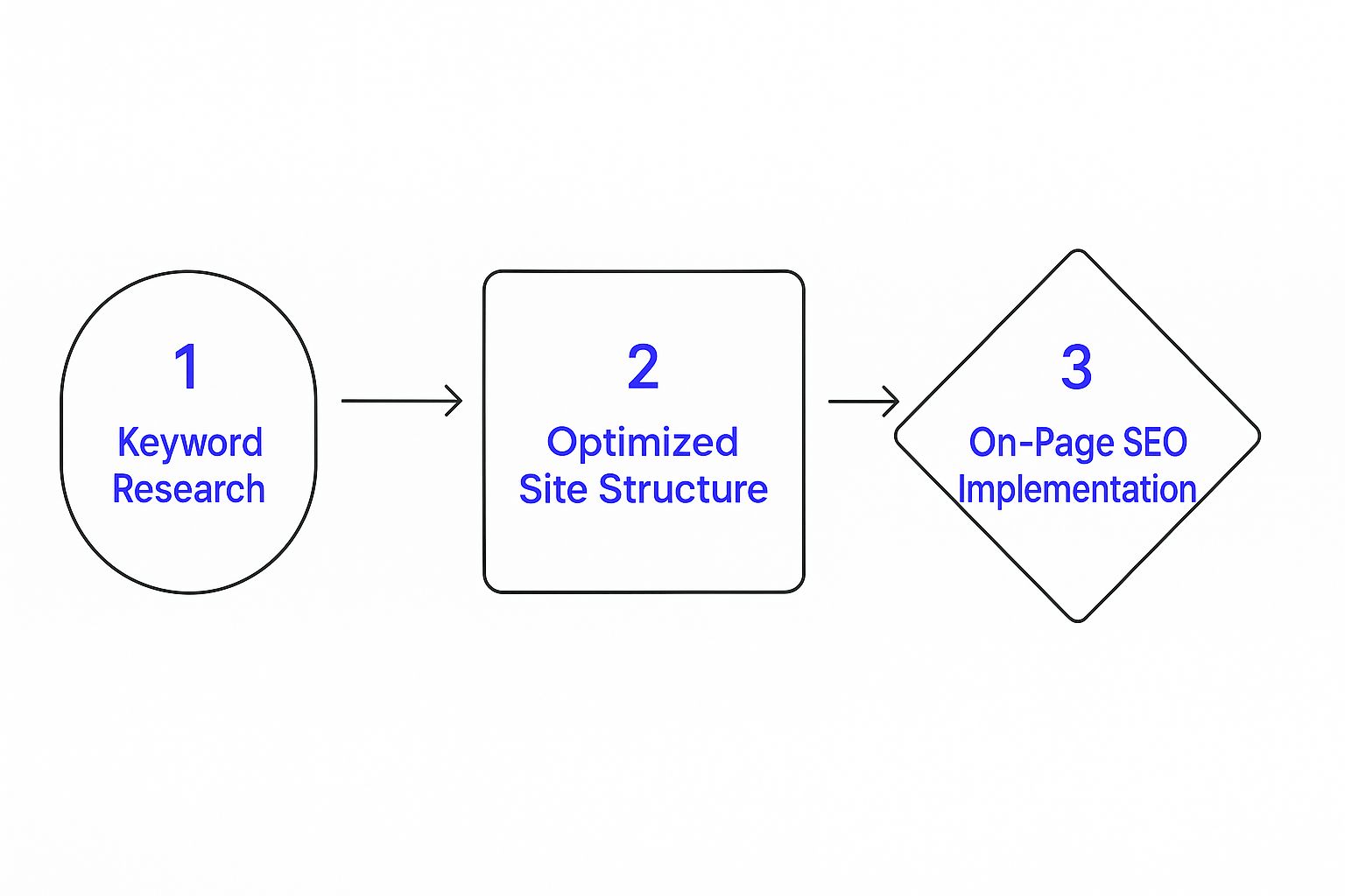
To get your SEO strategy started on the right foot, it helps to understand how these core pillars fit together.
The Pillars of SEO Friendly Design
This quick overview breaks down the core components that create a search-engine-friendly website, setting the stage for the detailed strategies to follow.
By focusing on these four areas, you create a seamless experience that satisfies both your audience and the search algorithms.
Laying a Strong Foundation
At the end of the day, an SEO-friendly design isn't just about making things look pretty. It's about building a credible, functional, and intuitive platform that genuinely serves your audience.
If you're looking for more inspiration, exploring these 10 Website Design Best Practices can offer some valuable perspective on what's working right now. Always remember: a thoughtful design is the foundation. Every other SEO effort you make will be built on top of it.
Crafting an Intuitive Site Architecture
Think of your website's architecture as the blueprint for a house. A good blueprint makes it easy to walk from the kitchen to the living room without getting lost in a maze of hallways. A bad one? It leaves guests wandering in circles, frustrated and ready to leave.
The same principle applies to your website. For both your visitors and the search engine crawlers, a logical site structure is absolutely non-negotiable for an SEO-friendly website design.
A confusing layout is a dead end for users and a total nightmare for Googlebots trying to index your content. If crawlers can't easily find and understand how your pages relate to one another, they simply can't rank them effectively. This all starts with building a simple, logical hierarchy.
Building a Logical Hierarchy
Your site structure should look like a pyramid. At the very top, you have your homepage. This links down to your main categories (like "Men's," "Women's," or "Sale"). Each of those categories then branches out to more specific subcategories or individual product pages.
This creates a clear path that makes navigation a breeze for your users. I always try to follow the "three-click rule" as a guiding principle. The idea is that a user should be able to find any piece of information on your site within three clicks from the homepage. It’s not a rigid law, but it’s a fantastic gut check for keeping things simple and user-friendly.
Here’s what a well-organized hierarchy might look like in practice for an e-commerce store:
- Homepage:
yourstore.com - Category Page:
yourstore.com/womens-jewelry/ - Sub-Category Page:
yourstore.com/womens-jewelry/necklaces/ - Product Page:
yourstore.com/womens-jewelry/necklaces/gold-pendant
This structure isn't just for show; it directly influences one of the most visible parts of your SEO: your URLs.
Clean URLs and Breadcrumbs
Clean, descriptive URLs are a fundamental part of good technical SEO. A URL like the "gold-pendant" example above immediately tells both people and search engines what the page is about. You want to avoid those messy, auto-generated URLs filled with random numbers and symbols—they offer zero context and look untrustworthy.
Another powerful tool for both users and search engines are breadcrumbs. These are the small navigational links you often see at the top of a page that show the exact path you took to get there.
For example: Home > Women's Jewelry > Necklaces > Gold Pendant
Breadcrumbs are fantastic for user experience because they reduce the number of clicks someone needs to make to jump back to a higher-level category. From an SEO perspective, they reinforce your site structure for search engines, making the relationships between your pages crystal clear.
Finally, a strong internal linking strategy ties this all together. When you link from high-authority pages (like your homepage) to important category and product pages, you pass along "link equity" or "link juice" throughout your site. This is your way of telling Google which pages you consider most important, helping them rank higher. A logical architecture makes this process feel natural and incredibly effective, ensuring your most valuable pages get the visibility they deserve.
Mastering Mobile-First Design and User Experience

Let's get one thing straight: mobile isn't just a part of your traffic anymore. It's the whole show. Since Google switched to mobile-first indexing, the version of your site that people see on their phones is what dictates your search rankings. Not the desktop version. This is a game-changer, and simply having a "responsive" theme isn't enough to win.
A truly SEO-friendly website design begins on the smallest screen and scales up from there. This mobile-first approach is incredibly powerful because it forces you to focus on what truly matters. It helps you cut the clutter and deliver a fast, clean experience for the vast majority of your visitors. When you nail the mobile experience, the desktop version often falls into place beautifully.
Designing For The Thumb
Stop and think about how you actually use your phone. Chances are, you’re holding it in one hand, scrolling and tapping away with your thumb. That simple, everyday action should be the guiding principle for your entire mobile design.
This means your buttons have to be big enough to tap without a struggle, menus need to be dead simple to find and use, and forms shouldn't make someone want to throw their phone across the room. I’ve seen so many sites fail here with tiny text or links packed so close together that you can’t hit the right one. It's a surefire way to frustrate a visitor and send them straight to a competitor.
Here are a few things I always focus on for a thumb-friendly design:
- Large Tap Targets: Buttons and links need plenty of space around them. The goal is to make it impossible to accidentally click the wrong thing.
- Simplified Navigation: A clean "hamburger" menu or a simple navigation bar with only the absolute essentials is the way to go.
- Readable Fonts: Don't make people squint. Choose fonts and sizes that are easy on the eyes, even on a small screen.
A mobile-first mindset isn't just about shrinking your desktop site. It’s a complete rethinking of the user's journey from the perspective of someone holding a smartphone.
On Mobile, Performance Is Everything
This mobile-first philosophy is especially vital when we talk about speed. The data here is pretty stark. The average desktop page loads in 10.3 seconds, but that number balloons to a painful 27.3 seconds on mobile. That massive gap is where you lose people.
Every single image, script, and fancy design element has to be ruthlessly optimized to load quickly over a cellular connection. A slow mobile site is probably the single fastest way to lose a potential customer and tank your rankings in one go.
If you’re looking for some great real-world inspiration, check out these responsive web design examples. You'll see how top-tier brands create fantastic experiences that feel just right, no matter the device.
Fine-Tuning for Speed and Core Web Vitals
Let's be blunt: a slow website is a conversion killer. In a world where every second matters, site speed isn't some technical footnote—it's a massive factor in user experience and a core pillar of an SEO-friendly website design. Slow load times don't just annoy visitors; they actively drive them away and send all the wrong signals to Google.
The data here is crystal clear. Just a one-second delay in page load time can tank your conversions by 7%. It gets even more brutal on mobile, where a whopping 53% of users will bounce if a site takes more than three seconds to load. You can see more stats on how speed shapes user behavior from the team at blacksmith.agency.
To put a number on this "feeling" of a fast or slow site, Google gave us Core Web Vitals. These aren't just arbitrary metrics; they're designed to measure how a real person actually experiences your page's performance.
This is where all the foundational SEO work comes together.
As you can see, a fast, technically sound website isn't an accident. It’s the result of a deliberate strategy, not something you tack on at the end.
Breaking Down The Core Web Vitals Metrics
Think of Core Web Vitals as a report card for your site's health in three critical areas. Nailing these is non-negotiable for ranking well and keeping people on your site.
Largest Contentful Paint (LCP): This is all about perceived loading speed. LCP measures how long it takes for the biggest piece of content on the screen (like a hero image or a large text block) to appear. You're aiming for under 2.5 seconds to show users that your page is loading promptly.
First Input Delay (FID): This one measures interactivity. It’s the time between a user’s first action (like a click) and the browser’s response. A good FID is less than 100 milliseconds—so fast it feels instantaneous.
Cumulative Layout Shift (CLS): We’ve all been there: you go to click a button, and bam—the page jumps, and you hit an ad instead. That’s layout shift. CLS measures your page's visual stability, and you want a score below 0.1 to avoid frustrating your visitors.
A strong Core Web Vitals score is a direct signal to Google that your site offers a fantastic user experience. It's one of the clearest ways to show that your design is built for people, not just bots.
How to Actually Make Your Website Faster
Boosting your Core Web Vitals isn't about finding a single magic button. It’s about making a series of smart, targeted optimizations that add up to a big difference. The best place to start is with the common issues that deliver the biggest impact.
Here's a simple checklist to get you started on the most important speed optimizations.
Your Speed Optimization Checklist
This checklist covers the essentials, but there's always more you can do.
One of the biggest culprits I see slowing down websites is unoptimized images. Before you upload a single picture, run it through a compression tool. Serving images in modern formats like WebP also makes a huge difference.
Next, take a hard look at your code. Minifying your CSS, JavaScript, and HTML files is a straightforward way to trim the fat. This process strips out all the unnecessary stuff—like comments and extra spaces—that browsers don't need, making your files smaller and faster to process.
Finally, don’t forget browser caching. This technique allows a user's browser to save parts of your website locally. When they come back, their browser doesn't have to re-download everything. It's a simple change that makes a massive difference for your repeat visitors. For a more comprehensive look at all the levers you can pull, there are fantastic guides that explain how to improve website speed in greater detail.
Weaving On-Page SEO Into Your Design from Day One

This is where the magic really happens. Truly great SEO-friendly website design doesn’t just tack on optimization at the end. It’s baked in from the very first sketch. When you think about on-page SEO during the design process, you’re setting your site up to win from the moment it goes live.
Taking this approach saves you a ton of headaches down the road. No more trying to force keywords into a design that wasn't built for them. Instead, your headlines, images, and content flow are all designed to signal relevance to search engines and create a seamless experience for visitors.
Using Header Tags to Create a Clear Hierarchy
Think of header tags (H1, H2, H3, and so on) as the skeleton of your content. They create a clear, logical outline that shows both Google and your readers what the page is all about and how the information is structured. A page that’s easy to understand is a page that’s easy to rank.
Your H1 tag is the big kahuna—the main title of the page. You only get one, so make it count. It’s like the title of a book. Then, your H2 tags act as the chapter titles, breaking down your main topic into key sections. H3s are for sub-points within those chapters.
As you're designing a page layout, start mapping this out:
- What’s the single most important idea on this page? That’s your H1.
- What are the main supporting points for that idea? Those are your H2s.
- Do any of those points need to be broken down further? Hello, H3s.
Building this structure into your wireframes and mockups forces you to organize your content logically. The result is a design that’s naturally scannable for users and incredibly easy for search engine crawlers to interpret.
Why Image SEO Starts with the Designer
Images are more than just eye candy; they're SEO goldmines waiting to be discovered. Every single image on your website can boost your search visibility, but only if you handle them correctly from the get-go. And yes, this is a designer's job, not just a content editor's.
I can't tell you how many times I've seen beautifully designed sites held back by lazy image practices. A file named
IMG_8572.jpgtells search engines absolutely nothing. It’s a completely wasted opportunity.
A designer should be naming files descriptively before they ever get uploaded. For instance, if you have a photo of a handmade wooden coffee table, the file should be named something like handmade-walnut-coffee-table.jpg. Boom—instant context for Google.
Beyond the file name, every image needs alt text. This is a short, simple description that explains what the image is about to search engines and screen readers for visually impaired users. By planning for alt text during the design phase, you ensure it doesn't get forgotten during a chaotic site launch. Making this a non-negotiable step in your workflow is a game-changer for building a truly SEO-friendly website.
Designing for Readability and the User Journey
Think of your website's design as the stage, and your content as the main performance. A truly SEO-friendly website design makes it easy—and even enjoyable—for people to consume your content, which keeps them on your site longer and encourages them to dig deeper. This is all about nailing readability and mapping out a clear user journey.
Great design isn't about throwing in flashy animations or complicated visuals. It's about clarity. It uses typography, whitespace, and a smart visual hierarchy to naturally guide someone's eyes through the page. If a visitor has to squint or struggle to read your text, they’re gone. It won't matter how brilliant your message is if no one sticks around to read it.
Making Your Content Easy to Scan
Let's be real: people don't read websites word-for-word, they scan. Your design has to lean into this behavior. That means breaking up those daunting walls of text and making the most important information pop. You're creating a visual flow that feels natural and inviting.
A few simple tweaks can make a world of difference for scannability:
- Pick a Readable Font: Stick with clean, straightforward fonts like Lato, Open Sans, or Roboto. Make sure the font size is comfortable to read on any screen—a good starting point for body text is 16px or larger.
- Embrace Whitespace: Don’t be afraid of empty space! Give your content room to breathe with generous margins and line spacing. This "negative space" makes your page feel less cluttered and easier to process.
- Use Clear Headings: Break up your content with H2 and H3 headings. This creates an outline that helps people quickly find the specific bits of information they’re looking for.
The goal here is to make absorbing information feel effortless. When someone can scan your page and immediately grasp what it's about, they're far more likely to stick around, read more, and maybe even become a customer.
Guiding Your Visitor to the Next Step
Beyond just being readable, your design needs to be a guide. Every page should have a purpose, and your design choices should work together to nudge visitors toward that goal. This is where a crystal-clear call-to-action (CTA) becomes your best friend.
Your CTA button needs to stand out. Use a color that contrasts with the rest of the page so it's impossible to miss. And please, skip the generic "Submit." Use clear, action-focused text like "Shop the Collection" or "Get a Free Quote" to tell people exactly what will happen when they click.
Weaving in different types of content can also make the user journey much more engaging. Did you know that websites with video are 53 times more likely to land on Google's first page? And long-form content often pulls in three times more traffic. You can dig into more of these powerful web development statistics to see just how much content format impacts SEO. By strategically placing a video or linking to an in-depth guide, you’re not just making the page more interesting—you're providing real value and turning passive browsers into active fans.
Got Questions About SEO-Friendly Design?
I get asked about the nitty-gritty of SEO and web design all the time. It makes sense—there's a lot to consider! So, I've pulled together answers to a couple of the most common questions that pop up.
How Long Does a Redesign Actually Take to Show SEO Results?
Ah, the million-dollar question. While Google might pick up on technical fixes almost overnight, you need to be patient to see the real, meaningful ranking shifts. Think months, not weeks.
SEO is a long game, and a redesign is just the first major play. How fast you see results depends on a bunch of factors, like how competitive your industry is, the quality of your content, and the strength of your backlink profile. The most important thing to remember is that the work doesn't stop at launch. Consistent effort is what separates the winners from the rest.
Can Website Builders Like Wix or Squarespace Be Truly SEO-Friendly?
You bet they can. Years ago, this was a real debate, but modern website builders have come a long way. Platforms like Squarespace or Wix now have some pretty solid, built-in SEO tools. You can easily handle things like mobile optimization, custom URLs, meta tags, and alt text right out of the box.
Sure, a custom-coded site might give you ultimate control for super advanced technical SEO, but for most businesses, a well-optimized site on a builder platform can absolutely compete and rank well.
If you take away just one thing, let it be this: focus on a mobile-first user experience. Google uses mobile-first indexing, which means a fast, seamless mobile site isn't just a nice-to-have; it's a must.
Ready to turn your online store into a growth engine? At Wand Websites, we build high-performing e-commerce sites designed to bring in more traffic and bigger orders. Let's create a website that works as hard as you do. Learn more at Wand Websites.
