7 Unmissable Principles of Good Website Design for 2025


Ever wondered why some websites are a joy to use while others feel like a digital maze? The secret isn't just flashy graphics or trendy animations; it's a deep understanding of core design principles. When a customer lands on your site, you have only a few seconds to make a great impression. A well-designed website acts as your best salesperson, working around the clock to build trust, guide users effortlessly, and turn casual visitors into loyal customers.
This guide moves beyond generic advice. We will dive deep into the 7 fundamental principles of good website design that form the backbone of every successful online presence. You won't find vague tips here. Instead, you'll get actionable insights and real-world examples to help you evaluate and improve your own digital storefront. We'll explore everything from creating a powerful visual hierarchy that directs attention to ensuring your site is accessible and inclusive for all users.
Whether you're an established e-commerce business owner hitting $50k a month or a successful Etsy seller ready to build an independent brand, mastering these concepts is non-negotiable. Think of this not just as a checklist, but as a strategic framework. Applying these principles will help you create a more intuitive, persuasive, and ultimately more profitable website. Let’s get started.
1. User-Centered Design (UCD)
If you take away only one thing from this list, let it be this: build your website for your users, not for yourself. User-Centered Design (UCD) isn't just a trendy buzzword; it's a foundational philosophy that places your customers' needs, behaviors, and preferences at the absolute core of every decision you make. This approach is one of the most critical principles of good website design because a site that frustrates users is a site that loses sales, plain and simple.

UCD involves a continuous cycle of understanding, designing, and testing. You start by researching your target audience to understand their goals and pain points. Then, you use those insights to create a design, which you then test with actual users to see what works and what doesn't. This feedback loop ensures the final product is intuitive, efficient, and genuinely enjoyable to use.
Real-World Examples of UCD in Action
Think about the e-commerce giants you use every day. Amazon's famous one-click purchasing system didn't happen by accident. It was born from an obsessive focus on removing friction from the buying process, a core tenet of UCD. Similarly, Airbnb invested heavily in user research to understand the anxieties of both hosts and guests. The result is an incredibly intuitive booking process that builds trust and makes a complex transaction feel simple and secure.
How to Implement User-Centered Design
Getting started with UCD doesn't require a massive budget. It requires a shift in mindset from "What do I want to sell?" to "How does my customer want to buy?"
- Create Detailed User Personas: Go beyond basic demographics. Interview your best customers. Use your sales data and analytics to build fictional profiles representing your ideal shoppers. What are their goals? What frustrates them about online shopping? Give them names and backstories.
- Conduct Usability Testing (Even on a Budget): You don't need a formal lab. Ask a few people who match your user persona to complete a specific task on your site, like "find a blue summer dress and add it to your cart." Watch them silently and take notes on where they get stuck or confused. Tools like Maze or UserTesting make this accessible for any business.
- Prioritize Accessibility from Day One: Good design is accessible design. Ensure your site is usable for people with disabilities by using clear color contrast, adding alt text to images, and ensuring keyboard navigation works properly. This not only expands your potential customer base but is also a key part of a user-centric philosophy.
- Implement Feedback Loops: Make it easy for customers to give you feedback. A simple "Was this helpful?" button, post-purchase surveys, or a clear contact form can provide a steady stream of valuable insights to fuel your next design iteration.
2. Responsive Design
In today's world, your customers aren't just sitting at a desk; they're browsing on their phones while waiting for coffee, on their tablets on the couch, and on their laptops at work. Responsive design ensures your website looks and works great on every single one of those devices. This approach isn't a "nice-to-have" feature; it's an absolutely essential principle of good website design. A site that forces a mobile user to pinch and zoom is a site that’s actively turning away business.
Popularized by designer Ethan Marcotte, responsive design uses flexible grids, adaptable layouts, and clever CSS media queries to automatically adjust its presentation to fit the screen it's being viewed on. The goal is to provide a seamless and consistent experience, ensuring key information and calls-to-action are always easy to find and use, regardless of the device. This directly impacts user satisfaction and, crucially, your conversion rates.
Real-World Examples of Responsive Design in Action
Many of the best brands have mastered this. Starbucks allows you to seamlessly start an order on your phone and finish it on your laptop without missing a beat, because the interface feels familiar and optimized for both. The Boston Globe was a pioneer in this space, creating a news site where the content elegantly reflows from a multi-column desktop layout to a single, readable column on mobile. Dropbox also maintains a clean, consistent, and functional interface whether you're managing files on a giant monitor or a small smartphone screen.
How to Implement Responsive Design
Building a responsive site means thinking flexibly from the very beginning. It's about designing a system, not just a static page.
- Adopt a Mobile-First Approach: Start by designing for the smallest screen (a smartphone) first. This forces you to prioritize the most critical content and features. It's much easier to scale a design up to a larger screen than to try and cram a complex desktop design into a tiny one.
- Use Flexible, Proportional Units: Instead of defining layout elements with fixed pixels (e.g.,
960pxwide), use relative units like percentages (%), ems, or rems. This allows your layout components to stretch and shrink fluidly based on the screen size. - Optimize Your Images: Large, high-resolution images can dramatically slow down your site on mobile devices with weaker connections. Use responsive image techniques (like the
<picture>element orsrcsetattribute) to serve smaller, optimized image files to smaller screens. - Test on Real Devices: Browser simulators are helpful, but nothing beats testing on actual physical devices. Get your hands on various iPhones, Androids, and tablets to see how your site truly performs. Pay attention to touch targets, font sizes, and load times.
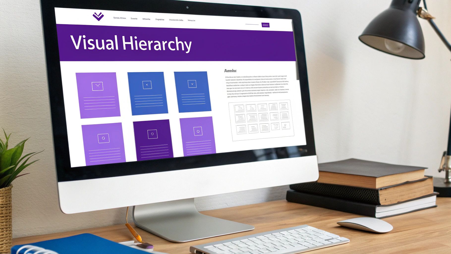
3. Visual Hierarchy
Imagine walking into a room with everything the same size, color, and shape. It would be impossible to know what to look at first. Visual hierarchy is the art of telling your user's eyes where to go next. This fundamental principle of good website design involves arranging elements in order of importance, using visual cues like size, color, and spacing to guide attention and create a clear, intuitive path through your content. Without it, your most important message, like your "Add to Cart" button, can get lost in the noise.

The goal of visual hierarchy is to make information easy to scan and digest. By establishing a clear focal point and a logical flow, you help users find what they're looking for without thinking. This reduces cognitive load, improves the user experience, and directly influences conversion rates by making the desired action the most prominent element on the page.
Real-World Examples of Visual Hierarchy in Action
Strong visual hierarchy is a hallmark of successful brands. Apple's product pages are a masterclass in this principle; a large, stunning product image is the hero, followed by a bold headline, a concise description, and finally, a bright, unmissable "Buy" button. There is never any doubt about what they want you to see and do. Similarly, news sites like the New York Times use typography to create an immediate hierarchy: massive headlines for top stories, smaller subheadings for related context, and standard body text for the article, guiding readers effortlessly through complex information.
How to Implement Visual Hierarchy
Implementing a strong visual hierarchy is about making deliberate choices to control the user's focus. It’s about signaling importance visually so users don't have to work to understand your page.
- Leverage Size and Scale: The simplest and most effective tool in your kit. Make your most important elements, like your main headline or call-to-action button, the largest things on the screen.
- Use Color and Contrast Strategically: Bright, contrasting colors draw the eye. Use a vibrant color for your key buttons (like "Add to Cart" or "Sign Up") and more muted tones for secondary information. This creates a clear visual cue for action.
- Master Typography: Don't just pick a font; create a typographic scale. Use different font sizes, weights (bold, regular, light), and styles (italics) to distinguish between headings, subheadings, and body copy. This helps users scan the page and understand the content structure at a glance.
- Embrace Whitespace (Negative Space): What you don't include is as important as what you do. Surrounding an element with ample whitespace makes it stand out and gives it perceived importance. Don't crowd your key call-to-action; give it room to breathe.
4. Fast Loading Speed
In today's fast-paced digital world, patience is a virtue few possess, especially online. If your website takes more than a few seconds to load, you’re losing customers. Fast loading speed isn't a technical luxury; it's a fundamental principle of good website design that directly impacts everything from user satisfaction and bounce rates to your search engine rankings and, most importantly, your conversion rates. A slow site feels broken and untrustworthy, sending potential buyers straight to your competitors.

Optimizing for speed involves a series of technical enhancements designed to deliver your website's content to the user as quickly as possible. This includes compressing images so they retain quality without hogging bandwidth, streamlining your site's code, and using smart caching strategies to "remember" parts of your site for returning visitors. Think of it as spring cleaning for your website's backend, ensuring every element is lean, efficient, and ready to perform instantly.
Real-World Examples of Speed in Action
The data on speed's impact is undeniable. Pinterest famously discovered that by reducing its perceived wait times by 40%, they increased sign-ups and search engine traffic by 15%. Similarly, Walmart found that for every one-second improvement in page load time, conversions increased by up to 2%. Platforms like Shopify have also built their success on performance, providing merchants with an infrastructure optimized for speed because they know it's critical for e-commerce success.
How to Implement Fast Loading Speed
Boosting your site's speed is one of the highest-impact improvements you can make. It transforms the user experience from one of frustration to one of seamless efficiency.
- Audit and Monitor Your Performance: You can't fix what you don't measure. Use free tools like Google PageSpeed Insights to analyze your site. It will give you a performance score and a specific list of recommendations, such as identifying oversized images or clunky code that's slowing things down.
- Optimize Your Visuals: Large, uncompressed images are the number one cause of slow websites. Use tools like TinyPNG or the built-in optimization features in platforms like Shopify to compress your images before uploading. Implement "lazy loading," which only loads images as the user scrolls down to them.
- Choose a High-Quality Host: Your web hosting is the engine of your website. A cheap, shared hosting plan might save you a few dollars, but it will cost you dearly in lost sales due to slow performance. Invest in a fast, reliable hosting provider that is optimized for your platform (e.g., e-commerce).
- Focus on Core Web Vitals: Google uses these metrics (Largest Contentful Paint, First Input Delay, and Cumulative Layout Shift) to measure real-world user experience. Regularly monitoring and improving these vitals not only makes your site better for users but can also give you a boost in search rankings.
5. Intuitive Navigation
If your customers can’t find what they’re looking for, they can’t buy it. This simple truth is why intuitive navigation is one of the most critical principles of good website design. Popularized by pioneers like Steve Krug in his book Don't Make Me Think, this principle is about making your site’s layout so logical and predictable that users don’t have to pause and wonder where to go next. They should be able to move through your site effortlessly, almost on autopilot.
Intuitive navigation isn’t about flashy menus or groundbreaking designs; it’s about clarity and efficiency. It involves organizing your content and products into a logical hierarchy that matches how your customers think. When navigation is done right, it builds user confidence, reduces bounce rates, and directly guides shoppers along the path to purchase without friction or frustration.
Real-World Examples of Intuitive Navigation
Look no further than Amazon for a masterclass in handling massive inventories. Its mega-menu system neatly organizes millions of products into clear, cascading categories and sub-categories, allowing users to drill down to specific items with just a few clicks. Another excellent example is the GOV.UK website, which abandoned a structure based on government departments in favor of one based on user needs (e.g., "Visas and immigration," "Driving and transport"). This user-first approach makes finding critical information incredibly simple.
How to Implement Intuitive Navigation
Building a "don't make me think" navigation system requires stepping into your customer's shoes and understanding their journey from their perspective.
- Follow the "Three-Click Rule": While not a rigid law, it’s a great guideline. A user should be able to find any crucial piece of information or product on your site within three clicks from the homepage. This forces you to create efficient, logical pathways.
- Use Card Sorting to Map Your Structure: This is a fantastic, low-cost user research method. Write your key pages or product categories on individual cards (or use a digital tool like OptimalSort) and ask real users to group them in a way that makes sense to them. This reveals their mental models, helping you build a sitemap that feels natural.
- Keep Your Navigation Consistent: Your main navigation bar, including its labels, colors, and position, should be identical on every single page of your website. This consistency acts as a reliable anchor, preventing users from feeling lost as they browse.
- Provide Multiple Pathways: Customers search in different ways. Complement your main navigation menu with a prominent search bar, clear breadcrumbs showing their current location, and a well-organized footer with links to important pages like "Contact Us," "Shipping Policy," and "FAQs."
6. Accessibility and Inclusivity
Good design is for everyone, not just for some. Making your website accessible means ensuring it can be used by people with a wide range of abilities and disabilities. This principle of good website design isn't a niche concern or an optional extra; it's a fundamental aspect of creating a high-quality, professional, and ethical online store that serves the largest possible audience. An inclusive website opens your doors to more customers and demonstrates that you value every single visitor.
Accessibility involves designing and building your site so that people using assistive technologies like screen readers, keyboard-only navigation, or screen magnifiers can access your content and complete transactions. It's about following established standards like the Web Content Accessibility Guidelines (WCAG), which provide a clear framework for making your site more usable for everyone. By embracing inclusivity, you're not just complying with standards; you're building a better, more robust customer experience for all users.
Real-World Examples of Accessibility in Action
Many leading organizations have made accessibility a core part of their digital strategy. Microsoft's Inclusive Design initiative is a fantastic example, creating products that are not just usable but delightful for people with diverse abilities. On the retail side, Target's website underwent significant accessibility improvements following legal action, resulting in a site that is far easier for users with disabilities to navigate and make purchases on. The BBC also sets a high bar with its comprehensive accessibility standards, ensuring its vast digital content is available to the entire public.
How to Implement Accessibility and Inclusivity
Integrating accessibility into your workflow is a continuous process that benefits your business by expanding your market reach and improving your overall site quality. Here’s how to get started:
- Provide Text Alternatives for Visuals: Every meaningful image on your site needs descriptive alt text. This text is read aloud by screen readers, allowing visually impaired users to understand the content and context of your product photos and promotional graphics.
- Ensure Keyboard-Only Navigation: Some users cannot operate a mouse and rely solely on a keyboard to navigate. Test your site by unplugging your mouse and using only the Tab key. Can you reach every link, button, and form field in a logical order? Is the currently focused element clearly visible?
- Maintain Strong Color Contrast: Text must be clearly legible against its background. Use tools like the WebAIM Contrast Checker to ensure your color combinations meet WCAG standards. This simple step helps users with low vision and color blindness and improves readability for everyone.
- Use Clear and Descriptive Link Text: Avoid generic link text like "Click Here" or "Read More." Instead, use descriptive text that tells users exactly where the link will take them, such as "Shop Our Summer Dress Collection." This provides crucial context for users of assistive technologies and improves SEO.
7. Consistent Design System
If you want your brand to feel professional, trustworthy, and instantly recognizable, then a consistent design system is your secret weapon. Think of it as the single source of truth for your website's entire look and feel. A design system is not just a style guide; it's a comprehensive library of reusable components, standards, and guidelines that dictate everything from button colors and font sizes to spacing and interaction patterns. This principle of good website design ensures that a user's experience is seamless and predictable, whether they're on your homepage, a product page, or your checkout.
This approach, popularized by thinkers like Brad Frost with his "Atomic Design" methodology, saves immense time and resources. Instead of reinventing the wheel for every new page or feature, your team can pull pre-approved, pre-coded components from the system. This not only speeds up development but also eliminates inconsistencies that can erode user trust and make your brand look amateurish. It’s about building a cohesive, scalable foundation for your digital presence.
Real-World Examples of Design Systems in Action
You've experienced world-class design systems without even realizing it. Google's Material Design is a prime example, providing the cohesive framework for how apps like Gmail, Google Drive, and Android OS look and behave. Every shadow, transition, and icon feels part of the same family. Another great example is IBM's Carbon Design System, which ensures that its vast portfolio of complex enterprise software products remains consistent and user-friendly for its professional audience. These systems are the reason massive companies can maintain brand unity across countless digital touchpoints.
How to Implement a Consistent Design System
Creating a design system is an investment that pays dividends in efficiency and brand equity. For an e-commerce store, it means every product card, "Add to Cart" button, and promotional banner feels intentional.
- Start with the "Tokens" (The Basics): Begin by defining your foundational elements. Document your exact color palette (primary, secondary, accent, and neutral colors), typography scales (H1, H2, body text, etc.), and spacing rules (e.g., 8-pixel grid). These are the basic building blocks.
- Build and Document Components: Create a library of reusable UI elements. This includes buttons, forms, navigation bars, product cards, and modals. For each component, document its purpose, states (e.g., default, hover, disabled), and usage guidelines.
- Involve Both Designers and Developers: A design system is a bridge between design and development. Ensure both teams collaborate on its creation to guarantee that what is designed is practical to build and maintain. This alignment prevents friction and rework down the line.
- Make it Accessible and Keep it Alive: The system is useless if no one can find it or if it becomes outdated. Host your documentation in a central, easily accessible place (like a Notion page or a dedicated tool like Storybook). Schedule regular audits to update components and add new ones as your website evolves.
7 Principles of Good Website Design Comparison
From Principles to Profit: Your Next Step
We’ve journeyed through the seven core pillars that uphold every successful e-commerce website. From the foundational approach of User-Centered Design to the crucial details of a Consistent Design System, you now possess a comprehensive blueprint. This isn't just a simple checklist; it's a strategic guide to transforming your digital storefront from a passive catalogue into an active, high-performing sales engine.
Think of these principles not as isolated rules but as interconnected gears. A strong Visual Hierarchy guides the eye, but its impact is lost if your site’s Loading Speed frustrates the user into leaving. Intuitive Navigation makes products easy to find, but it's the commitment to Accessibility that ensures everyone can find them. And it’s the consistency across your entire platform that builds the brand recognition and trust you've worked so hard to establish on platforms like Etsy.
Turning Knowledge into Actionable Growth
Understanding the principles of good website design is the first critical step. The next, more challenging step is implementation. For busy entrepreneurs like you, who are already managing product creation, marketing, and customer service, becoming a web design expert overnight isn't just unrealistic; it's a distraction from what you do best.
The real takeaway here is that your website is your single most powerful asset for scaling beyond the crowded marketplace. It's your opportunity to own your customer relationships, control your brand narrative, and ultimately, build a more profitable and sustainable business. Applying these principles correctly isn't about just making your site "look pretty." It's about strategically engineering an experience that converts visitors into loyal customers.
Let's distill the journey into three key action items:
- Conduct a Self-Audit: Use the principles we've discussed as a lens to review your current website. Where are the friction points? Is your navigation confusing? Does it load quickly on a mobile device? Be honest about where the experience falls short for your ideal customer.
- Prioritize by Impact: You don't have to fix everything at once. Identify the one or two principles that, if improved, would have the biggest impact on your sales. For many e-commerce stores, this often starts with mobile responsiveness and page speed, as they directly affect bounce rates and conversions.
- Think Like Your Customer: The most crucial principle is and always will be User-Centered Design. Before making any change, ask yourself: "How does this serve my customer? Does this make their shopping experience easier, faster, or more enjoyable?" This question is your ultimate north star.
Your Path to E-commerce Excellence
Mastering the principles of good website design is the definitive line between a hobby and a thriving e-commerce empire. It’s how you take the traction you've built and amplify it, creating a platform that not only captures sales today but also builds brand equity for tomorrow.
You’ve already proven you have a product people want. Now it’s time to give that product the world-class digital home it deserves. By investing in a strategically designed website, you're not just buying a new theme; you're investing in a more profitable, independent, and scalable future for your brand. This is your moment to transition from a successful seller to a dominant brand owner.
Ready to turn these principles into a powerful, high-converting website without the steep learning curve? At Wand Websites, we specialize in implementing these exact strategies to build e-commerce platforms that drive growth for ambitious entrepreneurs like you. Let us handle the expert design and development, so you can focus on scaling your business.
Discover how Wand Websites can transform your online store today.
