High-Converting Landing Pages for Ecommerce That Drive Sales

A high-converting ecommerce landing page is your secret weapon. Think of it as a focused, single-minded salesperson built for one product or campaign. It has a crystal-clear value proposition, persuasive design, and just the right amount of social proof to guide a visitor straight to the checkout. Its only job is to cut out the noise and create a direct path from that first click to a completed sale, making it essential for getting the most out of your ad spend.
Why Your Ecommerce Store Needs Dedicated Landing Pages
Sending paid traffic to your homepage or a generic category page is like inviting someone to a party but not telling them where the drinks are. It's one of the most common—and expensive—mistakes I see brands make. Those pages are built for browsing, loaded with dozens of choices and navigation links that pull visitors in every direction. The result? A scattered, confusing experience that kills any momentum you had.
A dedicated landing page, on the other hand, is a specialist. It’s designed with a single, laser-focused objective. This is so important because it perfectly matches the visitor's intent. If someone clicks your ad for a "summer linen shirt," they expect to see that exact shirt—not your entire summer collection.
This perfect alignment between the ad and the page creates a seamless journey. It instantly tells visitors, "Yep, you're in the right place." By stripping away the main navigation, competing offers, and other distractions, you keep their attention locked on the one action that matters.
The Anatomy of a High-Performing Page
Every truly successful ecommerce landing page is built from a handful of proven components. They all work together to build desire and, most importantly, trust. While the design can change, these core elements are consistent because they tap into the key psychological triggers that drive a purchase.
You'll find these building blocks on almost every page that converts well:
- A Compelling Hero Section: This is your digital storefront window. It needs a powerful headline, incredible product photos or a video, and a short value proposition that immediately answers, "What's in it for me?"
- Persuasive, Benefit-Driven Copy: Don't just list features. Great copy tells a story. It paints a picture of how your product will solve a problem or make the customer's life better.
- Irresistible Social Proof: This is non-negotiable. Customer reviews, glowing testimonials, user-generated photos, and trust badges from reputable sources provide that crucial third-party validation. It calms skepticism and makes the purchase feel like a safe, smart choice.
- A Clear, Unmistakable Call-to-Action (CTA): Your "Add to Cart" or "Buy Now" button should be impossible to miss. Make it stand out visually and use action-oriented words that create a little nudge of urgency.
A well-crafted landing page functions like your best salesperson. It anticipates questions, overcomes objections, highlights value, and confidently asks for the sale—all within a single, streamlined experience.
Measuring Success and Setting Benchmarks
So, what’s a "good" conversion rate? It's the million-dollar question. According to a broad analysis of over 41,000 pages, the average conversion rate for landing pages for ecommerce hovers around 4.2%. But here's where it gets interesting: the top-performing pages start at 11.4%, which is nearly three times higher. That gap shows just how much potential there is when you get the formula right. You can dive deeper into these conversion benchmarks on Unbounce.com.
To help you get there, here’s a quick-reference table breaking down the essential elements, their purpose, and what they look like in the real world. Think of it as a checklist for your next build.
Key Elements of a Winning Ecommerce Landing Page
Nailing these components isn't just about good design; it's about building a focused experience that speaks directly to your customer's needs and makes saying "yes" feel easy.
Design Landing Pages That Actually Persuade People to Buy
Let's get one thing straight: great design isn't about making a page "pretty." It's about psychology. A well-designed landing page is a silent salesperson, guiding a visitor's eye, building trust, and making that "Add to Cart" click feel like the most natural next step in the world.
Think of it as creating a visual roadmap. You're in control of where your visitor looks and what they feel. From the first glance to the final click, your design choices are either helping or hurting your conversion rate.
It all starts with a strong visual hierarchy. This just means you’re deliberately telling people what’s most important. Your headline, your hero image, and your call-to-action (CTA) button should grab attention instantly. Everything else is secondary.
You don't need to be a professional designer to pull this off. Simple tricks like size, color, and placement do the heavy lifting. Make your headline the biggest text on the page. Give your CTA button a color that stands out from everything else. This isn’t about being loud; it’s about creating clarity.
Nail Your Hero Section
You’ve got about three seconds. That’s it. Your hero section—the very first thing people see—needs to convince them to stick around. This is where your best, most impactful visuals go.
Ditch the generic stock photos. You need crisp, high-quality images or a short video that makes your product look incredible.
Even better, show your product in context. Selling rugged hiking boots? Show them caked in mud on a mountaintop. Selling a sleek minimalist coffee maker? Show it in a bright, modern kitchen. These lifestyle shots help customers imagine the product in their life, turning it from a simple "thing" into a desirable experience.
An effective hero section doesn't just show a product; it sells an outcome. It answers the visitor’s unspoken question, "How will this make my life better?" in an instant.
And please, don't sleep on video. A quick product demo or a glowing customer testimonial right at the top can be a game-changer. In fact, adding video to a landing page has been shown to boost conversions by as much as 86%.
The Strategic Use of Color and White Space
Color theory sounds fancy, but it's a practical sales tool. Colors trigger emotions and can subtly nudge users toward an action. Think about why so many CTA buttons are bright and bold—they’re designed to be impossible to ignore.
Here are a few principles to keep in mind:
- Contrast is your friend: If your page has a cool blue background, a bright orange or green button will pop right off the screen.
- Stay on-brand: Use your brand’s color palette to build a sense of familiarity and trust.
- Lean into psychology: Greens and blues often signal safety and trust. Reds and oranges create a feeling of urgency or excitement.
Just as important as the color you use is the space you leave empty. We call it white space (or negative space), and it’s your secret weapon against clutter. A page crammed with text and images is overwhelming. Leaving plenty of room around your key elements—like your CTA button—makes the whole design feel calmer, more professional, and easier to navigate.
Mobile-First Isn't a Suggestion, It's a Rule
The majority of your customers are probably browsing on their phones. This means a "mobile-first" design philosophy is non-negotiable. It forces you to design for the smallest screen first, which has the brilliant side effect of making you focus on what truly matters.
There's no room for fluff on a mobile screen. Your copy has to be short and punchy, your buttons need to be big enough to tap easily, and your images must load lightning-fast. A slow, clunky mobile experience is one of the fastest ways to lose a sale.
If you're looking for inspiration on what works, checking out some proven Google Adwords Landing Page Templates can give you a fantastic head start.
Write Compelling Copy That Converts
Let's be honest, a gorgeous design might get someone to stop scrolling, but it's your words that will get them to pull out their credit card. Your copy is the sales engine of your landing page. It’s how you connect with your audience, preemptively answer their questions, and convince them that your product is the solution they’ve been searching for.

It’s time to ditch the generic, jargon-filled descriptions that sound like they were lifted from a manufacturer's spec sheet. Great copy speaks directly to your customer's real-world problems and desires. The secret? You have to relentlessly focus on the benefits, not just the features.
Headlines That Hook and Hold Attention
Think of your headline as the gatekeeper to the rest of your page. You have maybe three seconds to grab a visitor's attention and give them a compelling reason to stick around. If the headline fails, nothing else matters—they're gone.
A powerful headline is crystal clear, short, and all about the customer's gain. It needs to immediately answer their silent question: "What's in it for me?"
Let's see this in action with a travel backpack:
- Before: "Durable Travel Backpack - 40L Capacity"
- After: "The Last Backpack You'll Ever Need for Weekend Adventures"
The first one lists features; it's a label. The second one sells a dream. It paints a picture of a future outcome and a feeling, which is always more persuasive.
Crafting Benefit-Driven Body Copy
Okay, your headline hooked them. Now the rest of your copy needs to reel them in. This is where you connect every feature of your product to a real, tangible benefit in the customer's life. I've always found this simple formula works wonders: [Feature] so you can [Benefit].
Instead of just saying, "Made with waterproof nylon," you bring it to life: "Made with waterproof nylon, so you can explore worry-free, knowing your gear will stay bone-dry in any downpour." See the difference?
Don't just sell the steak; sell the sizzle. Customers don't buy a drill because they want a drill; they buy it because they want a hole in their wall. Your copy must always focus on that "hole in the wall."
Use bullet points to break down your main benefits. People scan online, they don't read word-for-word. Bullets are your best friend for getting key information across quickly. Keep your sentences punchy and your language simple and direct.
The Undeniable Power of Social Proof
Here’s a hard truth: people trust other people way more than they trust brands. That’s why social proof is one of the most potent tools you have. Think of it as the digital version of a crowded restaurant—it instinctively signals that you’ve found a good spot.
Here are a few ways to weave social proof right into your landing page:
- Customer Testimonials: Don't just use a generic "Great product!" Find quotes from happy customers that call out specific benefits. A testimonial that says, "This backpack saved my laptop during a surprise rainstorm in Thailand!" is infinitely more powerful.
- Star Ratings and Reviews: Displaying star ratings right up front builds immediate trust and credibility.
- User-Generated Content (UGC): Nothing feels more authentic than seeing photos of real customers actually using your product in their own lives.
The trick is to integrate these elements directly into your sales pitch, not just hide them on a separate reviews page. This builds momentum and reassures shoppers at the exact moment they're making a decision.
Mastering Microcopy for Maximum Impact
Finally, don't sweat the big stuff and forget the small stuff. Microcopy—those tiny bits of text on buttons, form labels, and error messages—can have a massive impact on your conversion rate.
Your call-to-action (CTA) button is the perfect example. A tiny change in wording can make a world of difference.
Using active, first-person language ("Get My...") makes the action feel more like a personal choice and less like a sterile transaction. This one small detail can be the final nudge someone needs to click that button and make a purchase.
Match Your Landing Page to Your Traffic Source
Here’s a hard truth: not all traffic is created equal. Someone clicking a retargeting ad on Instagram already knows you, but a visitor from a Google search for "best waterproof hiking boots" is in a totally different headspace. If you treat them the same, you’re just asking for a high bounce rate.
The real secret to a high-converting ecommerce landing page is creating a seamless, almost invisible transition from the ad or link they just clicked. This is a concept we call message match. It's the simple but incredibly powerful idea that your landing page’s headline, visuals, and overall vibe must directly reflect what brought the visitor there.
Any mismatch creates a jarring experience. It kills trust in seconds. Imagine clicking an ad for a "50% Off Summer Sale" only to land on a generic page showing new arrivals. You'd feel tricked, right? And you'd be gone in a flash.
How "Warm" Is Your Audience?
First things first, you have to figure out who you're talking to. I like to think of traffic in terms of "temperature," which really just tells you how aware they are of your brand and how ready they might be to buy.
- Cold Traffic: These are the newcomers. They’ve probably never heard of your brand and are coming from broad searches or top-of-funnel ads (like a Facebook campaign targeting general interests). They need the full introduction.
- Warm Traffic: This group is familiar with you. Maybe they're on your email list, follow you on social media, or have browsed your site before. They know who you are but haven't pulled the trigger yet.
- Hot Traffic: These are your most qualified visitors. They’re this close to buying. Think cart abandoners or people who’ve viewed a specific product multiple times. They usually arrive from a retargeting ad or a "back in stock" email.
This is why you see such a huge difference in conversion rates from different channels. It’s not magic; it’s about the audience's temperature.
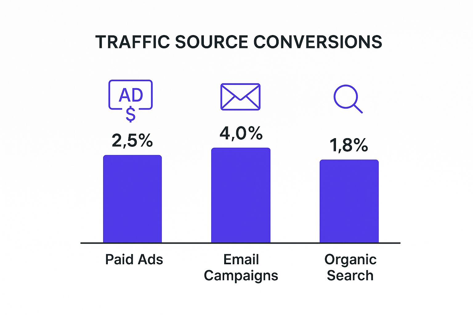
See that? Visitors from email campaigns are already warm—they trust you enough to be on your list. They're way more likely to convert.
Your landing page for cold traffic has a much tougher job. It needs to introduce your brand, build instant credibility with strong social proof, and shout your unique value proposition from the rooftops. For hot traffic? You can cut right to the chase. A page for a cart abandoner could have a headline like, "Still Thinking It Over? Here’s 10% Off to Help You Decide."
To make this crystal clear, I’ve mapped out how your strategy should shift depending on where your visitors are coming from.
Landing Page Strategy by Traffic Source
By tailoring your approach like this, you create a much more personal and effective experience for every single visitor.
Does Price Change the Pitch? Absolutely.
Just as important as traffic temperature is the product's price. Convincing someone to make a $20 impulse buy requires a totally different pitch than getting them to invest in a $1,000 piece of furniture. The more expensive the item, the more information and reassurance a customer needs.
High-ticket items require high-trust landing pages. You need to dial up the social proof, offer detailed specifications, provide risk-reversals like money-back guarantees, and potentially include customer service chat options.
The data backs this up. Conversion rates for items under $150 often hover between 3% and 5%. But for big-ticket products over $1,000, conversions typically drop to around 1%. As Shopify's detailed analysis shows, this is because higher prices demand more trust and a longer, more considered decision.
For a low-priced item, a punchy headline, great photos, and a huge "Buy Now" button might be all you need. For an expensive one, you have to build a rock-solid case from the ground up.
Let's look at a fictional brand, "Wanderlust Bags," to see this in action:
Scenario 1: The Impulse Buy
- Ad on Instagram: A fun, vibrant video of a traveler using their $49 "City Sling" bag.
- Landing Page: The page leads with that same video. The headline is benefit-driven: "Your Perfect Hands-Free Day Out." The copy is light, focusing on style and convenience, with a clear CTA to "Add to Bag." Simple, fast, and low-friction.
Scenario 2: The Considered Purchase
- Ad on Google Search: Targets "durable carry-on luggage" and mentions a "10-year warranty."
- Landing Page: This page is for their $299 "Globetrotter" suitcase. The headline immediately reinforces the ad's promise: "The Last Carry-On You'll Ever Buy." This page is much longer. It's packed with detailed specs, testimonials about durability, a video of the bag surviving stress tests, and prominent reminders of that warranty.
By matching your message, tone, and level of detail to the traffic source and the product price, you meet customers exactly where they are. It makes the entire journey feel natural, trustworthy, and a whole lot more persuasive.
Test and Optimize Landing Pages for Growth
Getting your ecommerce landing page live isn't the finish line—it's just the start. The real magic happens when you start treating your page like a living, breathing experiment. You have to constantly test and tweak to figure out what actually clicks with your audience. Embracing this mindset of continuous optimization is how you turn a decent page into a genuine conversion machine.
This isn't about throwing spaghetti at the wall to see what sticks. It's about making smart, data-driven decisions that methodically improve your page's performance over time.
Start Smart With A/B Testing
At its core, optimization is pretty simple: you pit one version of your page against another to see which one performs better. This is called A/B testing (or split testing), and it’s hands-down the most reliable way to figure out what your customers really want.
Here’s how it works: you create two versions of your page (let's call them A and B) and change just one single thing. Maybe you test a red "Add to Cart" button against a green one. Then, you split your website traffic right down the middle, sending half to Version A and the other half to Version B. From there, you just measure which version gets more people to convert.
The trick is to begin with a solid hypothesis. A good hypothesis isn’t just a guess; it's an educated one. For example: "I believe changing the CTA button from 'Buy Now' to 'Get My Kit' will increase conversions because the new copy is in the first person and focuses on the benefit to the customer." This approach gives every test a clear purpose.
What Elements Should You Test?
You could test nearly anything on your page, but you'll get the best results by focusing on the heavy hitters first—the elements that have the biggest influence on a visitor's decision.
I’ve seen huge wins come from testing these key areas:
- Your Main Headline: Does a headline that promises a benefit ("The Perfect Shave, Every Time") do better than one that just states a feature ("Our Sharpest Razor Blades Yet")? You'd be surprised.
- The Hero Visual: Put your best product photo up against a short lifestyle video showing the product in action. See which one grabs more attention.
- Call-to-Action (CTA) Copy and Color: I've seen tiny wording changes make a massive difference. Try testing something standard like "Add to Cart" against something more enthusiastic like "I Want This!" or a bold orange button against a calmer blue one.
- The Offer Itself: Which is more tempting to your audience? A 15% off discount or a "Free Shipping" offer? Test them both; the answer isn't always what you think it will be.
Here's the golden rule of A/B testing: only test one variable at a time. If you change the headline and the button color in the same test, you’ll have no idea which change actually caused the lift (or drop) in conversions.
Once you have a clear winner, make that change permanent and move on to your next hypothesis. This cycle of testing, learning, and implementing is the engine of continuous growth. To really dig in and keep improving, you'll need to refine your efforts. For a deeper dive, check out these potent Conversion Rate Optimization (CRO) strategies.
Look Beyond the Numbers to See Why
A/B testing tells you what is happening on your page, but it doesn't always tell you why. For that, you need to get a little more qualitative and watch how real people actually interact with your site. This is where you uncover the hidden friction points you'd never guess existed.
Two of my favorite tools for this are:
- Heatmaps: These give you a visual map of where users click, where their mouse moves, and how far they scroll. A heatmap might show you that nobody is clicking on a key benefit you thought was a huge selling point. Or it might reveal that people are trying to click on an image that isn't actually a link, which tells you they're confused.
- Session Recordings: This is like watching a replay of someone's visit to your page. You can watch anonymous recordings of real user sessions and see exactly where they get stuck, hesitate, or decide to leave. You might spot dozens of people struggling with a confusing form or getting lost after clicking a certain link.
These insights are pure gold. They give you the "why" behind the numbers, which helps you come up with much smarter ideas for your next A/B tests. For instance, if you see people repeatedly trying to click a static icon, your next test is obvious: make that icon a clickable link and see what happens.
Got Questions About Ecommerce Landing Pages? Let's Clear Things Up.
Even when you're deep in the trenches of building and tweaking landing pages, some questions always seem to pop up. It’s completely normal. Let’s walk through some of the most common ones I hear from clients, because getting these fundamentals right can save you from a lot of headaches later on.
Think of these as the small hinges that swing big doors. Nailing these details ensures your design, copy, and testing efforts actually pay off.
What's the Big Difference Between a Landing Page and a Homepage?
This is a classic, and for good reason. A homepage is your digital storefront, your brand's front lobby. It’s designed to welcome everyone and give them plenty of options. They can browse new arrivals, dig into different categories, read your blog, or learn your brand's story. The whole point is to encourage exploration.
An ecommerce landing page, on the other hand, is a specialist. It’s a laser-focused, distraction-free page built for one single purpose, usually connected to a specific ad campaign. If you’re running a Facebook ad for a new line of sunglasses, the landing page it clicks through to should be all about those sunglasses and nothing else.
The real difference boils down to focus. A homepage is a buffet with many choices. A landing page is a direct path to a single, specific action, like buying one product. This is precisely why they’re so powerful for paid ad campaigns.
How Many Products Should I Put on a Single Landing Page?
I’m going to make this easy for you: one page, one offer. The landing pages that convert the best almost always feature a single product or, at most, a tightly curated bundle. Why? Every extra choice you add creates a little bit of friction, a psychological hiccup known as "choice paralysis."
When a potential customer sees too many options, their brain often defaults to the easiest choice: none at all. A focused page keeps the message crystal clear and the path to the "buy" button short and sweet.
Now, if you absolutely have to feature a few different items, like for a "Summer Collection" sale, stick to these ground rules:
- Keep it lean: Don't go over 3-4 closely related products. Any more and you're just creating a mini-category page.
- Stick to one theme: Make sure all the products work together or solve the same problem (e.g., "The Complete Morning Skincare Routine").
- Give each product its own CTA: Every item needs its own clear "Add to Cart" button so there’s zero confusion.
At the end of the day, simplicity is your best friend. The tighter you can keep the focus, the better your conversion rate will be. I’ve seen it time and time again.
What Metrics Actually Matter for My Landing Page?
You could track dozens of metrics, but getting buried in data is just as useless as having none. To really understand what's working, you only need to keep a close eye on three key numbers. These three tell a pretty complete story when you look at them together.
- Conversion Rate: This is the big one. It's the percentage of visitors who actually do the thing you want them to do (like buy the product). A healthy conversion rate means your page is doing its job.
- Bounce Rate: This tells you how many people land on your page and leave almost immediately without clicking anything. A high bounce rate is a red flag. It could mean your ad isn't matching the page, your page is loading too slowly, or your offer just isn't compelling enough.
- Average Session Duration: How long are people sticking around? A longer time on the page usually means your copy and images are holding their attention, and they're genuinely considering the purchase.
Start with these three. They’ll give you a clear, high-level pulse check on your page's performance without overwhelming you.
Should I Really Remove the Navigation Menu from My Landing Pages?
Yes. Almost every single time, the answer is yes. Removing your site’s main navigation menu is one of the most effective things you can do for a landing page.
Think about it: every link in your navigation—"Shop," "New Arrivals," "About Us"—is an escape hatch. Each one is a tempting invitation for your visitor to get sidetracked and wander away from the one action you've paid to get them to take.
When you remove the navigation, you create a closed loop. You're essentially saying, "Hey, everything you need to make a decision is right here on this page." That intense focus is incredibly powerful and has been proven to boost conversion rates by keeping the user on a straight-and-narrow path to checkout.
Ready to build an ecommerce site that's not just another pretty storefront, but an actual sales machine? Wand Websites specializes in creating high-performing Shopify stores that turn clicks into customers. Let us handle the tech so you can get back to what you do best. Check out what we do at Wand Websites.
