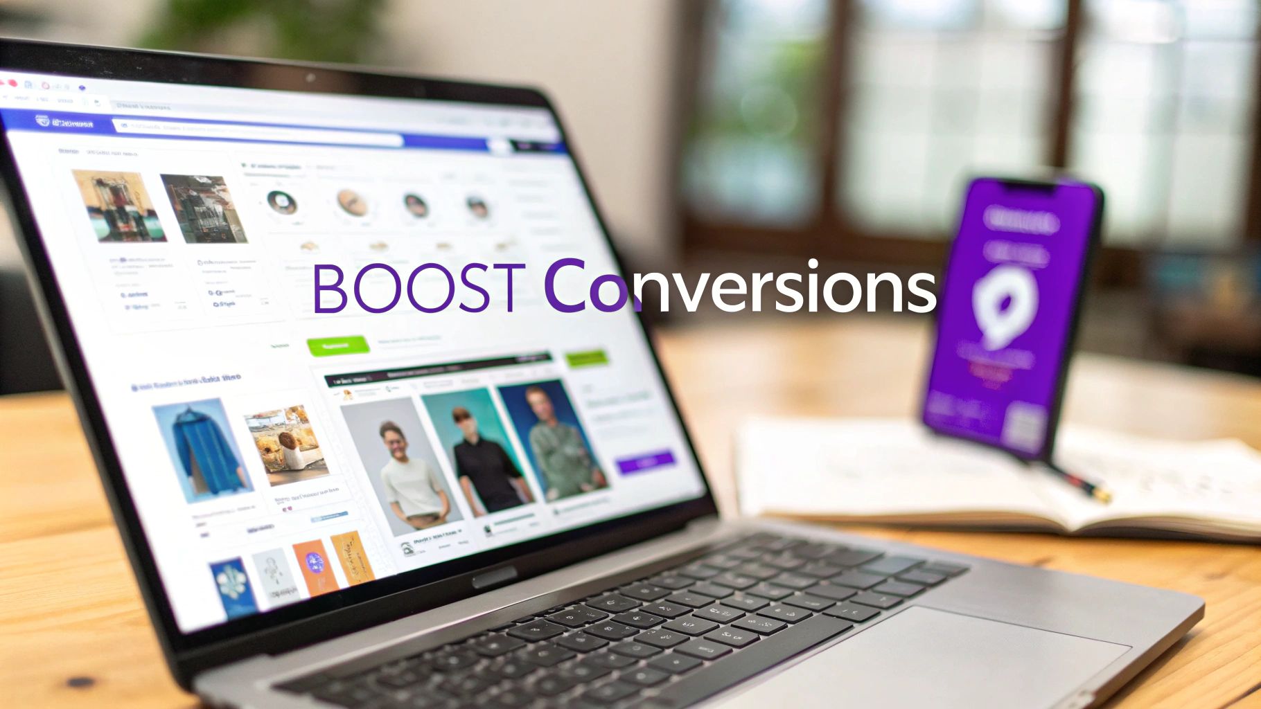
Improve Ecommerce Conversion Rates a Guide for Shopify Stores

Alright, let's talk about the big question: what conversion rate should you actually be aiming for? Before you can improve anything, you need a baseline. You have to know where you stand and set goals that actually make sense for your business.
The global average hovers around 2.95%, but honestly, that number is almost useless on its own. It gets thrown around a lot, but it varies so much depending on what you sell, who you sell to, and even where they live. Aiming for a "good" rate isn't about hitting some generic target; it's about benchmarking against your direct competition.
What Is a Good Ecommerce Conversion Rate
Moving from a marketplace like Etsy to your own Shopify store is a huge step. Suddenly, you have access to all this data, which is fantastic... and also a little overwhelming. The first thing everyone wants to know is, "What's a good conversion rate?"
The truth is, there's no single magic number. It’s a moving target.
Think about it this way: a store selling high-end, custom-built furniture is going to have a very different conversion rate than a beauty brand selling $20 lip gloss. The furniture purchase is a major decision with a long consideration period, while the lip gloss is often an impulse buy. Knowing this difference is the first real step toward setting goals that matter.
Setting Realistic Benchmarks
Let's say you’re that Etsy seller doing a respectable $10k a month, but you feel like you've hit a ceiling. You know the marketplace interface is holding you back. This is where context becomes king.
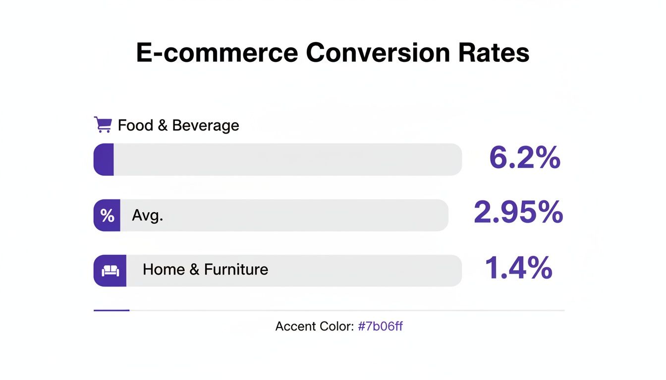
While the global e-commerce conversion rate is that 2.95% figure, some industries, like Food & Beverage, can crush it at 6.22%. On the flip side, Home & Furniture—a huge category for artisans coming from Etsy—often sees rates closer to 1.41%. That’s a massive gap, right? It all comes down to the buying cycle. Quick, repeat purchases convert faster than one-off, expensive items that people need to think about.
This is exactly why getting onto a platform built for speed and trust is so important. It helps you close that gap.
As you can see, what’s considered "good" is all relative. You have to compare apples to apples.
To help you get your bearings, here's a quick reference guide with some key benchmarks. Don't treat these as gospel, but use them to set a realistic starting point for your new Shopify store.
Ecommerce Conversion Rate Benchmarks You Should Know
These numbers give you a much clearer picture than a single global average. They show how much your niche, and even where your customers are, can influence performance.
How Devices and Regions Impact Conversions
Where your customers are shopping from—both geographically and on what device—plays a surprisingly big role. For instance, shoppers in North America tend to convert at a slightly higher rate (3.09%) than those in Europe (2.9%) or the Asia-Pacific region (2.15%). If you’re a US-based seller planning an international push, that’s good to know.
And then there's the big one: mobile.
Your store doesn’t just need to look good on a phone; it needs to be built for the phone. With mobile traffic now accounting for over 75% of visits for many stores, a clunky mobile experience is like putting a "Closed" sign on your virtual front door.
Technically, desktops still convert a tiny bit better at 3.09%, but mobile is right behind at 2.87%. Since the vast majority of your potential customers will find you on their phones, optimizing that experience isn't just a good idea—it's everything.
So, with all that in mind, what's a realistic goal for your new store?
- A solid start: Getting to 2-3% is a great initial goal. It means your foundation is strong.
- Getting good: Pushing into the 3-5% range means you’re doing a lot of things right and your optimizations are paying off.
- Truly excellent: If you're consistently hitting over 5%, you're likely a leader in your niche.
My advice? Start by aiming for the average in your specific industry. Once you hit that, then you can start layering in the strategies we're about to cover to climb into that next tier. This is a game of continuous, data-driven improvement, not a race to hit some mythical number overnight.
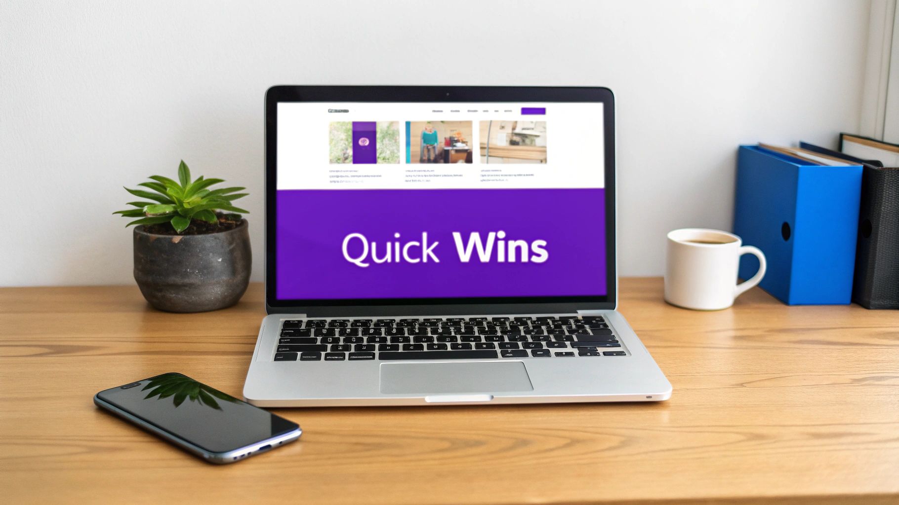
Quick Wins for an Immediate Conversion Lift
Before you get lost in the weeds of complex A/B testing and long-term strategies, let's grab the low-hanging fruit. These are the high-impact fixes that tackle the most common conversion killers, especially for a store that's just moved over from a marketplace. Think of it as patching the biggest leaks in your sales funnel first—simple changes that can deliver results almost overnight.
The first place to look? Site speed. Nothing kills a sale faster than a slow-loading page. Seriously. A tiny one-second delay can cause a 7% drop in conversions. If you're aiming for $10k a month, that's a whole lot of cash left on the table over a year.
Pop your URL into a free tool like Google's PageSpeed Insights. It’ll spit out a score and, more importantly, a to-do list of specific things you can fix right now.
Make Your Site Faster Today
More often than not, the biggest speed hogs are your images. You absolutely need gorgeous, high-resolution product photos, but they don't need to be massive files that take forever to load.
- Compress Your Images: Install a Shopify app like Crush.pics or TinyIMG. These tools will automatically shrink your image file sizes without making them look blurry or pixelated. It’s a set-it-and-forget-it fix.
- Use Lazy Loading: This just means images only load as a visitor scrolls down to them. It makes a huge difference for that critical initial page load, especially on your homepage and collection pages. Most modern Shopify themes have this built-in—just make sure the setting is turned on.
- Do an App Audit: Let’s be honest, we all get click-happy in the app store. But every app adds code to your site, and old, unused, or clunky ones can really drag performance down. Be ruthless. If you aren't using an app or it isn't adding clear value, uninstall it.
These technical tweaks can shave precious seconds off your load time, making for a much happier, less frustrated shopper. Once your site is feeling zippy, it's time to tackle the next big win.
Create a Seamless Mobile Experience
Sure, your store looks great on your big desktop monitor. But what about on a phone? With well over 75% of e-commerce traffic coming from mobile devices, a "responsive" design is just the starting point. The entire experience needs to feel natural for someone scrolling with their thumb.
Grab your phone right now and go through your entire checkout process. Start on the homepage, find a product, add it to your cart, and buy it.
Can you read the text without pinching to zoom? Are the buttons big enough to tap easily? Is the menu a pain to navigate? Every little moment of friction is a reason for someone to give up and leave.
Don't just check if your site works on mobile; audit it for convenience. If adding a product to the cart, entering payment information, or finding the shipping policy feels like a chore, you're losing customers.
Overhaul Your Product Pages
This is it—the final sales pitch. Your product page is where a browser becomes a buyer, so it has to be convincing. If you're coming from a platform like Etsy, you're probably already a great storyteller. This is where you lean into that skill.
Your product descriptions need to sell an outcome, not just list specs.
- Instead of: "This hand-poured soy candle is 8oz and made with essential oils."
- Try: "Transform your living room into a tranquil retreat. Our 8oz hand-poured soy candle uses calming lavender essential oils to help you unwind after a long day, burning cleanly for over 40 hours."
See the difference? One is a fact sheet, the other paints a picture and connects with what the customer actually wants.
Pair that killer copy with a gallery of high-quality images. Don't stop at one perfect studio shot. Show your product from every angle, show it in use (a lifestyle shot), and maybe even include a short video. Visuals answer questions and build desire in a way words alone never can. For more ideas on this, check out these ten powerful conversion rate optimization techniques to really get the ball rolling.
By focusing on these three core areas—speed, mobile, and product pages—you can get a real, measurable lift in your conversion rate without getting bogged down in complicated analytics just yet.
Building Unbreakable Trust Beyond Etsy Reviews
Let’s be honest: on Etsy, trust is practically handed to you. Shoppers land on your page with the built-in confidence that comes from a massive marketplace, established policies, and a sea of reviews. That all changes the second you launch on Shopify. Suddenly, that safety net is gone.
Now, it’s all on you. A new visitor is instantly, if subconsciously, asking a few critical questions: Is this a real business? Can I trust them with my credit card? Will my order actually show up? Your job is to answer every single one with a resounding "yes." This is about more than just a review widget; it's about weaving trust into every pixel of your site, and it's one of the fastest ways to improve ecommerce conversion rates.
Go Beyond Basic Star Ratings
Your five-star reviews are fantastic, but they're just the beginning. The real magic happens when you show people why they should trust you, not just tell them. Modern social proof is visual and relatable, and it belongs everywhere on your site—not just tucked away on a lonely testimonials page.
You need to help shoppers imagine your products in their own lives.
- User-Generated Content (UGC): Get your customers involved! Actively ask them to share photos of your products in their homes or out in the world. You can use a Shopify app to pull these gems directly from Instagram or let customers upload them with their reviews. Sprinkling these real-world photos on your product pages is unbelievably powerful.
- Detailed Testimonials: Dig into your reviews for the ones that tell a story. Instead of just a star rating, find the quotes that tackle a common hesitation or highlight a specific feature people love. Pull those out and feature them right on your homepage or relevant product pages.
- Video Reviews: A customer video is pure gold. If someone sends you a clip of them unboxing or using your product, put it front and center. Video feels raw and authentic, and it does an incredible job of calming those pre-purchase jitters.
This isn't just about proving you're legit; it's about building a community that people are excited to be a part of.
Craft a Compelling About Us Page
So many store owners treat their "About Us" page like a chore. That's a huge mistake. As a small business owner coming from a personal platform like Etsy, your story is your biggest advantage. It’s the one thing that separates you from the faceless, big-box retailers.
Your About Us page is your single best opportunity to build an emotional connection. It transforms a transaction into a relationship, making people feel good about supporting a real person with a passion.
Don't just list your business history. Tell your origin story. Why did you start this? What are you passionate about? Be sure to include a high-quality photo of yourself or the team. When a shopper feels like they know the person behind the brand, their trust level skyrockets.
Display Essential Trust Badges and Policies
While your story builds emotional trust, you also need to satisfy the logical, security-conscious part of a buyer's brain. People are actively scanning for signals that your store is secure and professional. You need to make those signals impossible to miss.
Start with the low-hanging fruit: universally recognized logos and clear policies.
- Payment Logos: In your site’s footer, make sure you're showing the icons for Visa, Mastercard, PayPal, and Shop Pay. It’s a simple, instant dose of familiarity.
- Security Seals: Adding a badge like "SSL Secure" near your checkout buttons provides a quick visual cue that their information is safe.
- Clear Policies: Your Shipping and Return Policies should be incredibly easy to find. Link to them from the footer, and maybe even add a short, reassuring line about them on your product pages (e.g., "Easy 30-Day Returns").
These small visual cues add up to provide powerful reassurance. They signal that you run a professional, secure shop, erasing that last bit of hesitation before a customer clicks "buy."
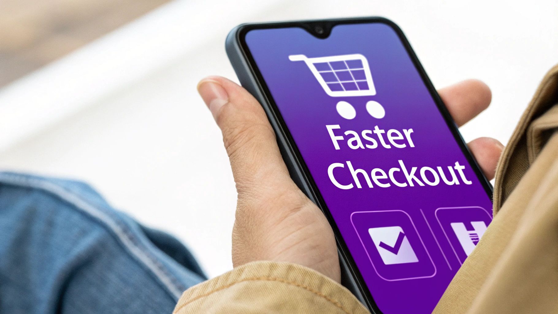
Streamlining Your Checkout to Reduce Cart Abandonment

You did it. You got a customer to hit "Add to Cart" and even make it to the checkout page. This is the moment of truth, the final step where an almost-sale becomes actual revenue. And yet, this is precisely where so many sales fall apart.
A clunky, confusing, or unexpectedly expensive checkout is the fastest way to kill a conversion. You've done all the hard work to get them this far—don't lose them at the one-yard line. Think of every extra click, every unnecessary form field, and every surprise fee as another reason for them to leave.
Simplify the Path and Remove Distractions
Your checkout page has one job and one job only: to complete the transaction. That’s it.
This is not the place for newsletter pop-ups, social media links, or "you might also like" product suggestions. In fact, I always recommend removing the standard website header and footer from your checkout pages entirely. All a customer should see is a clear, focused path to giving you their money.
A complicated checkout is a conversion killer. I've seen it time and time again. The data doesn't lie: the average large e-commerce site can see a 35% jump in conversions just by improving their checkout design. Simplicity isn't just nice to have; it's a core revenue strategy.
This "less is more" philosophy extends to the information you ask for. Do you really need their phone number? Does your handmade candle business need a mandatory "Company Name" field? Cut every single field that isn't absolutely essential. Each one you remove is one less hurdle for your customer.
Offer Guest Checkout and Express Payment Options
Let’s settle this debate right now: guest checkout is non-negotiable. Forcing a new customer to stop everything and create a password-protected account is a massive roadblock. Many will simply leave rather than deal with the hassle.
Always, always offer a prominent guest checkout option. You can gently nudge them to create an account after the sale is complete, maybe with a small incentive, but get the conversion first.
To make things even smoother, you need to embrace one-click payment options.
- Shop Pay: If you're on Shopify, this is a no-brainer. It lets returning customers check out in seconds by pre-filling all their info.
- PayPal: A huge chunk of online shoppers live and breathe by PayPal. It's familiar, it feels secure, and it speeds things up.
- Google Pay & Apple Pay: These are the new standard, especially for mobile shoppers. A purchase can be completed with a fingerprint or face scan. It doesn’t get much easier than that.
These express options show your customers that you value their time and convenience.
Be Brutally Honest About All Costs
Nothing sours a sale faster than "sticker shock" at the final step. Unexpected shipping costs are the #1 reason people abandon their carts. When you hide shipping fees and taxes until the very last second, it feels sneaky and instantly shatters the trust you’ve built.
Be completely transparent about all costs, right from the start.
- Use a Shipping Calculator: Let customers get a shipping estimate right on the cart page by simply entering their postal code. No surprises.
- Display Costs Clearly: Make sure shipping, taxes, and the final total are broken down and impossible to miss before they hit the "Pay Now" button.
- Consider a Free Shipping Threshold: Offering "Free Shipping on Orders Over $75" is a classic for a reason. It's a powerful incentive that removes the shipping objection and often bumps up your average order value.
By eliminating surprises, you remove the last major obstacle standing between a browser and a buyer. Tackling this is a huge step to reduce cart abandonment and win back lost sales, directly impacting your bottom line with every small improvement.
Using Data and Testing to Fuel Continuous Growth
Ready to stop guessing and start knowing what actually works on your site? Moving from Etsy to your own Shopify store gives you an incredible gift: data. It's time to put it to work.
This isn't about becoming a data scientist overnight. Far from it. This is about building a simple, repeatable process for learning from your customers and making small, smart changes that add up to big wins down the road.
CRO, or conversion rate optimization, sounds super technical, but it’s really just a cycle of listening, testing, and improving. You listen to what your analytics are telling you, come up with a hunch, test it, and then implement what you've learned. This process is the engine that will continuously improve ecommerce conversion rates over time.
Your first step is setting up your listening post. You need a reliable way to see how visitors are actually behaving on your site. For any Shopify store, that means getting comfortable with Google Analytics 4 (GA4).
Setting Up Your Analytics Foundation
You can't fix problems you can't see. GA4 is your roadmap to understanding customer behavior. Setting it up with Shopify is pretty straightforward, and once it's running, it starts collecting the crucial data you need to make informed decisions.
Don't get overwhelmed by all the reports. In the beginning, just focus on a few key metrics that tell you how well your sales funnel is working.
- Add to Cart Rate: What percentage of people viewing a product page actually add that item to their cart? A low number here could signal issues with your product photos, descriptions, or pricing.
- Checkout Completion Rate: Of everyone who starts the checkout process, how many actually finish? If you see a big drop-off here, it’s a massive red flag that your checkout process has too much friction.
- Top Exit Pages: Where are people leaving your site most often? If a specific product or collection page is a major exit point, it deserves a closer look.
These numbers give you a starting point. They tell you where to look, which sets you up to figure out why people are leaving and what you can test to fix it.
My best advice is to treat your data like clues in a mystery. A high exit rate on your shipping policy page isn't just a number; it's a clue that your shipping costs might be a surprise or your policies are confusing. The data points you to the problem.
Recent data shows just how much traffic source can influence conversions. While the overall average conversion rate sits around 2.9%, it jumps to 3.2% for paid search traffic. This highlights how visitors with high intent are more likely to buy. For a store owner just like you, moving to Shopify gives you direct control over these channels, letting you capture and convert those ready-to-buy shoppers. To see how rates vary by industry and channel, you can explore the full breakdown of conversion statistics.
Demystifying A/B Testing for Beginners
Once you have a hunch based on your data, it's time to test it. A/B testing (or split testing) sounds complicated, but the concept is dead simple. You create two versions of a page (an "A" and a "B"), show each version to half of your visitors, and see which one performs better.
You don’t need expensive tools to start. Shopify has apps that make running simple A/B tests accessible for everyone. The key is to test one thing at a time so you know exactly what caused the change.
Here are a few simple, high-impact A/B tests you can run right away:
- Call-to-Action (CTA) Text: Try testing "Add to Cart" vs. "Buy Now." It seems small, but one might resonate much more strongly with your audience.
- Promotional Offers: On your homepage banner, test "Free Shipping Over $50" against "15% Off Your First Order." See which offer drives more people to start shopping.
- Product Page Headlines: For your best-selling product, test your current headline against one that focuses on a key benefit. Think "The Artisan Ceramic Mug" vs. "Your Perfect Morning Coffee Mug."
Let each test run until you have enough data to see a clear winner—usually a week or two, depending on your traffic. By building this simple habit of testing, you replace assumptions with proof, creating a powerful engine for continuous growth and a steadily rising conversion rate.
Frequently Asked Questions About Ecommerce Conversion Rates
Jumping into the world of conversion rates can feel a bit like learning a new language. You’ve got your store running, which is a huge step, but now you’re probably wondering how to actually make it grow.
If you’re asking these questions, you’re not alone. Let’s tackle some of the most common ones we hear from store owners just like you, clearing up the confusion so you can get on a confident path to improving your store's performance.
How Long Does It Take to See Results from CRO?
This is the big one, isn't it? And the honest, experienced answer is: it really depends. Some tweaks can give you an almost instant lift, while other, more foundational changes need a bit of patience to really pay off.
The best way to think about it is in two buckets: quick wins and long-term strategies.
Changes with Immediate Impact (Days to Weeks): If you find and fix something genuinely broken—like a checkout button that doesn't work on iPhones or a product page that takes forever to load—you can see a jump in sales right away. The same goes for running a compelling, can't-miss flash sale. Even a simple A/B test on your "Add to Cart" button could give you a clear winner in under a week.
Changes with Gradual Impact (Weeks to Months): Things like building up a solid base of customer reviews, improving your site’s SEO, or dialing in your welcome email series are more of a slow burn. These efforts are all about building momentum. You might not see a huge spike overnight, but after a few months, you’ll look back and notice a steady, upward trend in your overall conversion rate.
The trick is to keep a simple log of your changes. When you swap out your product photos, jot down the date. When you simplify your checkout form, make a note. This helps you connect the dots between the work you're doing and the results you're seeing.
What Changes Should I Prioritize If I Have Limited Time?
When you’re a small business owner, you’re the CEO, the marketer, the shipper, and the customer service rep. You don't have a team dedicated to this stuff, so you have to be ruthless about where you spend your time.
Your time is your most valuable resource. The goal isn’t to do everything at once; it's to do the right things first. Always focus on clearing the path for your customer to make a purchase.
Here’s a no-nonsense priority list to get you started:
Fix What's Obviously Broken. Before you do anything else, go through your own store like you're a customer. Use your phone and your computer. Click everything, add things to your cart, and try to check out. If you hit a broken link, a confusing menu, or a form that won’t submit, fix that immediately. These are the leaks sinking your ship.
Focus on Your Money Pages. Your homepage, your best-selling product pages, and your checkout flow are your most valuable real estate. A tiny improvement on a page that gets thousands of visitors will have a much bigger impact than a massive overhaul on a page nobody sees.
Listen to Your Customers. Are people constantly emailing to ask about your return policy? That’s a giant blinking sign telling you to make that information crystal clear on your product pages. Your customers are literally handing you a roadmap to higher conversions—you just have to pay attention.
What Is a Good Conversion Rate for a Niche Store?
It's so easy to get hung up on industry benchmarks you read in a blog post, but for a niche store, those big, generic numbers can be pretty misleading. A "good" conversion rate for you is one that's consistently getting better.
To give you some context, a solid baseline for many e-commerce stores is 2-3%, though top-tier brands often push past 5%. The global average tends to float between 2.35% and 2.95%, but this varies wildly by industry. For instance, the food and beverage space might see 6.22%, while luxury and jewelry can be as low as 0.94%.
A huge piece of this puzzle is mobile. Mobile now accounts for over 75% of all e-commerce visits and 66% of orders, so if you want to grow, your mobile experience has to be flawless. For a deeper look at these stats, you can check out these detailed ecommerce conversion rate statistics.
Instead of chasing a random number, focus on these metrics instead:
- Your Own Baseline: What's your conversion rate right now? Your number one goal should be to beat that number, month after month.
- Profitability: A 5% conversion rate is useless if you had to discount everything by 50% to get it. What really matters is whether your business is profitable and sustainable.
- Customer Lifetime Value (CLV): I’d rather have a store with a 2% conversion rate and tons of repeat customers than a store with a 4% conversion rate full of one-and-done buyers. Loyal customers are the foundation of a healthy business.
At the end of the day, the best conversion rate is the one that allows your business to thrive. Use industry benchmarks as a loose guide, but make your own progress the true measure of your success.
Ready to stop wrestling with marketplace limitations and build a Shopify store that's engineered for growth? At Wand Websites, we specialize in helping successful Etsy sellers like you make a seamless and profitable transition. We build conversion-focused websites that give you the freedom and control to scale your brand. Let's unlock your store's true potential together. Learn more at https://www.wandwebsites.com.
