7 High-Converting Exit Intent Popup Examples for E-Commerce in 2026


That moment a visitor’s cursor drifts towards the 'close tab' button is a critical-and often missed-opportunity. For e-commerce stores, especially those growing beyond marketplaces like Etsy, this isn't just a lost visitor; it's lost revenue. An exit-intent popup is your last, best chance to re-engage them, offering a compelling reason to stay, subscribe, or complete their purchase.
But a generic "Don't Go!" message won't cut it. To be effective, you need a smart strategy that matches the right offer with the right customer at the right time. This guide breaks down real, high-converting exit intent popup examples, analyzing the psychology, copy, and targeting that make them so effective.
We'll provide actionable takeaways you can implement on your Shopify store today to capture more leads and save more carts. Combining these popups with a focused strategy is key. For a deeper look into a core part of this process, consider implementing tactics from A Shopify Guide to Reduce Cart Abandonment.
Get ready to see exactly how top brands use platforms like OptinMonster, ConvertFlow, and Sleeknote to turn potential goodbyes into profitable hellos.
1. OptinMonster
If you’re just starting your journey into the world of exit-intent popups, OptinMonster’s gallery is the perfect place to get your creative gears turning. Instead of throwing you into a complex design tool, they present a curated, skimmable showcase of real-world exit intent popup examples. This makes it an outstanding resource for visual inspiration before you commit to a specific design or offer for your own store.
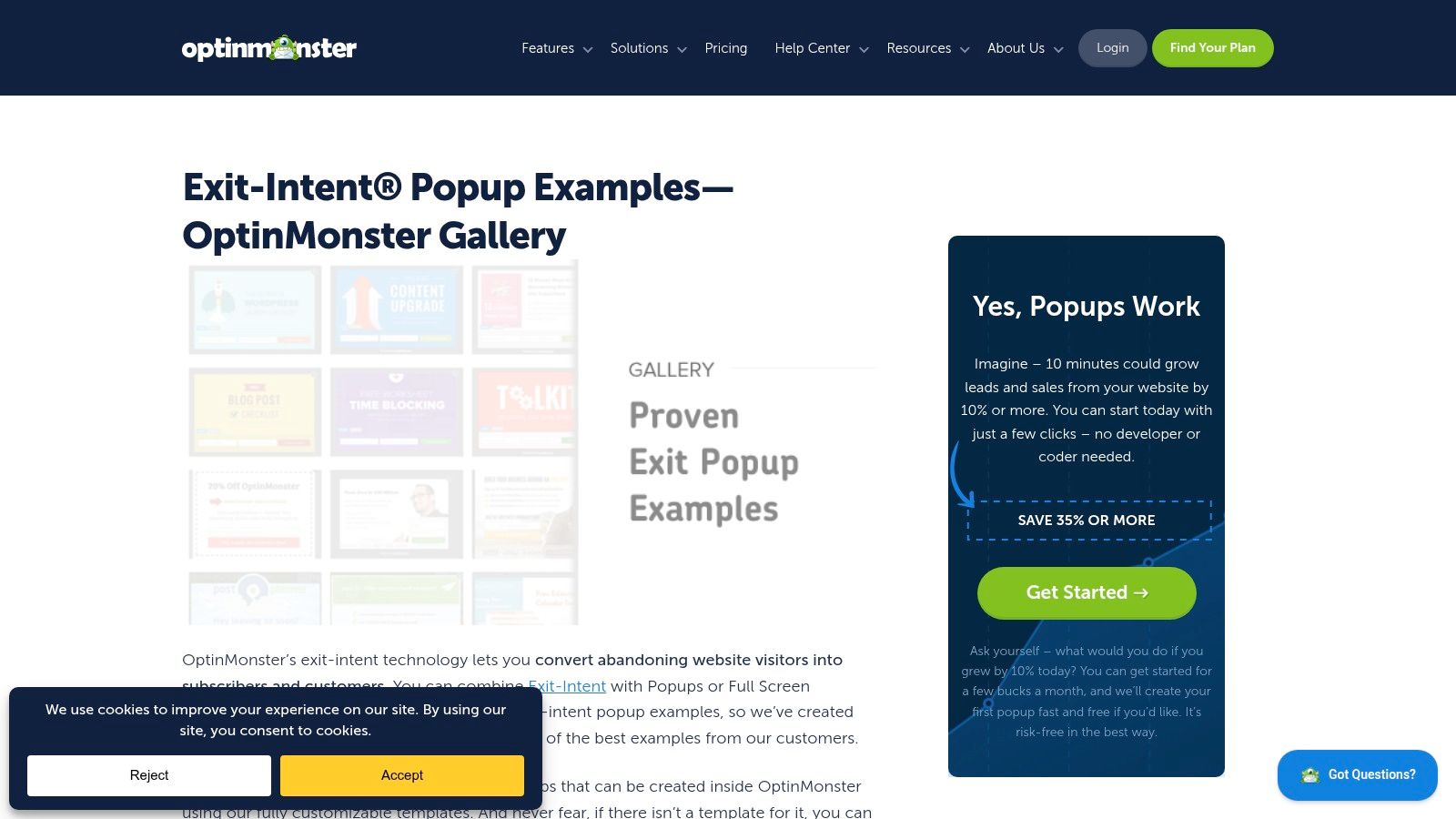
The gallery breaks down popups by their goal, such as capturing emails, reducing cart abandonment with a last-minute coupon, or promoting a lead magnet. Seeing these different approaches side-by-side helps you quickly identify which strategy might work best for your audience and products.
Why It's a Great Starting Point
What makes this resource so valuable is its direct connection to a leading popup provider. Each example isn't just a pretty picture; it's a campaign built with OptinMonster's technology. This means the designs and trigger logic are grounded in reality, with links to tutorials that explain the "how-to" behind the examples.
Unique Strengths:
- Real-World Application: You see campaigns from actual businesses, which provides a dose of reality that stock templates often lack.
- Categorized by Goal: The gallery is organized by campaign objective (e.g., "Grow Your Email List," "Reduce Cart Abandonment"), making it easy to find relevant examples.
- Educational Context: OptinMonster pairs the visuals with articles on trigger sensitivity and timing, giving you the strategic background needed to implement them effectively.
Access and Practical Tips
The gallery itself is free to browse, providing a ton of value without any upfront cost. Of course, to build and launch these popups, you would need an OptinMonster subscription, which starts at $9 per month (billed annually).
Pro Tip: Don't just copy the designs. Pay close attention to the copy and the offer. A simple 10% discount might work for one brand, while a free shipping offer or a downloadable guide might be more effective for another. Use the gallery to brainstorm the incentive itself, not just the layout.
While some examples might feel a bit dated, the core psychological principles behind them remain timeless. Use them as a foundation and give them a modern design twist that aligns perfectly with your brand’s aesthetic.
Website: https://optinmonster.com/exit-intent-popup-examples/
2. ConvertFlow
If your goal is to go from inspiration to implementation as quickly as possible, ConvertFlow is an excellent resource. Their page presents a short, focused roundup of exit intent popup examples, each paired with a one-click template you can adapt. This approach is especially helpful when you want to copy a proven structure, like a finish-your-order flow, and speed up implementation on your Shopify store.

The collection is cleanly organized, showcasing different popup strategies from list-growth to cart abandonment. Each example is clearly labeled and comes with a brief explanation of the strategy behind the design, including details on offer framing and microcopy.
Why It's a Great Starting Point
What makes ConvertFlow so effective is its direct bridge between an idea and a working campaign. Instead of just showing you a picture, it provides a direct link to a template. This dramatically shortens the build time for Shopify store owners who want to get a high-performing popup live without spending hours in a design tool. The focus is on action, not just theory.
Unique Strengths:
- Clear Rationale: Every example includes a clear explanation of why it works and the specific use case it's designed for, so you know when to deploy each pattern.
- Built-in Templates: The direct link to customizable templates is a huge time-saver, allowing you to get a professionally designed popup ready in minutes.
- Shopify-Focused: Many examples are geared toward e-commerce and Shopify, making the strategies directly applicable to online stores trying to save sales or grow their email list.
Access and Practical Tips
The example page and its associated templates are free to explore and customize within the ConvertFlow app. To launch a campaign on your live site, you'll need a ConvertFlow plan. They offer a free plan for up to 250 conversions, with paid plans starting at $99 per month for higher traffic sites.
Pro Tip: Use the templates as a starting point, not a final product. The real power comes from adapting the copy and offer to your specific audience. Test a cart-recovery popup with a percentage-off discount versus one with a free shipping offer to see which incentive resonates more with your abandoning shoppers.
While the gallery isn't as extensive as others, the quality and action-oriented nature of the examples are top-notch. If you use a different popup tool, you can still gain immense value by manually recreating the layouts and campaign logic presented.
Website: https://www.convertflow.com/campaigns/exit-intent-popup-examples
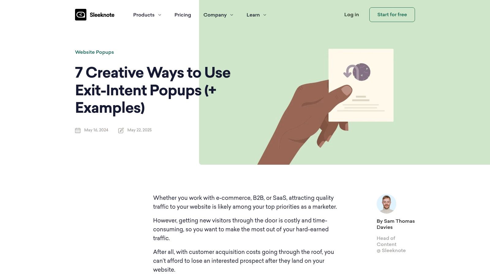
3. Sleeknote
If OptinMonster provides the visual inspiration, Sleeknote’s blog delivers the strategic playbook. This resource moves beyond a simple gallery of exit intent popup examples and instead provides a tactic-oriented guide that maps different popups to specific e-commerce goals. It’s less about just looking at designs and more about understanding when and why to use a particular approach.
The guide excels at connecting popups to concrete business outcomes, like saving an abandoned cart, collecting emails, or even gathering crucial customer feedback. It also tackles advanced segmentation, offering advice on showing different incentives based on cart value or the specific page a visitor is about to leave.
Why It's a Great Starting Point
What makes Sleeknote’s guide so powerful is its emphasis on profit-conscious marketing. Instead of just suggesting a blanket 15% discount, it encourages you to think about margin protection and segmentation. For instance, why offer a huge discount to a low-value cart when a smaller incentive would work just as well? This level of strategic thinking is gold for stores looking to optimize profitability, not just conversions.
Unique Strengths:
- Actionable Playbooks: The examples are presented as "playbooks" you can easily brief your team or agency on, complete with the goal, context, and copy.
- Profit-Conscious Advice: It provides guidance on using incentives smartly, helping you avoid giving away too much margin unnecessarily.
- Mobile-Specific Guidance: The article acknowledges that true exit intent doesn't exist on mobile and offers smart alternatives, like time-based or scroll-based triggers.
Access and Practical Tips
The blog post is completely free to read. While the examples are built using Sleeknote's tool and naturally reference its features, the underlying strategies are universal. To implement them directly, you would need a Sleeknote subscription, which starts at €49 per month (billed annually).
Pro Tip: Focus on the section about tailoring incentives to cart value. A shopper abandoning a $25 cart has different motivations than one leaving a $250 cart. Use Sleeknote’s logic to create tiered offers: maybe free shipping for the high-value cart and a 10% coupon for the lower-value one.
This resource is ideal for e-commerce owners who already have a basic popup strategy but want to refine it with more advanced segmentation and logic. It’s less about a huge gallery and more about providing quality, actionable blueprints for smarter marketing.
Website: https://sleeknote.com/blog/exit-intent
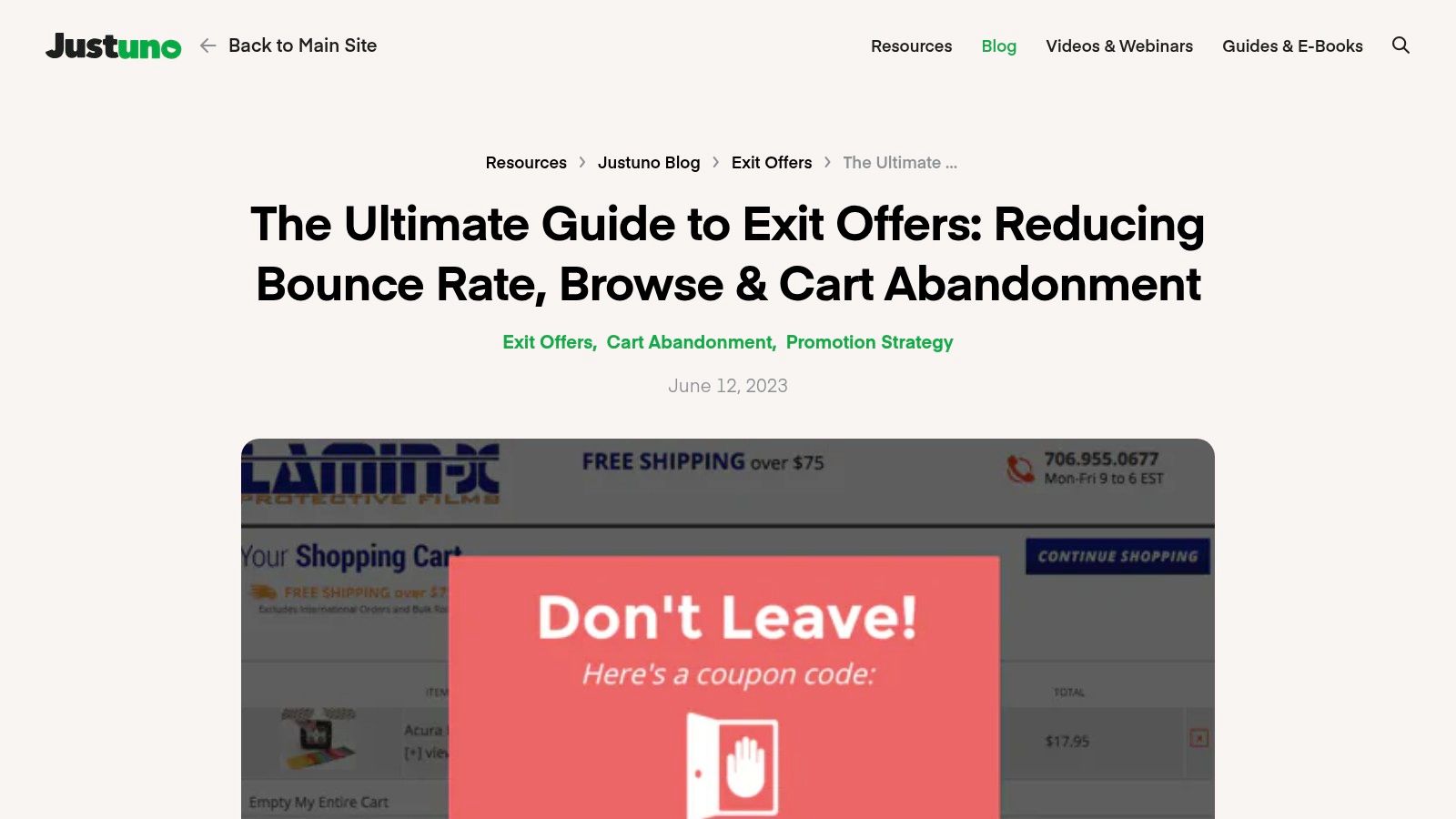
4. Justuno
If you're ready to move beyond basic popups and think more strategically about your customer journey, Justuno's guide is the perfect next step. Instead of a simple gallery, it offers a masterclass in segmentation, breaking down the difference between a standard exit, browse abandonment, and cart abandonment. This makes it an essential resource for planning more intelligent exit intent popup examples that are tied directly to user behavior.
The guide dives into why a generic exit offer isn't always the right move. It explains how to present a different, more valuable offer to a user about to abandon their cart versus someone who just browsed a product page. This funnel-based approach helps you match the offer's value to the visitor's level of intent.
Why It's a Great Starting Point
What makes this guide so useful is its focus on strategy over just design. It forces you to think like a conversion strategist, asking questions like, "At what point in the funnel is this visitor leaving?" and "What incentive will be most effective for this specific abandonment scenario?" Each example is presented with context and performance insights, showing the tangible results of a well-targeted campaign.
Unique Strengths:
- Funnel-First Framing: It clearly separates browse abandonment from cart abandonment, helping you prioritize tests and create distinct campaigns for each.
- Real-World Results: The guide includes examples from real ecommerce brands, complete with the results they achieved, providing social proof for the tactics.
- Strategic Guidance: It offers in-depth advice on targeting rules and timing, which are critical for deploying effective, non-intrusive popups.
Access and Practical Tips
The entire ultimate guide on Justuno's blog is completely free to read. While it showcases tactics best implemented with the Justuno platform, the strategic principles are universal. Justuno's plans, which you would need to implement these advanced targeting rules, start at $25 per month.
Pro Tip: Use this guide to map out your A/B testing plan. For instance, test a 15% discount on cart abandonment exit intent versus a "free shipping" offer on browse abandonment. The guide gives you the framework to build these separate tests and measure which one drives more revenue.
While some examples assume you have access to a platform with advanced targeting features like Justuno, the core ideas can be adapted. Even with simpler tools, you can create different popups for your cart page versus your product pages, mimicking the funnel-based strategy.
Website: https://www.justuno.com/blog/ultimate-guide-to-exit-offers/
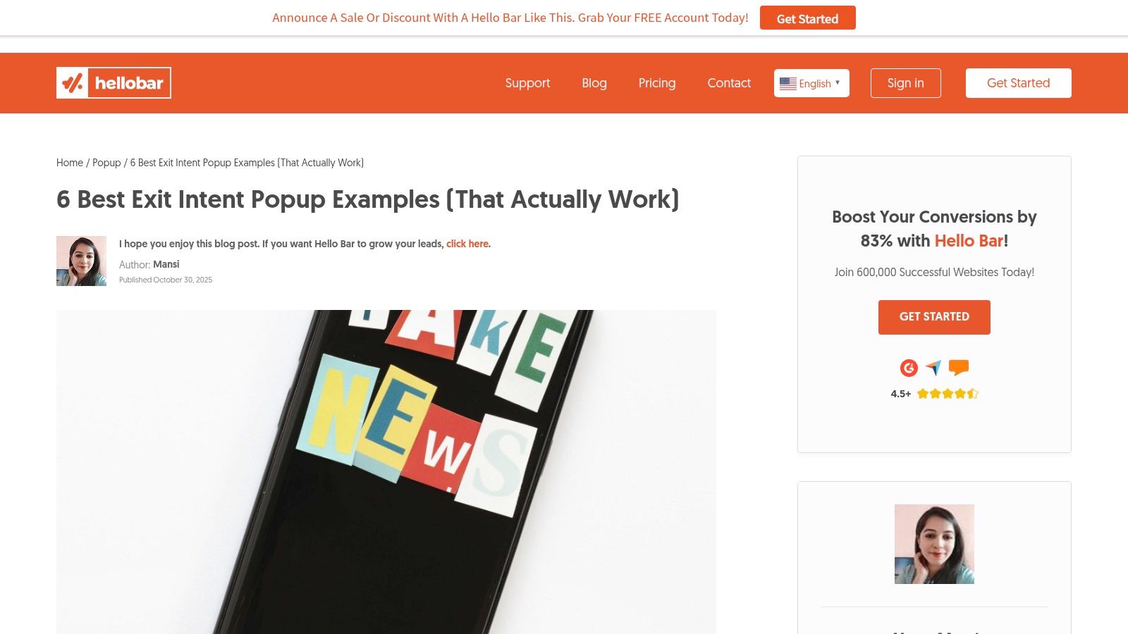
5. Hello Bar
If you need a quick, no-fluff roundup of exit intent popup examples to get stakeholder buy-in or simply find concrete ideas, Hello Bar's list is an excellent resource. It focuses on modern designs from well-known brands, providing a concise breakdown of what makes each example effective. This is particularly handy for busy founders who need actionable insights without a deep dive.
The roundup presents a handful of high-impact popups, explaining the psychology behind their offers, such as using free shipping to overcome a common purchase barrier or creating urgency to finalize a sale. This direct approach makes it easy to see how specific copy and offer angles can be applied to your own Shopify store.
Why It's a Great Starting Point
Hello Bar’s strength is its brevity and practicality. It doesn't overwhelm you with dozens of examples; instead, it curates a small selection that demonstrates key conversion principles. By showcasing popups from recognizable brands, it helps build confidence in these strategies and makes internal alignment much easier.
Unique Strengths:
- Brand-Name Examples: Seeing popups from established companies provides social proof and makes it easier to pitch similar ideas to your team.
- Concrete Copy and Offers: The examples focus on practical angles like free shipping, urgency, and social proof that translate directly to e-commerce.
- Best-Practice Framework: The article pairs its examples with a clear "Do's and Don'ts" list, offering quick strategic guardrails for your own popup design.
Access and Practical Tips
The blog post is completely free to access on the Hello Bar website. While the article naturally promotes the Hello Bar tool, the strategic takeaways are universal and can be implemented with any popup software.
Pro Tip: Focus on the "why" behind each example. Hello Bar notes how one brand uses a question-based headline to re-engage visitors. Think about how you could use a similar conversational hook to address your specific audience's pain points or hesitations before they leave.
Although the analysis for each example is not as deep as other resources, its direct, actionable nature makes it a perfect starting point for brainstorming. Use it to quickly identify a proven strategy, then adapt the copy and offer to fit your brand's unique voice and value proposition.
Website: https://www.hellobar.com/blog/6-best-exit-intent-popup-examples-and-ideas/
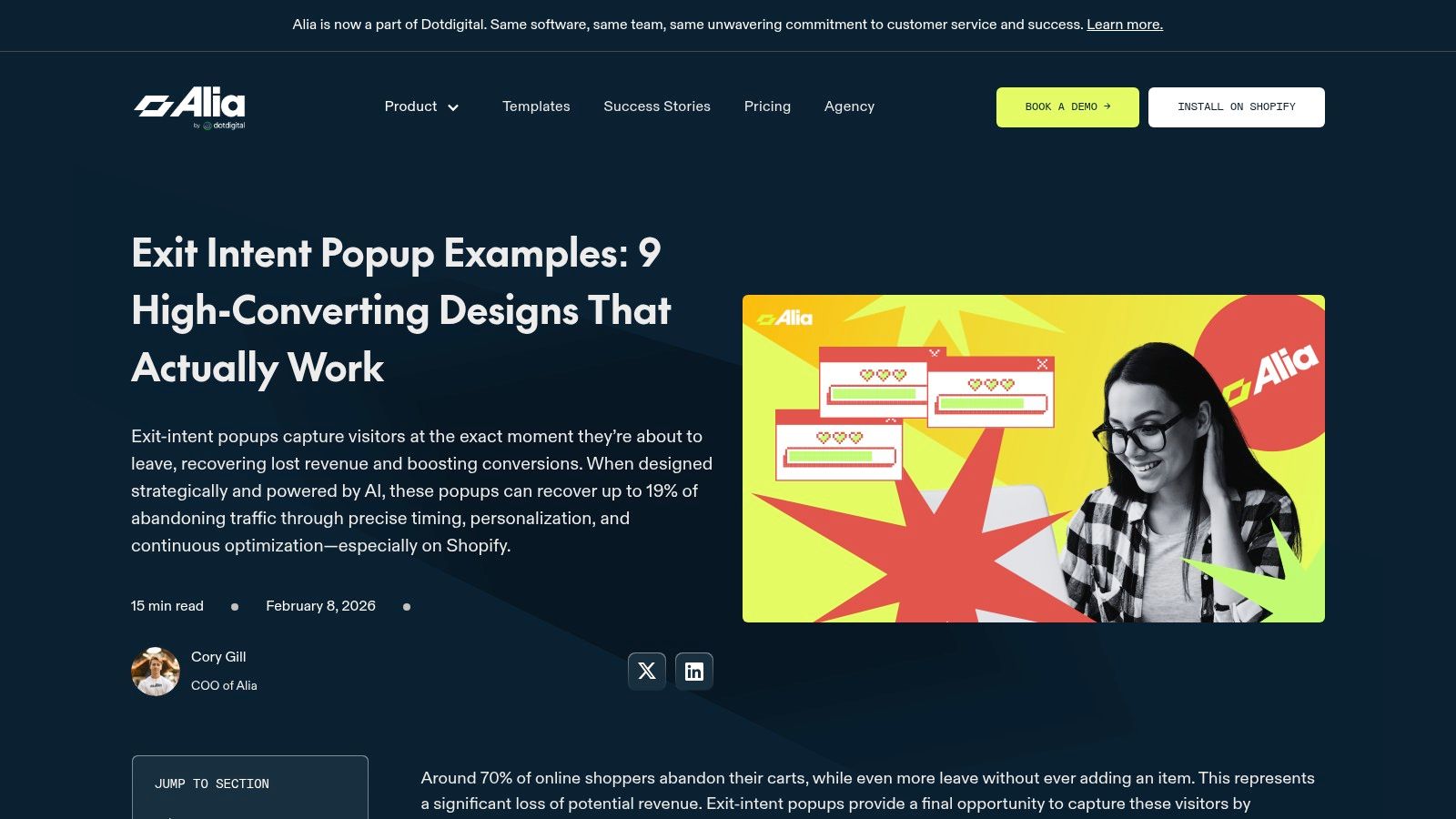
6. Alia Popups
For DTC brands wanting to move beyond generic discounts, Alia Popups provides a refreshing collection of exit intent popup examples that focus heavily on personalization and segmentation. Their blog roundup is particularly valuable for e-commerce stores looking for creative alternatives to the standard "10% Off" offer, highlighting strategies like gender-based flows and post-capture follow-ups.
This resource feels modern and is geared toward brands that understand their audience segments. You'll find inspiration for email captures, cart-saving prompts, and even product discovery popups that guide shoppers to the right category, demonstrating a more advanced, conversational approach to user engagement.
Why It's a Great Starting Point
What makes Alia Popups stand out is its emphasis on the entire customer journey, not just the initial capture. The examples often imply a next step, like a personalized welcome series based on how a user answered a question in the popup. It encourages you to think about what happens after the visitor subscribes.
Unique Strengths:
- Segmentation Focus: Many examples are built around personalization, such as asking a shopper "Who are you shopping for?" to tailor future marketing.
- Modern Visuals: The designs feel current and align well with today's top DTC brand aesthetics, providing relevant visual inspiration.
- Creative Offer Ideas: It showcases a good mix of prompts that go beyond discounts, including quizzes, product recommendations, and segmented content.
Access and Practical Tips
The blog post featuring these examples is completely free to view. While the gallery is smaller and tied to the features of the Alia Popups app, it's an excellent source of fresh ideas. To implement the popups, you would need the Alia Popups Shopify app, which offers a free plan and paid tiers starting at $9.99 per month.
Pro Tip: Pay close attention to the multi-step popups. An initial question like "What's your skin type?" or "Which style do you prefer?" can dramatically increase engagement before you even ask for an email. Use this strategy to segment your new subscribers right from the point of capture.
While it's a smaller vendor without as many big-brand case studies, the strategic thinking behind its examples is top-notch for any e-commerce store wanting to build a more personal connection with its audience.
Website: https://www.aliapopups.com/blog/exit-intent-popup-examples
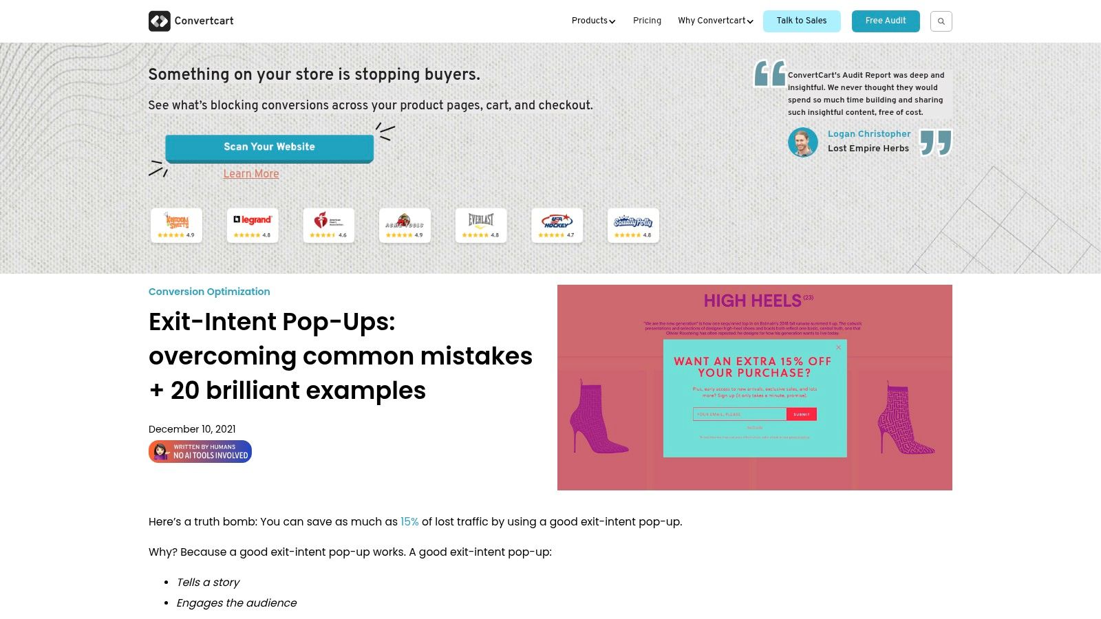
7. ConvertCart
ConvertCart offers a broad, brand-diverse roundup of exit-intent popups that serves as both a source of inspiration and a cautionary guide. It’s less of a curated gallery and more of a practical field manual, showcasing 20 creative exit intent popup examples while also dedicating a section to common mistakes. This dual focus makes it an excellent resource for pre-launch quality assurance, helping you spot potential issues before they go live.
The blog post compiles examples with different offers, copy angles, and visuals, giving you a wide spectrum of ideas. It’s especially useful for e-commerce stores, with suggestions on timing, triggers, and audience segmentation that can be applied directly to your own campaigns.
Why It's a Great Starting Point
What sets this resource apart is its balanced approach. Instead of just showing you what works, ConvertCart also explains what doesn't work. The "Common Mistakes" section is invaluable for avoiding user experience friction and even potential SEO penalties that can arise from poorly implemented popups. This helps you build a campaign that is both effective and respectful of your visitors' experience.
Unique Strengths:
- Large Library: With 20 distinct examples, you get a significant amount of inspiration in one place, spanning various industries and offers.
- Anti-Patterns Included: The inclusion of "what not to do" is a major benefit, providing a practical checklist to ensure your popup doesn't annoy users or harm your site's performance.
- E-commerce Focused: The advice is specifically geared toward online stores, focusing on relevant metrics like cart abandonment and lead generation.
Access and Practical Tips
The blog post is completely free to access, making it a fantastic no-cost resource for any e-commerce owner. Since the examples are not tied to a specific tool, they are universally applicable but will require manual recreation in your chosen popup software, like Klaviyo or Privy.
Pro Tip: Use the "Common Mistakes" section as a final review checklist before you launch a new exit-intent campaign. Ask yourself: Is the close button obvious? Is the offer clear? Does it work well on mobile? This simple check can prevent a lot of headaches.
Some of the visual designs in the examples are a bit older. Focus on the underlying strategy and offer, then give the design a modern refresh that matches your brand’s visual identity. The core ideas, like offering a direct discount versus free shipping, are timeless.
Website: https://www.convertcart.com/blog/exit-intent-pop-up-examples
Top 7 Exit-Intent Popup Tools Comparison
| Example | Implementation complexity 🔄 | Resource requirements ⚡ | Expected outcomes 📊 | Ideal use cases 💡 | Key advantages ⭐ |
|---|---|---|---|---|---|
| OptinMonster | Low — browse-ready examples; tool-tied tweaks | Low–Medium (OptinMonster or manual porting) | Quick idea generation; clearer trigger rules | Shopify ecommerce visual inspiration & timing logic | Skimmable gallery; real campaign screenshots; documented triggers |
| ConvertFlow | Low — one-click templates, quick adapt | Low (ConvertFlow account; porting if needed) | Fast setup; repeatable structures; consistent copy | Finish‑your‑order flows; rapid Shopify implementation | Templates + strategy notes; short build time |
| Sleeknote | Medium — tactic playbooks require setup | Medium (segmentation, cart-value logic) | Targeted, profit-conscious lifts; actionable playbooks | Teams briefing vendors; margin-sensitive incentiveing | Playbooks mapped to goals; incentive-by-AOV guidance |
| Justuno | Medium — funnel targeting & A/B test setup | Medium–High (funnel analytics, targeting features) | Better test prioritization; measurable performance insights | Funnel-focused testing; multi-trigger A/B tests | Funnels-first framing; real-world results; targeting guidance |
| Hello Bar | Low — concise examples for buy-in & copy translation | Low (copy/offer angles; minimal tooling) | Quick stakeholder alignment; easy copy-led wins | Busy founders; translating concrete copy to Shopify | Brand examples; practical copy/offers; do’s & don’ts |
| Alia Popups | Medium — personalization & post-capture flows | Medium (segmentation data, follow-up workflows) | Improved relevance and segmentation-driven conversions | DTC brands wanting segmentation & creative offers | Personalization-first examples; modern visuals; post-capture flows |
| ConvertCart | Low–Medium — browse many examples; manual recreation | Low–Medium (inspiration + QA checks) | Broad inspiration; fewer anti-patterns; better QA | Pre-launch QA; creative brainstorming; avoiding mistakes | Large, diverse library; “common mistakes” section |
From Inspiration to Implementation: Your Exit-Intent Playbook
You've just walked through a masterclass of high-converting exit intent popup examples, from the targeted discounts of OptinMonster to the interactive quizzes powered by ConvertFlow. Seeing what works is the fun part, but now it’s time to turn that inspiration into a real, revenue-generating asset for your store. The biggest mistake you can make is simply copying an example you liked. A truly effective exit-intent strategy begins with a single, clear objective.
Before you even think about headlines or offers, ask yourself: What is the number one action I want a leaving visitor to take?
- Is your primary goal to save abandoned carts? A direct, last-minute discount or a free shipping offer is your strongest play.
- Need to grow your email list for future sales? Focus on a high-value lead magnet, like a "first to know" list for new product drops or a helpful guide related to your niche.
- Are visitors bouncing from product pages? A quiz that guides them to the perfect product or a chat invitation to answer questions can be incredibly effective.
Once your goal is set, you can select the most appropriate strategy from the examples we've explored. Remember that the examples featuring tools like Sleeknote and Justuno aren't just about the final design; they are about the underlying psychology. They work because they interrupt a pattern and make an offer that feels timely and genuinely helpful, not intrusive.
Putting Your Plan into Action
Getting your first popup live is a major win, but it's only the beginning. The real growth comes from testing and refining your approach. Don't be afraid to experiment relentlessly. A successful exit-intent system isn't something you set up once and forget about. It's a dynamic part of your conversion strategy that should evolve with your business.
Here are your immediate next steps:
- Define Your Goal: Pick one specific, measurable goal (e.g., "reduce cart abandonment by 5%" or "capture 200 new email subscribers this month").
- Choose Your Tool: Based on our reviews, select a tool that fits your budget and technical comfort level. A tool like Alia Popups is great for getting started quickly on Shopify, while ConvertCart offers a more hands-on, managed service if you want expert guidance.
- Launch Your First Test: Don't aim for perfection on day one. Launch a simple A/B test. For instance, you could test two different headlines or compare a 10% discount against a free shipping offer.
- Analyze and Iterate: Let your test run until you have enough data to make a clear decision. Analyze the results, keep the winning variation, and then launch a new test against it. This continuous cycle of improvement is where you'll find the most significant gains.
The journey from seeing great exit intent popup examples to implementing a profitable strategy is about being intentional. Start small, stay focused on your primary goal, and commit to ongoing testing. By doing so, you'll create a powerful system that consistently converts abandoning visitors into valuable customers and subscribers.
Building these kinds of growth systems is exactly what we do. If you're ready to implement an advanced exit-intent strategy on your Shopify store but want an expert partner to handle the technical details and ensure it’s optimized for maximum impact, Wand Websites can help. We build conversion-focused e-commerce stores that turn your traffic into loyal, repeat customers. Let's build a store that grows with you.
