Ecommerce Checkout Optimization Strategies to Boost Sales


The Hidden Revenue in Your Checkout Experience

Let's face it, a cumbersome checkout process can negatively impact your revenue. Even small improvements to your ecommerce checkout optimization can make a big difference to your profits. Understanding why customers abandon their carts is key to unlocking this hidden revenue. What causes last-minute cart abandonment? What's the cost of a clunky checkout experience? Successful ecommerce businesses proactively address these questions.
Benchmarking Your Checkout Performance
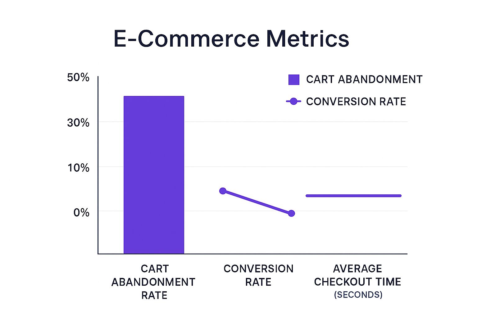
Identifying the right performance benchmarks is the first step. These benchmarks vary across retail categories, so understanding your specific niche is important. While many focus on basic conversion rates, top performers look at the bigger picture. They dive into behavioral data to find bottlenecks and understand user frustration.
Streamlining for Success
For example, consider streamlining your checkout. In 2025, UK fashion retailer White Stuff saw a 37% increase in conversion rates and a 26% rise in average order value after switching to a single-page checkout. This also led to a 100% speed boost for mobile checkout pages, important since over half of global ecommerce traffic comes from smartphones. Find more detailed statistics here. This highlights the growing importance of a mobile-first approach.
Identifying and Addressing Checkout Bottlenecks
Many optimization attempts fail because they don't address the root causes of abandonment. Successful brands use behavioral data to identify friction points in their checkout process. This data shows where users hesitate, struggle, or give up. To maximize checkout improvements, learn more about Shopify Conversion Optimization. Understanding these pain points lets businesses create targeted solutions that directly boost revenue. This strategic approach to ecommerce checkout optimization turns a potential point of failure into a powerful driver of sales.
Simplifying Your Checkout Flow Without Losing Essential Data

A simple checkout is essential for happy customers and more sales. But simplifying too much can mean missing out on useful information. How do you find the sweet spot between a smooth checkout and getting the data you need? That's the key to ecommerce checkout optimization. Let's explore how successful businesses collect essential data without making things complicated.
Striking the Right Balance: Streamlining vs. Data Collection
The trick is figuring out which data points are absolutely necessary and which ones can wait. Asking for a customer's birthday could be great for marketing, but making it mandatory at checkout might scare them away. A better option could be to ask for it after the purchase or when they create an account. This way, you get extra info without slowing down the sale.
The number of form fields also matters. Fewer fields usually mean more conversions. Research shows that shrinking the number of fields from 16 to 8 can seriously boost conversion rates. This highlights the importance of a lean data collection strategy for your ecommerce checkout.
Intelligent Sequencing and Smart Defaults
The order you ask for information also affects how many people complete the checkout. Asking for the billing address before the shipping address, when they’re often the same, can be confusing. Smart defaults, like pre-filling fields based on location or automatically copying the shipping address to the billing address, can make things easier. These small tweaks can make a big difference in ecommerce checkout optimization.
Conditional Logic for a Personalized Experience
Conditional logic lets you customize the checkout based on what the customer chooses. If someone picks "express shipping," you can add extra fields just for that service. This keeps the checkout clean for people who don't need those extra fields. This personalized approach simplifies the checkout while making sure you get the right data at the right time.
To help illustrate the different checkout approaches and their impact, let's look at the following comparison:
Single-Page vs. Multi-Step Checkout ComparisonA detailed comparison of the advantages and disadvantages of different checkout approaches to help you select the right strategy for your store.
As you can see, both single-page and multi-step checkouts have their own advantages and disadvantages. Choosing the right one depends on your specific needs and target audience. A/B testing can help you determine what works best for your store.
Examples of Effective Checkout Transformations
Many brands have improved their checkouts with these strategies. One example is hiding the "coupon code" field behind a link. This keeps things simple for people without a code while still offering the option. Another tactic is delaying account creation until after the purchase, letting customers focus on buying first. These changes, along with careful A/B testing, have led to real improvements in conversion rates for many businesses.
Mobile Checkout Mastery: Beyond Basic Responsiveness

Mobile commerce is exploding, but simply shrinking your desktop checkout for smaller screens isn't enough for true ecommerce checkout optimization. This section explores the finer points of mobile checkout and why a dedicated mobile strategy is essential for converting smartphone shoppers. For example, features like thumb-friendly navigation and optimized keyboards can significantly improve the user experience.
Addressing Mobile-Specific Challenges
Think about the last time you filled out a form on your phone. Tiny buttons, awkward scrolling, and a constantly shifting keyboard can be incredibly frustrating. This frustration leads directly to abandoned carts. Successful merchants recognize these challenges and design specifically for mobile interactions. This includes things like touch-target sizing – making buttons large enough for easy tapping – and input field optimization to ensure the correct keyboard type appears for each field (numeric for phone numbers, email for email addresses).
Navigation also needs to be intuitive for one-handed use. Users should easily reach key actions with their thumb, without awkward stretching or hand repositioning. This thumb-friendly design is a cornerstone of effective mobile checkout optimization. Think about how your checkout flow looks and functions on different screen sizes.
Device-Specific Experiences vs. One-Size-Fits-All
The "one-size-fits-all" approach to checkout doesn't cut it in a mobile-first world. Top-performing stores are moving beyond responsive design to create device-specific checkout experiences. This could involve simplifying the form for mobile users, prioritizing mobile payment options like Apple Pay or Google Pay, or even developing a completely separate mobile checkout flow. Performance optimization is also key. A Web.dev case study found that Rakuten24 saw a 53.37% revenue-per-visitor increase and 33.13% higher conversions after improving Core Web Vitals. Industry benchmarks show conversion rates ranging from 1.4% to 6.8% across different sectors as of 2025, with faster loading directly impacting performance. Reducing form fields from 16 to 8 can also significantly increase conversions. Learn more about this topic. This targeted approach acknowledges the unique needs and behaviors of mobile shoppers.
Mobile Payment Methods and Metrics
Mobile users often prefer different payment methods. Streamlining mobile payments with options like Apple Pay, Google Pay, and other digital wallets reduces friction and provides the most convenient experience.
Simply offering mobile payments isn't enough, though. You also need to track mobile-specific checkout metrics. This includes mobile conversion rates, average order value on mobile, and mobile cart abandonment rates. Focusing on these metrics helps you measure the effectiveness of your mobile optimization and pinpoint areas for further improvement. This data-driven approach ensures your mobile checkout meaningfully contributes to overall revenue growth.
The Form Field Psychology That Drives Completions
Your checkout form is the final step between browsing and buying. It's where shoppers solidify their purchase and your business generates revenue. But it can also be a point of friction, causing shoppers to abandon their carts and costing you sales. Optimizing your form fields is key to a smooth and successful checkout experience, and that involves understanding the psychology of how users interact with forms.
Why Most Form Optimization Advice Falls Short
A lot of standard form optimization advice focuses just on minimizing the number of fields. While fewer fields is often better, just cutting fields without considering their psychological impact can actually hurt your conversion rates. For example, removing a field like "Company Name" might seem like a simple way to shorten the form, but it could alienate business customers who expect to see it. This highlights why understanding the psychology behind form fields is so important.
The Psychology of Smart Field Sequencing
The order you ask for information has a big impact on completion rates. Imagine asking for a billing address before the shipping address – it disrupts the natural flow of how users think about providing this info. Baymard Institute's research shows how small details like separating "First Name" and "Last Name" can create friction, while a single "Full Name" field often provides a better user experience. Similarly, hiding optional fields like "Address Line 2" behind a clickable link reduces visual clutter while still making it available for those who need it.
Error Prevention and Validation Timing
Real-time validation – providing feedback as users type – is a great way to prevent errors and keep shoppers happy. Think about completing a long form only to find out at the end you made a typo in your email address. Real-time validation catches these mistakes immediately. But the timing of this validation is just as important. Validating a field before the user finishes typing can be irritating and interrupt their flow.
Microcopy, Visual Cues, and Interaction Design
The words you use around your form fields (microcopy) have a surprising effect on user behavior. Even a small change from "Submit" to "Complete Order" can make a big difference. Visual cues, like highlighting required fields or using progress bars, help guide users through the process. Interaction design, such as incorporating auto-fill for addresses, further simplifies the checkout. These subtle changes can significantly improve your ecommerce checkout optimization.
To help illustrate how to effectively structure and optimize your checkout form fields, we've created a handy guide below:
Checkout Form Field Optimization Guide
This table provides a breakdown of essential, optional, and unnecessary checkout form fields, along with recommendations for optimizing their sequence and formatting. This will help you streamline the checkout process and improve your conversion rates.
By focusing on these key areas, you can create a more user-friendly checkout experience and improve your overall conversions.
The Impact of Field Optimization on Conversions
The following data chart visualizes findings from Baymard Institute’s research on checkout form field optimization, showing how seemingly minor adjustments can significantly decrease cart abandonment rates:
Checkout Form Field Optimization and Abandonment Rates
This chart shows the positive effect of these changes. For instance, using a single "Name" field resulted in a 4% decrease in abandonment, while hiding the "Coupon Code" field yielded a 3% reduction. These seemingly small improvements can lead to substantial revenue gains for your business, especially as your customer base grows. This underscores the power of considering the psychology of form design to optimize your ecommerce checkout.
Building Unshakeable Trust at the Moment of Decision
Trust is absolutely essential for success in ecommerce, especially when a customer is about to make a purchase. It’s not enough to simply slap a security badge on your site. You need to understand what makes shoppers anxious at checkout and address those concerns head-on. This takes a strategic approach to ecommerce checkout optimization to build confidence and reassure shoppers they’re making a safe and secure purchase.
Addressing Customer Anxieties
One of the biggest drivers of cart abandonment is a simple lack of trust. Customers might worry about the security of their payment information, whether the products are genuine, or if the shipping and returns process will be a headache. If you don’t deal with these worries, your conversion rates can take a real hit. For example, studies have shown that 18% of users abandon their carts because checkout seems too complicated. This highlights how vital it is to make the checkout process transparent and reassuring.
Strategically Positioning Reassurance Cues
Smart online retailers place reassurance cues strategically throughout the checkout experience. These cues can include things like:
- Security indicators: Displaying recognized security badges from companies like Norton or McAfee can instantly boost shopper confidence.
- Customer reviews: Positive reviews build trust in both your products and your brand as a whole.
- Guarantees: Offering clear guarantees, such as money-back guarantees or satisfaction guarantees, can ease a customer's worries about buying.
- Contact information: Making it easy to contact customer service shows shoppers you're there to support them if needed.
These cues need to be placed where they'll have the biggest impact – right when customers are most likely to have doubts. For instance, showing security badges near the payment information fields reinforces trust during a crucial step. Displaying customer reviews on product pages or in the shopping cart can build confidence before the customer even gets to checkout.
Transparency Builds Confidence
Many common trust-building tactics, like just showing security badges, don't always work because they don't tackle the specific anxieties shoppers have. Successful online stores take it further by being completely transparent about things like:
- Shipping costs: Being upfront about shipping costs avoids unpleasant surprises at checkout.
- Return policies: A clear and easy return policy gives customers real peace of mind.
- Product authenticity: Sharing details about where a product comes from and guaranteeing its authenticity builds trust, especially for expensive items.
Implementing a Comprehensive Trust Strategy
Building trust during checkout isn't about one-off tactics; it's about a comprehensive strategy. This strategy should be built on:
- Understanding customer concerns: Customer surveys and checkout behavior analysis can pinpoint exactly what's causing cart abandonment.
- Addressing those concerns directly: Use reassurance cues, transparent policies, and clear communication to proactively address customer worries.
- Continuously testing and optimizing: Regularly A/B test different trust-building elements to find what works best for your customers and refine your approach.
By implementing a solid trust strategy, you can drastically reduce cart abandonment, improve conversion rates, and create a positive customer experience. This fosters loyalty and encourages repeat business. It's essential for sustainable ecommerce checkout optimization and achieving long-term growth. Don’t just tell your customers your checkout is secure – show them.
Testing Your Way to Checkout Breakthrough Moments
Optimizing your ecommerce checkout isn't a set-it-and-forget-it kind of task. It needs constant testing and tweaking to really boost those conversions. While A/B testing can give you some clues, a structured approach is key to unlocking those "aha!" moments and significantly improving your checkout performance. This means understanding what to test first, getting reliable results, and turning those results into real changes.
Prioritizing Your Testing Roadmap
Not all parts of your checkout are equally important. Some have a bigger impact on conversions than others. For example, the Baymard Institute found that cutting form fields from 16 down to 8 can dramatically increase conversions. This highlights how important it is to keep data collection streamlined. So, prioritizing tests around form fields, such as simplifying the "Name" field or hiding "Address Line 2", can give you a better return than testing less impactful things like button color. Building a testing roadmap based on potential impact, not just how easy it is to implement, is a cornerstone of efficient ecommerce checkout optimization.
Ensuring Statistically Significant Results
Many A/B tests don't give you usable results because of setup issues, not enough traffic, or faulty analysis. To get statistically significant results, you need enough traffic going through both your original and test versions. This helps you confidently say whether the differences you see are because of the changes you made or just random. A clear test hypothesis, based on real customer behavior data, is also crucial for understanding your results correctly. This data-driven approach helps you make smart decisions based on evidence, not guesses.
Developing Effective Test Hypotheses
To develop strong test hypotheses, you need to understand your customer's journey. For example, if you see a lot of people abandoning their carts at the shipping info stage, your hypothesis might be that simplifying the address fields will increase conversions. This hypothesis is based on what you’re actually seeing and gives your test clear direction. Remember to document your hypotheses, the test variations, and what you expect to happen before you start testing. This makes analyzing the results much easier later.
Interpreting Results and Implementing Findings
Once your test is done, understanding the results is just as important as running the test itself. Did your new version do better than the original? If so, by how much? Is the difference statistically significant? These questions guide your next steps. A successful test means implementing the changes quickly. If it wasn't successful, figure out why and use that to refine your next hypothesis. Check out these best practices for ongoing testing and checkout refinement: Shopify conversion rate optimization. This constant cycle of testing, analyzing, and implementing is what drives real, lasting improvement in ecommerce checkout optimization.
Case Studies: Challenging Conventional Wisdom
Sometimes, test results can surprise you and challenge what you thought you knew about checkouts. For example, a case study might show that adding a security badge near the payment fields – which seems like a good idea – actually lowered conversions. There could be several reasons for this – maybe the badge highlighted security concerns, or maybe it just didn't look right with the overall design. These unexpected results highlight how important data-driven testing is and why you should always question your assumptions. By embracing these findings and adapting your strategy, you can find hidden ways to boost your performance.
