Create Effective E Commerce Landing Pages That Convert

So, what exactly is an e-commerce landing page? Think of it as a standalone webpage with a single, laser-focused mission: to get a visitor to take one specific action. It's not your homepage, and it's not a regular product page. It’s a dedicated page built to turn traffic from a marketing campaign—like a social media ad or a targeted email—into a sale or a lead.
Meet Your Digital Salesperson
Imagine your online store’s homepage is like the main entrance to a massive department store. There are dozens of aisles, signs pointing everywhere, and a dizzying array of products. A visitor can easily wander around, check out different departments, or just get sidetracked and leave. It’s designed for browsing.
An e-commerce landing page, on the other hand, is like a specialized pop-up shop. It’s set up with one goal: to sell the one thing you just advertised. There are no other doors, no confusing signs, and zero distractions. The whole experience is built to guide a potential customer from "I'm interested" to "I'm buying" as smoothly as possible.
This razor-sharp focus is the secret sauce. By getting rid of things like the main site navigation, sidebars, and links to other products, you create a path with no friction. The visitor isn't bogged down with choices; they see a clear value proposition and a single, powerful call to action (CTA).
The Big Difference: Landing Pages vs. Product Pages
It's easy to mix these two up, but their roles are fundamentally different. A standard product page is a permanent fixture in your main website's structure, while a landing page is often a temporary, standalone page tied to a campaign.
- Product Pages: These are part of your store's catalog. They're surrounded by navigation menus, "you might also like" suggestions, and company-wide reviews. They’re meant for people who are already on your site and exploring what you have to offer.
- Landing Pages: These are custom-built for a specific group of people coming from a specific place (like a Facebook ad for a new line of sneakers). They seamlessly continue the conversation that started in the ad, using the same messaging and visuals to build trust and make the sale.
This highly targeted strategy really works. In fact, businesses see a 55% increase in leads when they grow their number of landing pages from 10 to 15. Each page acts like a dedicated salesperson for a single campaign, speaking directly to what that specific audience wants.
If you're looking to dive deeper into the nuts and bolts, this guide on how to create a landing page is a great resource. Ultimately, it’s this singular focus that turns casual visitors into paying customers, making landing pages a non-negotiable tool for any serious e-commerce brand.
The Anatomy of a Page That Sells
Think of a high-converting e-commerce landing page like a perfectly tuned engine. Every single part has a job to do, and they all have to work together in harmony to drive the visitor toward one specific, irresistible action. Getting this anatomy right is what separates a page that just sits there from one that actively makes you money.
Let's pull back the curtain and look at the essential components that make a landing page truly effective.
Your Magnetic Headline and Value Proposition
You’ve got about three seconds to make an impression. That's it. Your headline is your first—and maybe your only—shot to grab someone's attention. A great headline doesn't just describe the product; it immediately answers the visitor’s biggest question: "What's in it for me?"
This works hand-in-glove with your value proposition. This is a short, punchy statement that spells out exactly what makes you special, why you're a better choice than the competition, and the specific problem you solve for your customer.
This image breaks down the key pieces of a well-designed e-commerce landing page.
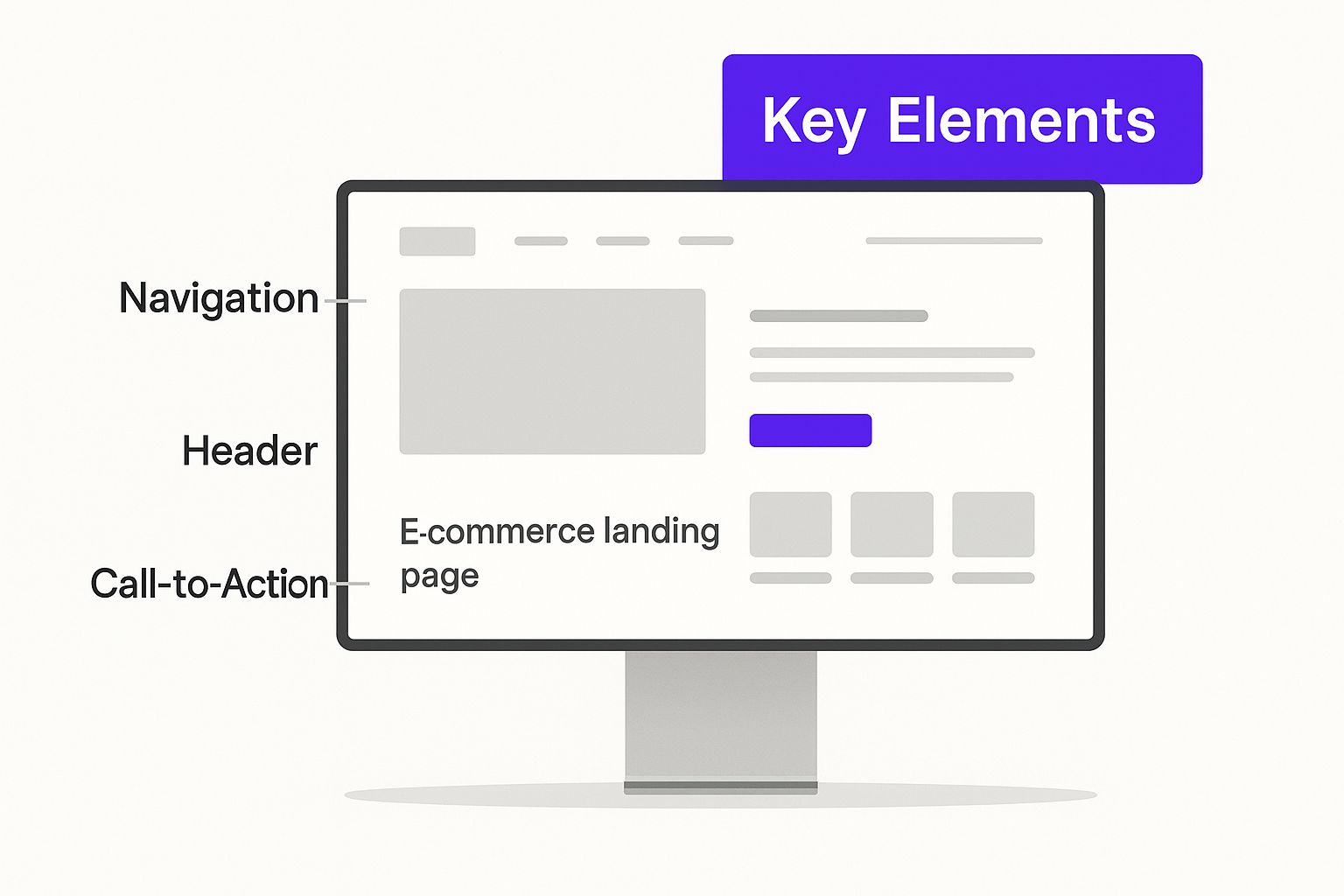
As you can see, everything from the headline at the top to the trust signals at the bottom is strategically placed to guide the user smoothly toward that final click.
Compelling Copy and Crystal-Clear Imagery
Okay, you've hooked them with the headline. Now, your copy needs to reel them in. The best e-commerce copy doesn't just list features; it paints a picture by translating those features into real-world benefits.
Instead of saying, "Our blender has a 1200-watt motor," try something like, "Whip up silky-smooth smoothies in under 30 seconds." This benefit-first approach helps people visualize exactly how your product will make their life better.
People can’t touch or feel your product online, so your visuals have to do all the heavy lifting. Show it off from every angle, show it in use, and place it in lifestyle shots that your ideal customer can see themselves in. A great video can be a game-changer, with some studies showing it can boost conversions by up to 86%.
Building Trust with Social Proof
Let's be honest—online shoppers are a skeptical bunch. Social proof is your secret weapon for breaking down that wall of doubt and building instant credibility. It’s the online version of seeing a long line outside a restaurant; it immediately signals that this is something worth checking out.
Here are a few of the most powerful types of social proof:
- Customer Reviews and Testimonials: Nothing beats a real person's words. Feature glowing reviews that tackle common questions or highlight specific benefits. Simple star ratings also give a quick, powerful visual cue of quality.
- Trust Badges: Displaying logos from well-known payment providers like Visa or PayPal, and security seals from companies like Norton or McAfee, instantly makes visitors feel more secure.
- "As Seen On" Logos: If your product has been featured in a magazine or on a popular blog, show off their logos! This lets you "borrow" their authority and apply it to your brand.
To help you keep track of these crucial components, here's a quick reference table.
Essential Elements of an E-commerce Landing Page
Putting these pieces together thoughtfully is how you build a page that doesn't just look good but actually performs.
The All-Important Call to Action (CTA)
Finally, we land on the most critical element of all: the call to action. Your CTA button should be the undeniable star of the show. It needs to pop off the page with a contrasting color and use simple, action-packed language.
Steer clear of boring words like "Submit" or "Click Here." Instead, be specific and tie it to the value they're getting. Think "Claim My Free Sample" or "Build My Custom Plan." This reinforces the benefit of clicking. It’s a small detail with a huge impact—data shows that personalized CTAs can convert 42% more visitors than generic ones. If you want to dive deeper, you can find more insights about landing page statistics in recent industry reports.
By carefully assembling these core components, you create a persuasive and frictionless path from casual browser to happy customer, turning your landing pages into powerful conversion engines.
Landing Page Design That Guides Users to Buy
Great landing page design is less about winning art awards and more about getting people to click "buy." It's about psychology. Think of your landing page like a well-designed physical store. You wouldn't hide the checkout counter in the back room, right? Of course not. You’d make it bright, obvious, and easy to get to. The same logic applies online, where smart design choices become your most powerful sales tools.

The whole point is to make buying feel like the most natural, obvious next step. By clearing out the clutter and creating a clear path forward, you reduce hesitation and build momentum that carries a shopper all the way through the checkout process.
Create a Clear Visual Hierarchy
Visual hierarchy is just a fancy way of saying you arrange things on the page to show what’s most important. You want to subtly direct your visitor's eyes along a specific path: first the headline, then the main benefit, then a great product shot, and finally, that all-important call-to-action (CTA) button.
It's easier than it sounds. You can pull this off with a few classic design tricks:
- Size and Scale: Your headline should be the biggest text on the page. Your CTA button should be big and proud, impossible to miss.
- Color and Contrast: Make your CTA button pop. Use a bold, contrasting color that makes it jump off the page and scream, "Click me!"
- Whitespace: Don't be afraid of empty space. Whitespace isn't wasted space; it’s what makes the important stuff stand out. It gives your CTA room to breathe and draws the eye right to it.
This careful arrangement works like a silent tour guide for your visitor's eyes, making sure they see the right message at the right time. It leads them straight to your conversion goal without them even noticing they're being led.
Good design is invisible. It’s when a user can navigate your page and complete an action without having to think about where to click or what to do next. That's when you know you've created a truly effective user experience.
Implement a Mobile-First Design
Let's be clear: designing for mobile is no longer an option—it's the only place to start. With over 50% of online browsing happening on phones, your landing page has to look and work perfectly on a small screen. A mobile-first approach means you design for the phone first, and then figure out how it should look on a desktop.
This forces you to focus on what truly matters, ensuring the core experience is fast, clean, and ridiculously easy for most of your visitors. Key elements like your value proposition and CTA button need to be front and center, no pinching or zooming required. Honestly, a clunky mobile experience is one of the quickest ways to kill a sale before it even has a chance.
Remove All Distractions
This might feel weird at first, but one of the best things you can do for your landing page is to remove your main website navigation menu. Yes, really.
Think about it. The visitor landed on this page for a specific offer. By taking away links to your homepage, "About Us" page, or other products, you eliminate all the escape hatches. You're creating a focused environment with only one path forward. Every link that doesn't lead to a conversion is a potential leak in your sales funnel. Plug those leaks, and you'll be amazed at how much your page's performance improves.
How to Optimize Your Pages for More Conversions
Launching your e-commerce landing page is a huge step, but it’s definitely not the finish line. Think of it more like the opening night of a play. The script is solid and the actors are ready, but the real magic happens when you start tweaking the performance based on how the audience reacts. This ongoing process is called Conversion Rate Optimization (CRO), and it’s how you turn a good landing page into a sales machine.
CRO isn’t about guessing what might work. It's about listening to what your visitors are showing you through their actions. By methodically testing different parts of your page, you can figure out what truly motivates your audience to click that "buy" button. It’s all about continuous improvement—making small, smart changes that add up to big gains in sales over time.
To really get the most out of your e-commerce landing pages, you have to commit to ongoing improvement through conversion optimization techniques.
Unlock Insights with A/B Testing
A/B testing is your secret weapon for making decisions backed by real data, not just a gut feeling. Imagine you’re a chef trying to perfect a new recipe. You wouldn't change ten ingredients at once—you’d adjust the salt, have a taste, then maybe try a different herb. That’s exactly how A/B testing works for your landing pages.
You simply create two versions of your page (let's call them Version A and Version B) with just one single difference between them. For instance:
- Headline A: "Shop Our New Summer Collection" vs. Headline B: "Get Sunshine-Ready with Our New Summer Styles"
- CTA Button A: A blue button that says "Buy Now" vs. CTA Button B: An orange button that says "Add to Cart"
- Image A: A clean product shot on a white background vs. Image B: A lifestyle photo showing someone happily using the product
Then, you show Version A to half of your visitors and Version B to the other half. After you've collected enough data, you can see which version got more conversions. The winner becomes your new default page, and you move on to test the next element.
A/B testing takes ego and opinion out of the conversation. It doesn't matter what you think will work better; the only thing that matters is what the data proves your customers actually respond to.
Prioritize Blazing-Fast Page Speed
In e-commerce, speed isn't just a nice-to-have; it's the foundation of a good experience. Every millisecond your page takes to load, you're bleeding potential customers. Today's shoppers are impatient, and a slow, clunky page is a one-way ticket to your competitor's site.
The impact of speed is staggering. Data shows that if an e-commerce landing page loads in just one second, its conversion rate can be up to 2.5 times higher than a page that takes five seconds to load. That’s a massive difference. When load times stretch to 10 seconds, conversion rates can be five times lower than that one-second sweet spot. The link between technical performance and your bottom line couldn't be clearer.
Here are a few practical ways you can speed things up:
- Compress Your Images: Large, unoptimized images are the number one cause of slow pages. Use a tool to shrink their file size without making them look pixelated.
- Simplify Your Design: Fancy animations and heavy scripts can really bog down your page. Keep the design clean, simple, and focused on what matters most.
- Use a Content Delivery Network (CDN): A CDN is a network of servers that stores copies of your page around the world. This way, it loads much faster for visitors, no matter where they are.
Analyze User Behavior to Guide Decisions
Your website analytics are a goldmine. They tell the story of how real people are interacting with your landing page. Don't just glance at the final conversion number; dive deeper into user behavior metrics to understand the "why" behind your page's performance.
Look for patterns in metrics like these:
- Bounce Rate: What percentage of people leave almost immediately? A high bounce rate might signal a mismatch between your ad and your landing page.
- Time on Page: Are people actually sticking around to read your copy, or are they gone in a flash?
- Scroll Depth: How far down the page are most people scrolling? If they aren't even seeing your call-to-action, you may need to move it higher.
When you combine the scientific approach of A/B testing with a relentless focus on speed and a deep understanding of user analytics, you create a system for improvement. Optimization is a continuous cycle of testing, learning, and refining that will turn your e-commerce landing pages into powerful, consistent sales drivers.
Alright, let's move from theory to practice. Seeing what the best brands are doing in the wild is one of the fastest ways to learn what actually works. It’s time to look at some brilliant e-commerce landing pages that are absolutely crushing it.
Think of this as a guided tour. We'll break down exactly why these pages convert so well, connecting the design principles we've talked about to real-world results. You'll see how they pitch their value, build rock-solid trust, and make clicking that "buy" button feel like a no-brainer.
Allbirds: The Tree Dasher 2
The shoe company Allbirds has built a cult following, and a quick look at their landing pages shows you why. They are masters of clean, benefit-focused design. When a new product like the Tree Dasher 2 drops, they don't just add it to their store—they create a dedicated experience that tells its story.
Their landing page for this running shoe is a perfect example of how to guide a visitor's eye. It kicks off with a stunning hero image and a simple, powerful headline: "A Cushier Crash Pad." Right away, you know the main benefit is comfort. No jargon, no fluff.
As you scroll, the page smartly mixes gorgeous photos with short, punchy text and clear icons to explain the shoe's features. They don't just say it's sustainable; they show you how with specifics like "lightweight, breathable eucalyptus fiber." This transparency is a huge trust-builder.
Look at how each of these examples uses a unique layout with bold visuals and clear headlines to grab your attention immediately. That's a lesson every e-commerce page can learn from.
Haus: The Apéritif Subscription
Haus, a brand that makes modern, low-ABV apéritifs, doesn't just sell a drink—it sells a vibe. Land on their subscription page, and you're immediately pulled into a warm, inviting scene. The lifestyle photos make you feel like you just walked into the coolest, most relaxed party.
The copy is just as inviting, speaking directly to the experience: "The new way to happy hour." Haus gets it. Their customers aren't just buying a bottle; they're upgrading their social life. This is a masterclass in selling the outcome, not just the product.
Key Takeaway: Their call-to-action is pure genius. Instead of a boring "Subscribe Now," they use "Choose Your Flavors." This tiny tweak makes the next step feel like a fun, creative choice rather than a financial commitment. It lowers the barrier to entry by making the action feel personal and exciting.
Purple: The Purple Mattress
Let's be honest, selling a mattress online is a huge challenge. You can't lie on it or bounce on it. So how does Purple get people to click "buy"? By tackling the biggest customer fears head-on with a landing page overflowing with social proof and risk-free offers.
The page is a fortress of trust, built from thousands of customer reviews, star ratings, and glowing testimonials. It immediately shows you that tons of people have taken the leap and loved their purchase.
Then, they seal the deal by putting their 100-night trial and free returns policy front and center. For a big-ticket item like a mattress, this is everything. By taking away the financial risk, they obliterate the single biggest reason someone would hesitate. The clean design, with pops of their signature purple on CTAs like "Shop The Purple Mattress," makes the whole process feel safe, secure, and surprisingly simple.
Measuring Landing Page Success with the Right Metrics
So you've built a beautiful e-commerce landing page. That’s great, but how do you know if it's actually working? Launching a page and just hoping for the best is a bit like sailing without a compass—you’re moving, but you have no idea if you’re heading in the right direction.
To figure out what’s clicking with your customers (and what’s not), you need to look past the superficial stuff and dig into the key performance indicators (KPIs) that tell the true story.
Think of these metrics as your page's health report. They pinpoint exactly where your strategy is winning and, more importantly, where you can make improvements. Tracking the right data empowers you to make smart, informed decisions that directly impact your bottom line.

Key Metrics That Matter Most
You could easily get lost in a sea of data. While there are tons of metrics you could track, a handful of them give you the clearest picture of how your e-commerce landing page is performing. Let's zero in on the ones that provide the most bang for your buck.
Conversion Rate: This is the big one. It’s the percentage of visitors who actually do what you want them to do, like click "Buy Now" and complete a purchase. A high conversion rate is the ultimate sign that your page is convincing and effective.
Bounce Rate: This tells you how many people land on your page and leave almost immediately without clicking anything. A high bounce rate can be a red flag, often signaling a mismatch between your ad and what your page delivers.
Average Time on Page: How long are people sticking around? If visitors are bailing after just a few seconds, it’s a good indicator that your content isn't grabbing their attention or answering their questions.
Cost Per Acquisition (CPA): This is your campaign's total cost divided by the number of sales it generated. It answers the most critical question of all: how much are you spending to get a single customer?
By understanding these numbers, you can start to diagnose problems like a pro. For example, a high bounce rate and low time on page might mean your headline or offer isn't compelling. On the other hand, if people are staying a while but not converting, your call-to-action might be weak or confusing.
Setting Realistic Benchmarks
It’s one thing to track metrics, but it’s another to know what "good" actually looks like. The median conversion rate for an e-commerce landing page hovers around 4.2%. This means half of all pages are converting at or below that number.
But here's where it gets interesting. The top-performing pages can hit conversion rates above 11.4%, putting them in the top 25% of all e-commerce sites. That gap between average and excellent shows there's huge potential for growth.
To put that in perspective, boosting your conversion rate from 4.2% to 11.4% could translate to an extra $54,000 in monthly revenue for a store with a $75 average order value. If you want to see how you stack up, you can discover more insights about conversion rates and compare your numbers to industry averages.
A Few Common Landing Page Questions Answered
As you start working with e-commerce landing pages, a few questions always seem to come up. It's totally normal. Getting these sorted out early on will give you a much clearer path forward.
Let's break down some of the most common ones I hear from clients. Think of this as your quick-start FAQ.
Landing Page vs. Product Page: What’s the Real Difference?
This is probably the biggest point of confusion, and it makes sense. They both show off your products, but they have completely different jobs to do.
Think of your product page like an item on a shelf in your main store. It's part of your permanent catalog, surrounded by navigation menus and other products, designed for people who are already browsing and exploring what you have to offer.
An e-commerce landing page, on the other hand, is like a special pop-up shop built for one specific event. It’s a standalone page created for a single marketing campaign. It gets rid of all the usual distractions—goodbye, main menu!—to focus a visitor’s attention on one single goal, usually coming from a specific ad or email. Its job is to convert, not to encourage browsing.
A product page is part of a broad conversation a visitor is having with your entire brand. A landing page is a focused, one-on-one pitch that delivers on a specific promise you made in your ad.
How Many Landing Pages Should My Store Have?
Honestly, there’s no magic number here. The best answer is: as many as you need to support your marketing campaigns. That said, research shows that businesses with 10 to 15 landing pages tend to get 55% more leads than those with fewer than 10. It really pays to be specific.
The goal isn't just to have more pages, but to have more targeted pages. Instead of sending everyone to one generic page, you should create a unique landing page for each audience you're targeting or each special offer you're running. This keeps your messaging sharp and gives every click the best possible chance to turn into a sale.
What Are the Best Tools for Building Landing Pages?
The good news is you don’t need to be a coding whiz to create beautiful, effective landing pages. There are some fantastic tools out there designed to make it simple, even if you’re just starting out.
Here are a few of the most popular builders that play nicely with platforms like Shopify:
- PageFly: A super popular drag-and-drop builder that’s known for being incredibly flexible and having a ton of great templates.
- Shogun: Another really intuitive page builder that's great for creating custom layouts from scratch. It also has some solid A/B testing features built right in.
- Unbounce: This one is a dedicated landing page powerhouse. It’s famous for its powerful conversion optimization tools, including some cool AI features.
Each platform has its own vibe and strengths, but they all let you build, test, and launch professional-looking pages without ever touching a line of code.
Ready to build an e-commerce website that doesn't just look good, but actively grows your business? At Wand Websites, we create high-performing, conversion-focused stores that turn your traffic into loyal customers. Let us handle the heavy lifting so you can focus on your products. Start growing with us today!
