8 Conversion Optimization Tips to Boost E-Commerce Sales

In the competitive world of e-commerce, driving traffic to your store is only half the battle. The real challenge, and where the magic happens, is converting those visitors into paying customers. Whether you're an Etsy seller ready to build your own brand or an established online store aiming for higher revenue, mastering the art of conversion is non-negotiable.
Many business owners hit a frustrating plateau where traffic is steady, but sales aren't growing. This is often a sign that your website isn't working as hard as it could be. Small, strategic changes can lead to significant increases in your conversion rate, average order value, and overall profitability. To kickstart your journey in turning more clicks into customers, consider exploring comprehensive strategies. There are excellent website conversion optimization tips available that can enhance your site's performance from the ground up.
This guide cuts through the noise to bring you eight proven, actionable conversion optimization tips specifically for e-commerce businesses. We'll move beyond the basics and dive into practical strategies, complete with real-world examples and step-by-step advice, so you can start making impactful changes today. Let's transform your website from a simple online catalog into a powerful sales engine.
1. A/B Testing
A/B testing, also known as split testing, is one of the most powerful and data-driven conversion optimization tips you can implement. It's a controlled experiment where you compare two versions of a single webpage element to see which one performs better. You split your website traffic, showing half your visitors the original version (the “control”) and the other half a new version (the “variation”).
By measuring how users on each version behave, you can eliminate guesswork and make decisions based on actual performance data. Think of it as a scientific method for improving your website. The goal is to identify which changes, no matter how small, lead to a statistically significant increase in conversions, whether that’s a purchase, a sign-up, or a download.
Why A/B Testing is a Must-Do
Wondering if a different headline, button color, or product image could boost sales? A/B testing gives you the definitive answer. For example, HubSpot famously increased sign-ups by 24% just by simplifying their form fields after running an A/B test. It allows you to make incremental improvements that compound over time, leading to substantial growth.
To run a successful test, it's crucial to understand the core metrics that define its validity. This quick reference summarizes the three pillars of a reliable A/B test: the metric you're tracking, the traffic you need, and how long to run it.
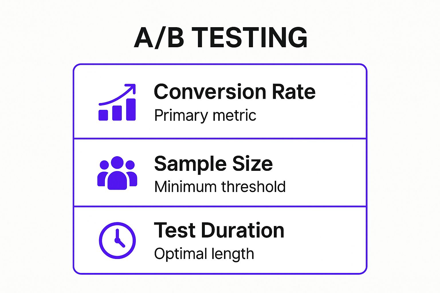
As the infographic highlights, achieving a statistically significant result means you need enough visitors and must run the test long enough to capture typical customer behavior.
How to Get Started
Getting started is easier than you think with tools like Google Optimize, Optimizely, or VWO. Here are a few actionable tips:
- Test One Thing at a Time: If you change the headline and the button color, you won’t know which change caused the lift. Isolate your variables for clear results.
- Focus on High-Impact Pages: Start with pages that have the most influence on your revenue, like your homepage, product pages, and checkout process.
- Run for a Full Business Cycle: Let your test run for at least one to two weeks to account for fluctuations in traffic and user behavior across different days.
- Document Everything: Keep a log of every test you run, including your hypothesis, the results, and what you learned. This becomes an invaluable internal resource.
For a deeper dive into the methodology, this video from Optimizely provides an excellent overview of the A/B testing process from start to finish.
2. Social Proof Implementation
Social proof leverages a powerful psychological shortcut: when people are uncertain, they look to the actions and experiences of others to guide their own decisions. It’s one of the most effective conversion optimization tips because it builds trust and validates a visitor's choice. By showcasing positive signals like testimonials, reviews, or user counts, you reduce friction and give potential customers the confidence they need to convert.
It's the digital equivalent of seeing a long line outside a restaurant and assuming the food must be great. For an e-commerce store, this means showing that real people have purchased, used, and loved your products. It transforms a solitary online shopping experience into a community-validated one.

Why Social Proof is a Must-Do
Wondering how to convince a hesitant shopper that your product is worth their money? Social proof provides the evidence they are looking for. For instance, Basecamp prominently displays customer testimonials and logos on their homepage to immediately build credibility, while Booking.com uses real-time booking notifications to create urgency and show product popularity. This isn't just a "nice-to-have"; it directly addresses customer anxiety and builds a bridge of trust that leads to more sales.
The challenge for many businesses is not understanding its importance, but in systemizing the collection process. To learn effective strategies, you can discover practical methods for getting consistent social proof without overwhelming your happy customers.
How to Get Started
Implementing social proof doesn't have to be complicated. You can begin by strategically placing different types of proof across your site. Here are a few actionable ideas:
- Place Testimonials Near Conversion Points: Add a compelling customer quote right next to your "Add to Cart" or "Sign Up" button to nudge users forward.
- Use Specific, Detailed Reviews: A review saying, "This t-shirt's fabric is incredibly soft and didn't shrink after three washes" is far more powerful than just "Great shirt!"
- Add Faces and Names: Whenever possible, include a photo and full name (or company) with a testimonial. This adds a layer of authenticity that text alone can't achieve.
- Showcase "Wisdom of the Crowd": Use dynamic counters like "1,257 sold this month" or "25 people are viewing this right now" to create a sense of demand and popularity.
3. Page Load Speed Optimization
In the world of e-commerce, speed is money. Page load speed optimization is the process of making your website’s pages load as quickly as possible. Every fraction of a second counts, as modern online shoppers have little patience for slow-loading sites. If a page takes too long to appear, potential customers will simply leave, costing you a sale before they even see your products.
Improving your site’s speed directly boosts conversions by enhancing the user experience and reducing bounce rates. It’s a fundamental part of any solid conversion optimization tips arsenal because a fast site feels professional, trustworthy, and efficient. This creates a seamless journey from browsing to checkout, keeping customers engaged and happy.
Why Page Speed is a Must-Do
Wondering if a few seconds really matter? The data is overwhelming. For example, Walmart found that for every one-second improvement in page load time, they saw a 2% increase in conversions. Similarly, AutoAnything cut their load times in half and watched sales jump by 12-13%. These aren't just minor tweaks; they are game-changing improvements that directly impact your bottom line.
A fast site not only keeps users from bouncing but also positively influences their perception of your brand. Tools like Google's PageSpeed Insights and GTmetrix can help you diagnose exactly where your site is lagging. Prioritizing speed is one of the highest-return investments you can make in your online store.
How to Get Started
You don't need to be a web developer to make a significant impact on your site's speed. Here are a few actionable tips to get you started:
- Compress Your Images: Use tools like TinyPNG or ImageOptim to reduce the file size of your product photos and banners without sacrificing visual quality. This is often the biggest and easiest win.
- Embrace Lazy Loading: Implement lazy loading so that images and other media below the fold only load when a user scrolls down to them. This dramatically speeds up the initial page load.
- Minimize HTTP Requests: Each element on your page (scripts, images, CSS files) creates a request. Reduce these by combining files and simplifying your page design where possible.
- Audit and Monitor Regularly: Use tools like Pingdom or GTmetrix to regularly check your site speed. This helps you catch new issues and monitor the impact of your improvements over time.
4. Mobile-First Design
Mobile-first design isn’t just about having a website that looks okay on a phone; it's a strategic philosophy that prioritizes the mobile user experience from the very beginning. Instead of designing for a large desktop screen and then shrinking it down, you start with the smallest screen and work your way up. This ensures your site is fast, intuitive, and easy to use for the majority of modern shoppers who browse on their smartphones.
With mobile traffic now dominating desktop in most e-commerce sectors, this approach is no longer optional, it’s a fundamental part of conversion optimization. It forces you to focus on what’s truly essential, stripping away clutter and delivering a streamlined path to purchase. This focus on core functionality directly impacts your bottom line by reducing friction for on-the-go customers.
Why Mobile-First Design is a Must-Do
Wondering why your mobile add-to-cart rate is so low? A clunky, slow, and hard-to-navigate mobile site is often the culprit. A mobile-first approach solves this by catering directly to the needs and limitations of a mobile user. For example, AliExpress saw a massive 104% increase in conversions for new users after overhauling their mobile experience. Similarly, Starbucks saw mobile orders and payments grow to represent 11% of their total U.S. transactions after a mobile-first redesign.
This strategy isn’t just about pleasing users; it’s also about pleasing search engines. Google’s mobile-first indexing means it primarily uses the mobile version of your site for ranking and indexing. A poor mobile experience can directly harm your visibility and organic traffic, making this one of the most critical conversion optimization tips for sustainable growth.
How to Get Started
Implementing a mobile-first mindset is a shift in process. You can begin applying its principles to your existing site or use it as the foundation for your next redesign. Here are a few actionable tips:
- Design for Thumbs: Place key navigation elements and call-to-action buttons within easy reach of a user's thumb. This makes one-handed browsing seamless.
- Simplify Forms and Checkout: Break down long forms into smaller, manageable steps. Use features like autofill and minimalist input fields to make checkout on a small screen painless.
- Embrace Large Tap Targets: Ensure all buttons, links, and clickable elements are at least 44x44 pixels. This prevents frustrating mis-taps and improves usability.
- Prioritize Ruthlessly: The limited screen real estate forces you to focus on the most critical content and CTAs. Push essential information above the fold and eliminate anything that doesn't directly contribute to the conversion goal.
5. Clear Call-to-Action (CTA) Optimization
Your call-to-action (CTA) is arguably the most important element on any given page. It's the final gateway between a visitor's interest and a conversion. CTA optimization involves strategically designing your action buttons and links to be as compelling and effective as possible. This goes far beyond just the button itself; it includes the copy, color, size, placement, and even the "negative space" surrounding it.
The goal is to remove any friction or hesitation and make it incredibly easy and desirable for users to take the next step. A well-optimized CTA acts as a clear, confident guide, telling visitors exactly what to do next and what to expect. This clarity is a cornerstone of any effective list of conversion optimization tips.

Why CTA Optimization is a Must-Do
A weak or ambiguous CTA can bring your entire sales funnel to a grinding halt. You can have the most persuasive copy and stunning product photos, but if the button to "Buy Now" is hidden or uninspiring, your conversion rates will suffer. For example, ContentVerve famously boosted conversions by over 90% simply by changing a button color from green to red, demonstrating that even subtle changes can have a massive impact.
Similarly, HubSpot saw a 21% increase in conversions by changing their CTA text from the generic "Submit" to the value-driven "Get My Free Ebook." These examples prove that optimizing your CTAs is a high-leverage activity that can deliver significant returns with relatively minimal effort.
How to Get Started
Optimizing your CTAs is a continuous process of testing and refinement. Start with your highest-traffic pages and work your way through your site. Here are a few actionable tips:
- Use Action-Oriented, First-Person Copy: Instead of "Start Your Trial," test "Start My Free Trial." This subtle shift in perspective can make the offer feel more personal and tangible.
- Focus on Value, Not Friction: Your button text should emphasize what the user gets, not what they have to do. "Get Your Free Quote" is more appealing than "Submit Your Information."
- Make it Unmissable: Your CTA should stand out visually. Use a bold, contrasting color that aligns with your brand but pops from the background. Ensure it's large enough to be easily tapped on mobile devices.
- Create Urgency (Authentically): Use phrases like "Shop the Sale Now" or "Get It Before It's Gone" to encourage immediate action, but avoid creating false scarcity that can damage trust.
- Test Placement and Frequency: Don't just stick a CTA at the bottom of the page. Test placing them above the fold, after key value propositions, or even as a sticky element that follows the user as they scroll.
6. Trust Signal Enhancement
Trust signal enhancement is a crucial conversion optimization tip that focuses on building credibility and reducing visitor anxiety. These signals are visual and textual cues, like security badges, guarantees, and clear contact information, that reassure users your website is legitimate and that their personal and financial data is safe. In an online world filled with scams, establishing this trust is non-negotiable.
When a customer lands on a new site, they are subconsciously looking for reasons to leave. A lack of trust signals can trigger their internal alarm bells, causing them to abandon their cart. By strategically placing these symbols of security and authenticity, you create a sense of safety that encourages them to complete their purchase. It’s about making your visitors feel comfortable and confident in their decision to do business with you.
Why Enhancing Trust Signals is Crucial
Not sure if a simple badge can make a difference? The data says it all. Econsultancy reported that nearly half of all users actively look for trust signals before making a purchase. In one famous case, Blue Fountain Media increased their conversions by an astounding 42% simply by adding a VeriSign trust badge to their site. These elements directly address a core psychological barrier to conversion: fear.
A well-placed trust signal acts as a powerful endorsement, telling your customer, "You're in good hands." This is particularly important on pages where users are asked to share sensitive information, such as checkout or sign-up forms. The goal is to proactively answer their security questions before they even have to ask.
How to Get Started
Integrating trust signals is a high-impact, low-effort tactic. You can begin building credibility almost immediately with tools and assets from providers like Norton, Trustpilot, or the Better Business Bureau. Here are some actionable tips:
- Place Badges Strategically: Position security seals like Norton or McAfee Secure right next to credit card fields and "Buy Now" buttons to alleviate last-minute fears.
- Showcase Your Guarantees: Clearly display your money-back guarantee, free shipping, or easy return policy near your call-to-action. This removes the perceived risk of a purchase.
- Use Recognizable Symbols: Stick with widely known and respected trust marks. An obscure or poorly designed badge can have the opposite effect and look suspicious.
- Keep It Current: Ensure all badges and certifications are valid and up-to-date. An expired security seal is a major red flag for savvy shoppers.
- Don't Overdo It: While important, littering your page with too many badges can create a cluttered, desperate look. Choose a few high-impact signals and place them thoughtfully.
7. Form Optimization
Forms are the final frontier between you and a lead or customer, making form optimization one of the most critical conversion optimization tips for your e-commerce site. This process involves systematically removing friction from any data collection point, whether it’s a checkout form, a newsletter sign-up, or a contact inquiry. The goal is to make it as easy and painless as possible for users to give you their information.
Every field you add, every confusing instruction, and every poorly handled error message is a potential roadblock that can cause a user to abandon the process. By streamlining your forms, you directly reduce abandonment rates and increase the number of successful submissions, which translates to more leads, sales, and subscribers. Think of it as clearing the path to conversion.
Why Form Optimization is a Must-Do
Wondering if that "Company Name" field is costing you sales? Form optimization provides the answer by focusing on user experience. For example, travel giant Expedia famously increased annual profit by $12 million simply by removing one optional field from their checkout form. Similarly, digital agency Imagescape boosted their conversion rate by a staggering 120% after cutting their contact form down from 11 fields to just four.
These examples prove that less is often more. Every field requires cognitive effort from your user. Reducing that effort makes completing the form feel faster and less intrusive, which is key to maximizing completions.
How to Get Started
Optimizing your forms doesn’t require a complete overhaul. Start with small, strategic changes using these actionable tips:
- Ask Only for What’s Essential: Be ruthless. Do you really need their phone number for a newsletter sign-up? Delay asking for non-critical information until a later stage in the customer relationship.
- Use a Single-Column Layout: Research from CXL Institute shows that single-column forms are completed faster than multi-column layouts because they provide a clear, linear path for the user to follow.
- Implement Real-Time Validation: Don't wait until a user clicks "Submit" to tell them they made a mistake. Use inline validation to provide immediate feedback, like a green checkmark for correctly filled fields or a red alert for errors.
- Embrace Smart Defaults and Autofill: Pre-fill known information for logged-in users and enable browser autofill capabilities. Use appropriate input types (like
type="email"ortype="tel") to bring up the correct mobile keyboards.
8. Urgency and Scarcity Tactics
Urgency and scarcity are powerful psychological triggers that motivate customers to act now rather than later. These tactics leverage the fear of missing out (FOMO) by creating a sense that a product, offer, or opportunity is in limited supply or only available for a short time. When customers feel they might lose a great deal, they are more compelled to make a purchase decision quickly.
This approach is one of the most effective conversion optimization tips because it directly addresses procrastination, a major barrier to sales. By introducing a real or perceived limitation, you shift the customer's mindset from "I'll think about it" to "I need to get this before it's gone," shortening the consideration phase and boosting immediate conversions.
Why Urgency and Scarcity are Must-Dos
Have you ever seen a message like "Only 2 left in stock!" and felt a sudden need to buy? That's scarcity in action. These tactics work by tapping into what psychologist Robert Cialdini calls the "Scarcity Principle," where people place a higher value on things they perceive as less available. For example, Booking.com masterfully uses messages like “Only 1 room left at this price” to dramatically increase immediate bookings.
Similarly, Amazon's "Lightning Deals" use a visible countdown timer to show the offer is time-sensitive, creating urgency. This simple addition can be the difference between a visitor browsing and a visitor buying. When used authentically, these strategies can significantly lift your conversion rates on product pages, in cart abandonment emails, and during promotional campaigns.
How to Get Started
Implementing urgency and scarcity requires a delicate touch to avoid sounding overly aggressive or dishonest. Here are a few actionable tips to get started:
- Be Authentic: Never fake your stock levels or deadlines. Dishonesty will destroy customer trust and can backfire spectacularly. Use low stock alerts only when inventory is genuinely low.
- Use Countdown Timers: Add timers to your product pages for limited-time sales or on your checkout page to show how long a cart is reserved. This visual cue makes the deadline feel more concrete.
- Highlight Demand: Use social proof messages like "20 people have this in their cart" or "Purchased 5 times in the last hour" to show that an item is popular and may sell out soon.
- Combine with Value: Urgency works best when paired with a strong offer. A ticking clock on a full-priced, low-demand item won't be very effective. Combine it with a discount or exclusive bonus to maximize impact.
Conversion Optimization Tips Comparison Matrix
Your Next Step: From Insight to Action
You've just navigated a comprehensive toolkit of conversion optimization tips, from the granular details of A/B testing button colors to the high-level strategy behind building unshakeable trust. We've explored the critical need for lightning-fast page loads, the non-negotiable importance of a mobile-first design, and the psychological power of well-placed social proof. The journey through optimizing CTAs, simplifying forms, and leveraging urgency is designed to give you a significant advantage in a crowded e-commerce landscape.
But knowledge without action is just trivia. The true value of this guide lies in what you do next.
Turning These Tips Into Tangible Growth
The path to a higher conversion rate isn't a sprint to implement all eight strategies by tomorrow. It's a strategic, iterative marathon. The secret to sustainable success is to adopt a mindset of continuous, data-driven improvement. Don't let the sheer number of possibilities lead to paralysis. Instead, focus on making one meaningful change at a time.
Here are your actionable next steps:
- Identify Your Biggest Leak: Start by diagnosing your store's most significant weakness. Use analytics to find your biggest drop-off point. Is it your product page? Your checkout form? A slow-loading homepage on mobile devices? This is your starting line.
- Form a Hypothesis: Based on the tips in this article, create a clear hypothesis. For example, "I believe that adding customer testimonials directly below the 'Add to Cart' button will increase conversions by building trust at the point of decision."
- Test and Measure: Implement the change and run a controlled test. Whether it's a formal A/B test or a simple before-and-after comparison over a set period, you need data to validate your efforts. Did the change work? Why or why not?
- Rinse and Repeat: Regardless of the outcome, you've learned something valuable about your audience. Take that insight, choose your next area of focus, and repeat the process. This cycle of hypothesizing, testing, and learning is the engine of conversion optimization.
For ambitious store owners, particularly those who have found success on platforms like Etsy and are ready to build a scalable brand, mastering these conversion optimization tips is your key to unlocking the next level of growth. Moving to a dedicated e-commerce platform like Shopify gives you the control and flexibility to implement these strategies without limitation, turning your website into a true conversion machine. This is where your brand transforms from a shop into an empire.
Feeling ready to build a high-performing website that puts these principles into practice but don't want to get lost in the technical details? At Wand Websites, we specialize in creating conversion-focused e-commerce stores that are built for growth from day one. Let us handle the expert implementation so you can focus on your products and customers. Explore how we can elevate your brand at Wand Websites.
