Top 8 Best Practices Website Navigation for 2025

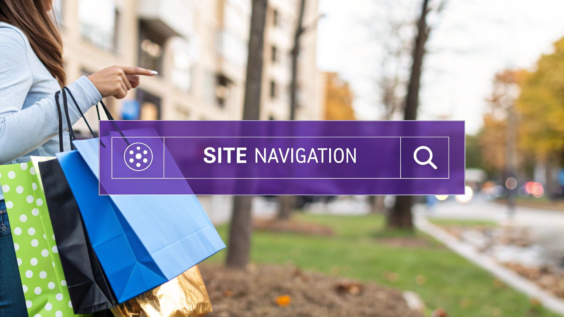
Imagine your e-commerce store is a bustling city. How do visitors find their way from the main entrance to the exact product they want? Your website navigation is the map, the street signs, and the friendly guide all rolled into one. Get it right, and customers glide effortlessly from browsing to checkout. Get it wrong, and you've created a frustrating maze with no exit, leading directly to abandoned carts and lost sales. For ambitious e-commerce brands, particularly those scaling up from platforms like Etsy to their own dedicated storefronts, mastering this is non-negotiable.
An intuitive navigation system is a powerful tool for growth. It builds immediate trust, showcases your product catalog effectively, and directly boosts critical metrics like conversion rates and average order value. Implementing the best practices for website navigation isn't just a design tweak; it's a core business strategy that impacts your bottom line. For businesses looking to enhance their online presence and user experience, collaborating with a professional digital agency can provide valuable insights into effective website navigation. For instance, the team at bare-digital specializes in creating user-centric designs that drive results.
This guide cuts through the noise to give you exactly what you need. We will break down eight essential navigation principles, providing actionable steps and clear examples you can apply to your store today. Forget guesswork and generic advice. Let's build a clear, compelling path to purchase that transforms first-time visitors into repeat customers.
1. Keep Navigation Simple and Consistent
Think of your website's navigation as the friendly GPS for your online store. If it’s cluttered, confusing, or keeps changing the route, your customers will get lost and frustrated. This is where simplicity and consistency become your most powerful tools. This foundational principle is all about creating a navigation structure that is so intuitive and predictable, users don't even have to think about it. They just know where to go.
By keeping your main menu clean and placing it in the same spot on every single page (typically the top header), you drastically reduce cognitive load. Shoppers aren't wasting mental energy figuring out how to browse; instead, they're focused on what matters: discovering and buying your amazing products. This simple approach builds trust and confidence, making the entire shopping experience feel effortless and professional.
Why It’s a Cornerstone of Great E-commerce Navigation
In the world of online shopping, a confused mind always says no. The goal of implementing simple and consistent navigation is to eliminate that confusion entirely. When a customer lands on your homepage, then clicks to a category page, and then a product page, the navigation bar should remain a stable, reliable anchor. This predictability is crucial for building user confidence.
This concept, championed by usability pioneers like Steve Krug, author of Don't Make Me Think, is one of the most impactful best practices for website navigation because it directly supports the user's journey from browsing to checkout. A consistent framework ensures users always know how to get back, explore other categories, or access their cart, no matter where they are on your site. For example, Apple's website is a masterclass in this, using a minimalist top navigation that remains identical across its vast ecosystem of product pages.
Actionable Tips for Implementation
Ready to streamline your site's navigation? Here’s how you can put this principle into action:
- Limit Your Main Menu Items: Follow the "Rule of 7" (plus or minus two). Aim to have between 5 and 9 primary navigation links. If you have more, consider grouping related items under a single, clear dropdown menu.
- Use Familiar Language: Stick to conventional terms that your customers will instantly recognize. Use "Shop," "Products," or "Categories" instead of overly creative but confusing labels.
- Conduct a Card Sorting Exercise: To understand how your customers group your products, ask a few of them to sort your product types into categories that make sense to them. This helps you mirror their mental models.
- Create a Navigation Style Guide: Document the design, placement, and terminology for all navigation elements. This ensures everyone on your team maintains consistency as the site grows.
2. Implement Clear Visual Hierarchy
Think of your navigation menu as a well-organized storefront window. The most important, eye-catching items are placed front and center, while supporting items are arranged neatly around them. This is visual hierarchy in a nutshell: using design cues like size, color, and spacing to tell your customers, "Hey, look here first!" This principle guides the user’s eye, making it instantly clear what’s most important and where they can find secondary information.
A strong visual hierarchy turns a jumble of links into an intuitive roadmap. It allows shoppers to scan your navigation, understand the structure of your site, and find their desired category without conscious effort. By visually distinguishing between primary, secondary, and tertiary links, you create an effortless flow that guides users from broad categories to specific products, dramatically improving their ability to navigate your store efficiently.

Why It’s a Cornerstone of Great E-commerce Navigation
Without a clear visual hierarchy, all navigation links appear equally important, which can overwhelm and paralyze a user with too many choices. The goal is to create order out of potential chaos, making the user's path to purchase as frictionless as possible. When primary categories are visually dominant (perhaps larger, bolder, or a different color), users can quickly grasp the main offerings of your store.
This concept, central to the work of information design experts like Edward Tufte, is one of the most critical best practices for website navigation because it directly influences how easily users can process information. A well-executed hierarchy prevents users from getting lost and reduces the time it takes to find a product. A great example is Amazon, which uses a prominent primary navigation for major departments, with less emphasized sub-navigation appearing as users drill down, creating a clear and scalable system.
Actionable Tips for Implementation
Ready to bring order and clarity to your navigation? Here’s how to apply visual hierarchy effectively:
- Vary Font Size and Weight: Make your top-level menu items larger or bolder than the sub-menu links. This simple typographic tweak instantly signals importance.
- Use Color and Contrast Strategically: Assign a specific color to your primary navigation links to make them stand out. You can also use a subtle background color for dropdown menus to group sub-items together visually.
- Leverage White Space: Don't cram your links together. Use ample spacing (padding and margins) around and between navigation elements to reduce clutter and improve readability. This helps group related items and separate distinct sections.
- Make Clickable Elements Obvious: Ensure links look interactive. Use underlines on hover, button-like styles for key calls-to-action (like "Shop Now"), or a change in color to provide clear visual feedback that an element is clickable.
3. Use Descriptive and Intuitive Labels
Think of your navigation labels as the signs on a highway. If they're vague, misleading, or use confusing jargon, your visitors are going to take a wrong turn and get lost. Descriptive and intuitive labels are all about using clear, straightforward language that instantly tells users what they'll find when they click a link. It's about speaking your customer's language, not your internal company shorthand.
This principle focuses on removing guesswork from the user experience. Instead of using clever but ambiguous terms, you opt for words that accurately reflect the destination content. When a shopper sees a label like "Women's Hiking Boots," they have a precise expectation of what that page contains. This clarity builds immediate trust and makes your site feel easy to use, guiding customers smoothly toward what they're looking for.
Why It’s a Cornerstone of Great E-commerce Navigation
In e-commerce, clarity equals conversions. Every moment a customer spends deciphering your navigation is a moment they aren't spending exploring your products. Using descriptive labels is one of the most effective best practices for website navigation because it aligns your site's structure with your customer's mental model. This concept is heavily championed by plain language advocates like Ginny Redish, who emphasize that clear content is usable content.
When labels are intuitive, users can predict the outcome of their clicks, which significantly reduces friction and frustration. For instance, an outdoor gear store like REI excels at this by organizing navigation around activities like "Hike," "Camp," and "Run," which is how their customers think about their needs, rather than just using generic product categories. This user-centric approach makes the site feel helpful and expertly curated.
Actionable Tips for Implementation
Ready to make your navigation labels crystal clear? Here’s how you can put this principle into action:
- Avoid Internal Jargon: Ditch company-specific terms or industry acronyms. Instead of "AW24 Collection," use a more descriptive label like "New Fall Arrivals."
- Keep Labels Concise but Descriptive: Aim for two or three words that pack a punch. "Customer Service" is more welcoming and clear than a simple "Support" link.
- Conduct User Interviews: Talk to your actual customers. Ask them what terms they would use to find specific products on your site. Their vocabulary is your best guide.
- Run A/B Tests: If you're unsure between two labels, test them! See which version results in more clicks and higher engagement to let data guide your decision. For example, you could test "Shop Now" against "Explore Products."
4. Design for Mobile-First Navigation
In today's e-commerce landscape, your customer's first interaction with your store is more likely to happen on a smartphone than on a desktop. A mobile-first approach flips the traditional design process on its head. Instead of designing for a large screen and then trying to shrink it down, you start with the smallest screen first, ensuring the core navigation is flawless and intuitive for mobile users.
This strategy forces you to prioritize what's truly essential, eliminating clutter and focusing on the most critical paths to purchase. By perfecting the mobile experience first, you ensure that the majority of your audience has a smooth, frustration-free journey. Scaling the design up for tablets and desktops then becomes a process of enhancement rather than compromise, leading to a better experience on every device.

Why It’s a Cornerstone of Great E-commerce Navigation
With mobile commerce accounting for a massive share of online sales, a clunky mobile navigation system is a direct path to lost revenue. Designing mobile-first is one of the most crucial best practices for website navigation because it aligns your site's functionality with modern user behavior. This approach, championed by UX experts like Luke Wroblewski, ensures your navigation is not just usable but enjoyable on the devices your customers use most.
For navigation that adapts seamlessly across all devices and screen sizes, a strong understanding of responsive design best practices is essential. It ensures that elements like menus, buttons, and links are optimally placed and sized, no matter the viewport. For example, Spotify’s app uses an intuitive bottom-tab navigation for core features, a pattern perfectly suited for one-handed mobile use, which then expands into a more traditional header on desktop. This thoughtful adaptation is key to converting mobile browsers into buyers.
Actionable Tips for Implementation
Ready to put your mobile shoppers first? Here’s how to implement a mobile-first navigation strategy:
- Prioritize Ruthlessly: Identify the top 3-4 most critical actions a user needs to take. These should be the most prominent elements in your mobile navigation, often including "Shop," "Search," and "Cart."
- Embrace the Thumb Zone: Design your navigation so that key interactive elements are easy to reach with a thumb. Consider a bottom navigation bar for your most important links, as this is prime real estate for mobile accessibility.
- Use a Sticky Header: Keep your main navigation (like the hamburger menu icon and cart) visible at the top of the screen as users scroll. This "sticky" navigation provides constant, easy access without interrupting their browsing.
- Test on Real Devices: Don't just rely on resizing your browser window on a desktop. Test your navigation on actual smartphones and tablets to understand the true user experience, including touch target sizes and performance.
5. Provide Clear Current Location Indicators
Imagine exploring a massive shopping mall without any signs telling you which store you're in or what floor you're on. You'd quickly feel lost and overwhelmed. The same feeling happens to customers on a website without clear location indicators. This practice is all about providing constant, subtle visual cues that tell users exactly where they are within your site's hierarchy at all times.
These indicators, often called "You are here" signs, can take the form of highlighted menu items, descriptive page titles, and most famously, breadcrumb trails. By making it obvious where a user is, where they've come from, and where they can go next, you remove disorientation and empower them to explore your product catalog with confidence. This sense of place is critical for turning casual browsers into happy, paying customers.
Why It’s a Cornerstone of Great E-commerce Navigation
A user who feels lost is a user who is one click away from leaving. Providing clear location indicators is one of the most effective best practices for website navigation because it directly addresses this potential frustration. It reinforces your site's structure in the user's mind, helping them build a mental map of your store and understand how different product categories relate to one another.
This is especially vital for stores with deep or complex product catalogs. When a shopper lands on a product page from an external link like Google Shopping, location cues are their only way to orient themselves and discover related items. E-commerce giants like Amazon and Etsy master this by using detailed breadcrumb trails at the top of every page (e.g., Home > Clothing > Women's > Dresses > Casual), showing the exact path and allowing for easy navigation back to broader categories. This simple tool dramatically improves usability and encourages deeper exploration.
Actionable Tips for Implementation
Ready to give your customers a clear sense of direction? Here’s how to put this principle into action:
- Implement Clickable Breadcrumbs: Display a breadcrumb trail at the top of category and product pages. Ensure each "crumb" in the path is a clickable link, allowing users to easily move back up the hierarchy.
- Use a Distinct "Active" State: Style your main navigation so the link for the current page or category looks different from the others. This could be a change in color, a bold font, or an underline. Consistency here is key.
- Write Clear and Descriptive Page Titles: Ensure the H1 heading on each page clearly states what the page is about (e.g., "Men's Leather Wallets"). This reinforces the user's location and improves SEO.
- Leverage Structured Data: Add schema markup to your breadcrumbs. This helps search engines understand your site structure and can result in enhanced search result listings, driving more qualified traffic.
6. Implement Effective Search Functionality
Think of your website’s search bar as an express lane for your most decisive customers. While many visitors enjoy browsing through categories, others arrive with a specific product in mind. If they can't find a search bar quickly, or if it delivers poor results, they're likely to bounce to a competitor who can give them what they want without the hassle. An effective search function is a powerful navigation alternative that caters to these goal-oriented shoppers.
Placing a prominent, intelligent search bar on your site empowers users to bypass traditional menu browsing and go directly to their desired destination. It’s not just a box they type into; it’s a dynamic tool that can guide, suggest, and refine their journey. By making search a first-class citizen in your navigation design, you cater to high-intent users and can dramatically speed up the path from discovery to purchase.
Why It’s a Cornerstone of Great E-commerce Navigation
For e-commerce stores with large or complex inventories, a robust search function is non-negotiable. It transforms a potentially overwhelming browsing experience into a simple, direct query. When a customer knows exactly what they want, forcing them to click through multiple menu layers creates unnecessary friction. The goal is to make finding products feel as easy as a Google search.
This principle, championed by information architecture experts like Peter Morville and perfected by e-commerce giants like Amazon, is one of the most critical best practices for website navigation because it directly serves user intent. A great search experience doesn't just return results; it anticipates user needs with features like autocomplete and provides helpful filters to narrow down options. This turns your search bar from a simple utility into a conversion-driving assistant, boosting both sales and customer satisfaction.
Actionable Tips for Implementation
Ready to turn your search bar into a superstar? Here’s how to put this principle into action:
- Make It Prominent: Place the search bar in the header, where users instinctively look for it. Use a contrasting color or a clear icon to ensure it’s impossible to miss.
- Implement Autocomplete and Suggestions: As users type, show them relevant product suggestions, popular search terms, and even product images. This helps prevent typos and guides them toward available products.
- Design a Helpful 'No Results' Page: If a search yields no results, don't just show a dead end. Offer alternative search suggestions, links to popular categories, or contact information for customer support.
- Provide Robust Filtering and Sorting: On the search results page, allow customers to filter by price, brand, size, color, and other relevant attributes. Also include sorting options like "Best Selling," "Newest," and "Price: Low to High."
- Analyze Your Search Data: Regularly review what your customers are searching for. This data is a goldmine for understanding product demand, identifying content gaps, and even discovering new keywords for your marketing efforts.
7. Use Progressive Disclosure for Complex Navigation
Imagine walking into a hardware store where every single nut, bolt, and tool is laid out on one massive table. It would be an overwhelming nightmare. Progressive disclosure is the digital equivalent of organizing that store into neat, clearly labeled aisles. It’s a design technique that shows users only the essential information and options first, revealing more complex choices as they navigate deeper. This prevents cognitive overload and keeps the user experience clean and focused.
For stores with extensive catalogs or numerous product variations, this approach is a lifesaver. Instead of flooding your main navigation with dozens of subcategories, you present the primary categories first. As a user hovers over or clicks on a category, more specific options are revealed. This layered approach guides the user step-by-step, making a potentially complex journey feel simple and manageable.
Why It’s a Cornerstone of Great E-commerce Navigation
The core principle of progressive disclosure is to manage complexity and reduce user error. By sequencing information, you make it easier for shoppers to find what they need without getting distracted by options that aren't relevant to them yet. It respects the user's attention, only asking for it when necessary. This is one of the most powerful best practices for website navigation when dealing with large inventories.
This concept, championed by usability expert Jakob Nielsen, directly combats decision fatigue. When a user isn't overwhelmed, they are more likely to stay engaged and continue their journey toward a purchase. For example, a site like Dropbox uses this masterfully; the menu options change contextually based on the file type you select, showing you only relevant actions like "Share" or "Download" instead of every possible function at once. This keeps the interface clean and the user's path clear.
Actionable Tips for Implementation
Ready to tidy up your complex navigation? Here’s how you can implement progressive disclosure:
- Use Clear Visual Cues: Indicate expandable sections with universally recognized icons like arrows (› or ▾) or plus signs (+). This signals to users that more information is available with a click or hover.
- Implement Smooth Animations: Use subtle, quick transitions (like a gentle slide-down or fade-in effect) when revealing hidden content. This makes the interaction feel polished and less jarring than options that just pop into existence.
- Don't Bury Critical Links: Test your navigation to ensure essential features like "Contact Us" or "Account Login" aren't hidden too many layers deep. Progressive disclosure should simplify, not obscure.
- Design for Keyboard Accessibility: Ensure that users who rely on keyboards can open, navigate through, and close your expandable menus using keys like Tab and Enter.
8. Ensure Fast Loading and Responsive Navigation
Imagine your navigation menu is a drawbridge to your store's kingdom. If it takes too long to lower or gets stuck halfway on a smaller screen, your visitors will turn around and leave. In the digital world, speed and adaptability are not just nice-to-haves; they are critical components of a positive user experience. A fast-loading, responsive navigation is the digital equivalent of a smooth, welcoming entrance.
This principle ensures that your navigation elements appear and function instantly, regardless of the user's device or internet connection. It’s about creating a seamless experience where menus adapt perfectly from a wide desktop monitor to a narrow smartphone screen. By prioritizing performance, you eliminate a major source of user frustration and demonstrate that your brand values your customer's time and convenience.
Why It’s a Cornerstone of Great E-commerce Navigation
In e-commerce, every second counts. A slow-loading menu can be the direct cause of a lost sale. Modern shoppers are impatient, and research consistently shows that even a one-second delay in page response can result in a significant drop in conversions. Responsive design is equally crucial, as mobile shopping now dominates the market. If a user has to pinch and zoom just to tap a navigation link, they are highly likely to abandon their cart.
This focus on performance and adaptability is one of the most vital best practices for website navigation because it directly impacts both user satisfaction and SEO. Search engines like Google, heavily influenced by performance advocates like Steve Souders and Ilya Grigorik, prioritize sites that offer a fast and mobile-friendly experience. Implementing this practice means happier customers and better visibility. For instance, Stripe’s documentation provides a stellar example of instant-loading navigation that remains perfectly functional and easy to use across all devices.
Actionable Tips for Implementation
Ready to speed up your site's navigation and make it mobile-perfect? Here’s how you can put this principle into action:
- Optimize Navigation Assets: Compress any images or icons used in your menu. For simple graphics, use lightweight formats like SVG, which scale perfectly without losing quality.
- Prioritize CSS for Interactions: Use CSS for hover effects, dropdowns, and animations whenever possible. CSS-based interactions are much faster and smoother than those relying on JavaScript.
- Test on Slow Networks: Use your browser's developer tools to simulate a 3G connection. This will help you experience your site as a user with a slower connection would and identify performance bottlenecks.
- Monitor Performance Continuously: Utilize tools like Google PageSpeed Insights or GTmetrix to regularly check your navigation's load time and identify areas for improvement.
- Prioritize Above-the-Fold Loading: Ensure that the navigation elements visible without scrolling (above the fold) load first. Defer the loading of more complex or less critical menu components that appear further down the page.
Best Practices Navigation Comparison
From Maps to Magic: Transforming Your Store with Great Navigation
We've journeyed through the intricate world of website navigation, exploring the foundational principles that transform a simple online store into a powerful, customer-guiding machine. Think of your navigation not as a mere list of links, but as the central nervous system of your e-commerce brand. It's the silent salesperson, the helpful store associate, and the trusty map that ensures no visitor ever feels lost or frustrated. Implementing these best practices for website navigation isn't just a technical task; it's a strategic investment in your customer's journey and your bottom line.
From the clean simplicity of your main menu to the intuitive power of a well-tuned search bar, each element we've discussed plays a crucial role. When these pieces work in harmony, the result feels less like a website and more like magic. Your customers effortlessly find what they need, discover new products they love, and move toward checkout with confidence and clarity. This seamless experience is what separates a good store from a great one.
Your Blueprint for Navigational Excellence
Let's distill our journey into a clear, actionable blueprint. Your mission, should you choose to accept it, is to view your website through your customer's eyes and pinpoint every opportunity for improvement.
- Audit Your Current Navigation: Start by asking the tough questions. Is your menu cluttered? Are your labels too generic? How does it perform on a mobile device? Use the principles we've covered as your checklist.
- Prioritize the Customer Journey: Map out the most common paths your customers take. Your navigation should make these paths as smooth and direct as possible, removing any unnecessary clicks or confusing detours.
- Embrace a 'Mobile-First' Mindset: Don't just test on mobile; design for it from the ground up. This approach forces you to prioritize what's truly essential, resulting in a cleaner and more focused experience on all devices.
- Test, Analyze, and Iterate: Your navigation is not a "set it and forget it" feature. Use tools like heatmaps and analytics to see where users are clicking and where they're getting stuck. Continuous improvement is the key to sustained growth.
Beyond Links: Building a Brand Experience
Mastering these navigation concepts is about more than just organizing content; it's about building trust and demonstrating professionalism. For ambitious sellers ready to scale beyond the confines of marketplaces like Etsy, a polished, intuitive website is non-negotiable. It's the foundation of your independent brand, the digital storefront that you control completely.
When a customer lands on your site, your navigation is one of the first things they interact with. A logical, responsive, and visually appealing menu instantly communicates that you are a serious, customer-focused business. It shows that you’ve invested time and thought into their experience, which builds the confidence needed to turn a casual browser into a loyal customer. This is how you move from being just another shop to a destination brand that people remember, trust, and return to. By taking control of your navigation, you are taking a massive step toward building a truly sustainable and profitable e-commerce empire.
Building a high-performing e-commerce website is a journey, and getting the navigation right is a critical first step. At Wand Websites, we specialize in helping businesses like yours make that leap, turning great products into thriving online stores with fixed prices and clear timelines. Let us handle the technical magic so you can focus on creating. Ready to build a website that guides customers right to the 'buy' button? Let's talk.
